Method
The Design of NME
2013–2015
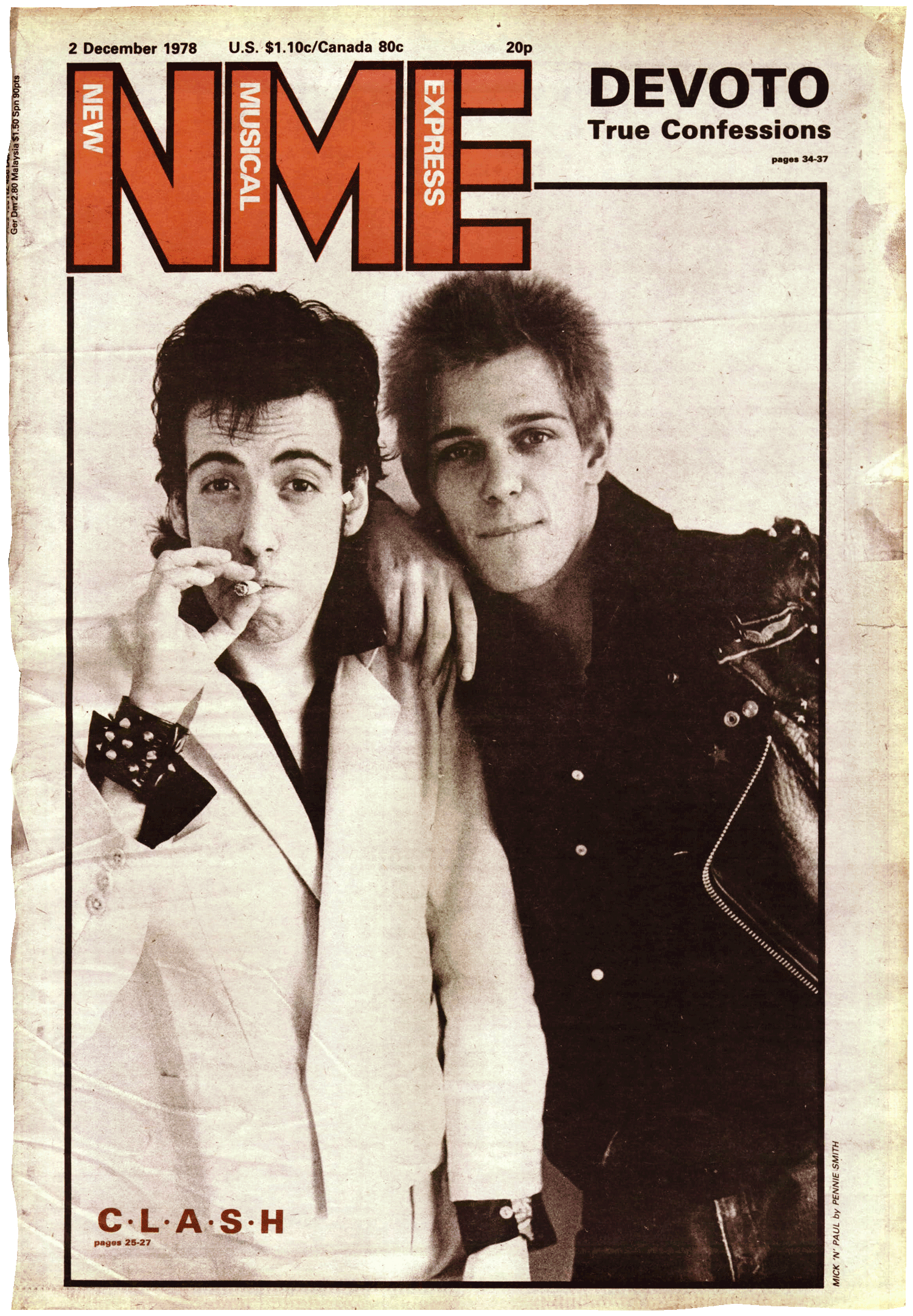
Image: The New Musical Express (NME) newspaper, 2 December 1978, art directed by Barney Bubbles
The young Mark Neil’s inky fingertips would religiously smudge through the week’s NME. Back then, I never imagined I’d be given the opportunity to work there. It meant the world, it still does.
When I arrived, NME was due to go into development and editor Mike Williams was eager to get started on his vision. The thing that initially stood out from our early conversations was this idea of NME being definitive — the definitive guide to the past, present and future of music. All I was thinking at this point was... “Where’s the archive cupboard?”
Readers were generally unconvinced by the NME in its current form. We needed to challenge all regular content, give them more new music, more reviews, more detail, more energy and personality to the design. We also needed to make sure heritage content would work for the core younger audience of 15–34 year olds as well as long time faithfuls.
Our development team was locked away in a small room and we talked fondly of the NME’s past and classic covers. I couldn’t stop thinking about this…
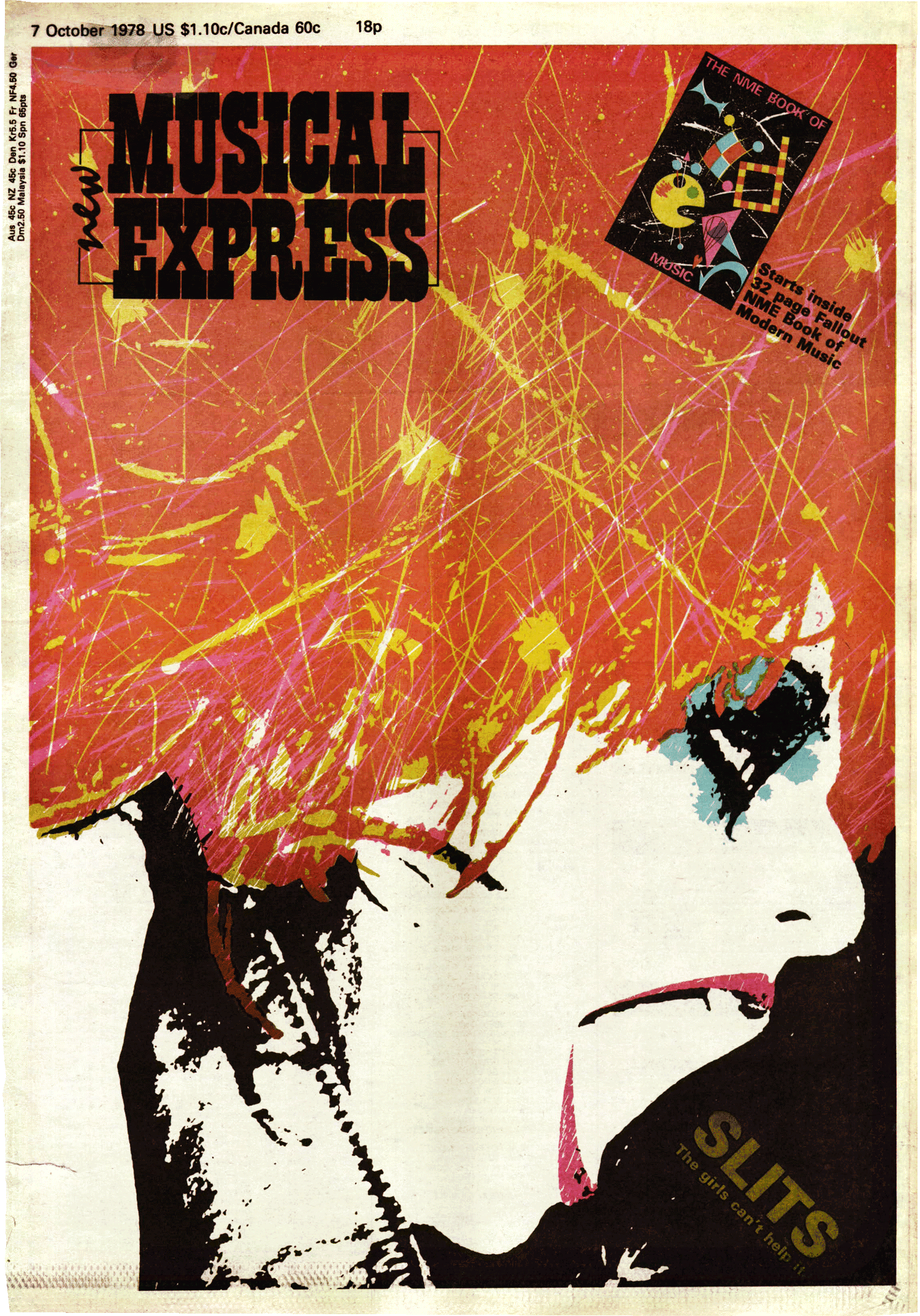
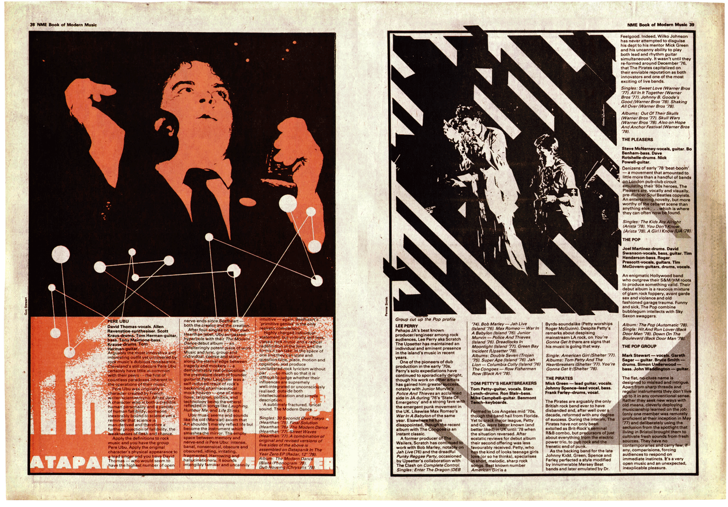
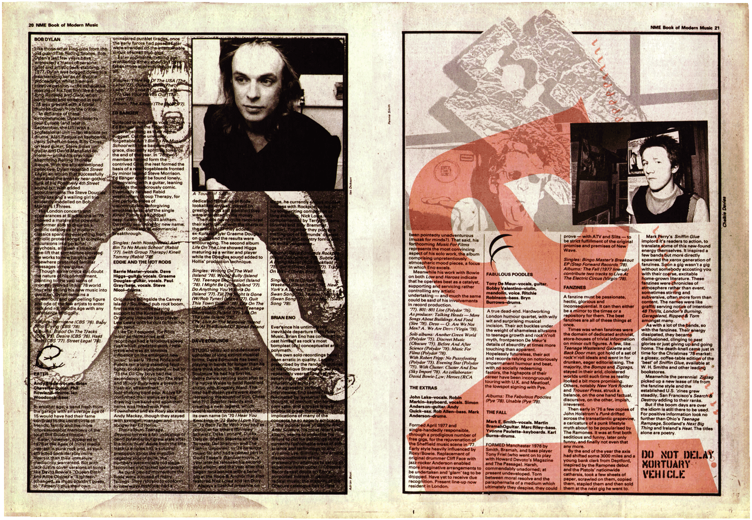
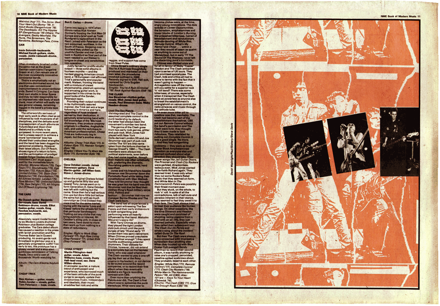
My favourite time in NME’s design history – when Barney Bubbles redesigned NME in 1978 with editor Neil Spencer.
To coincide with this redesign released in October 1978, NME published The NME Book of Modern Music, also designed by Bubbles. This was released as an eight week series of pullout spreads from the paper that would fold down and eventually form the 64 page book.
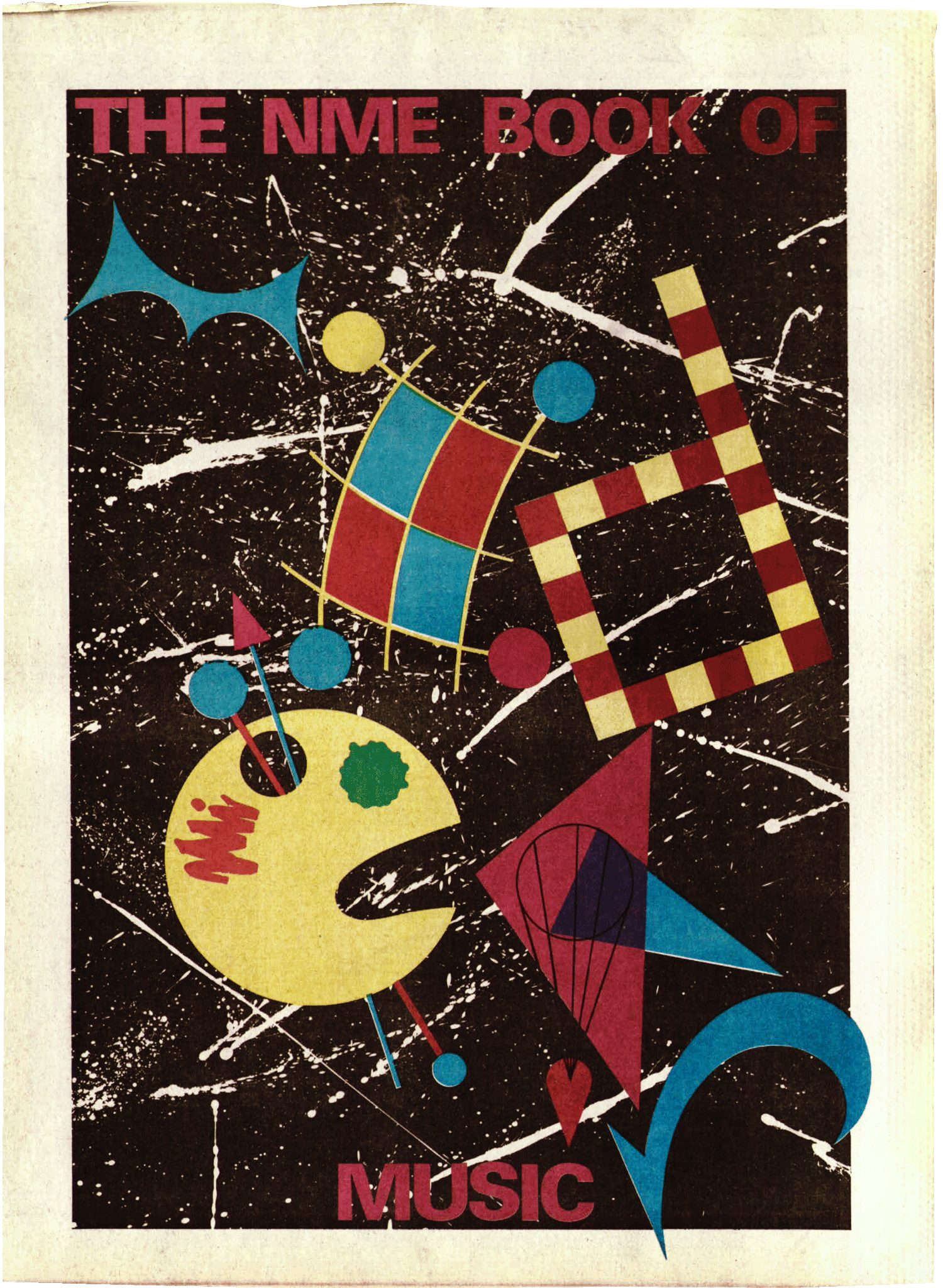
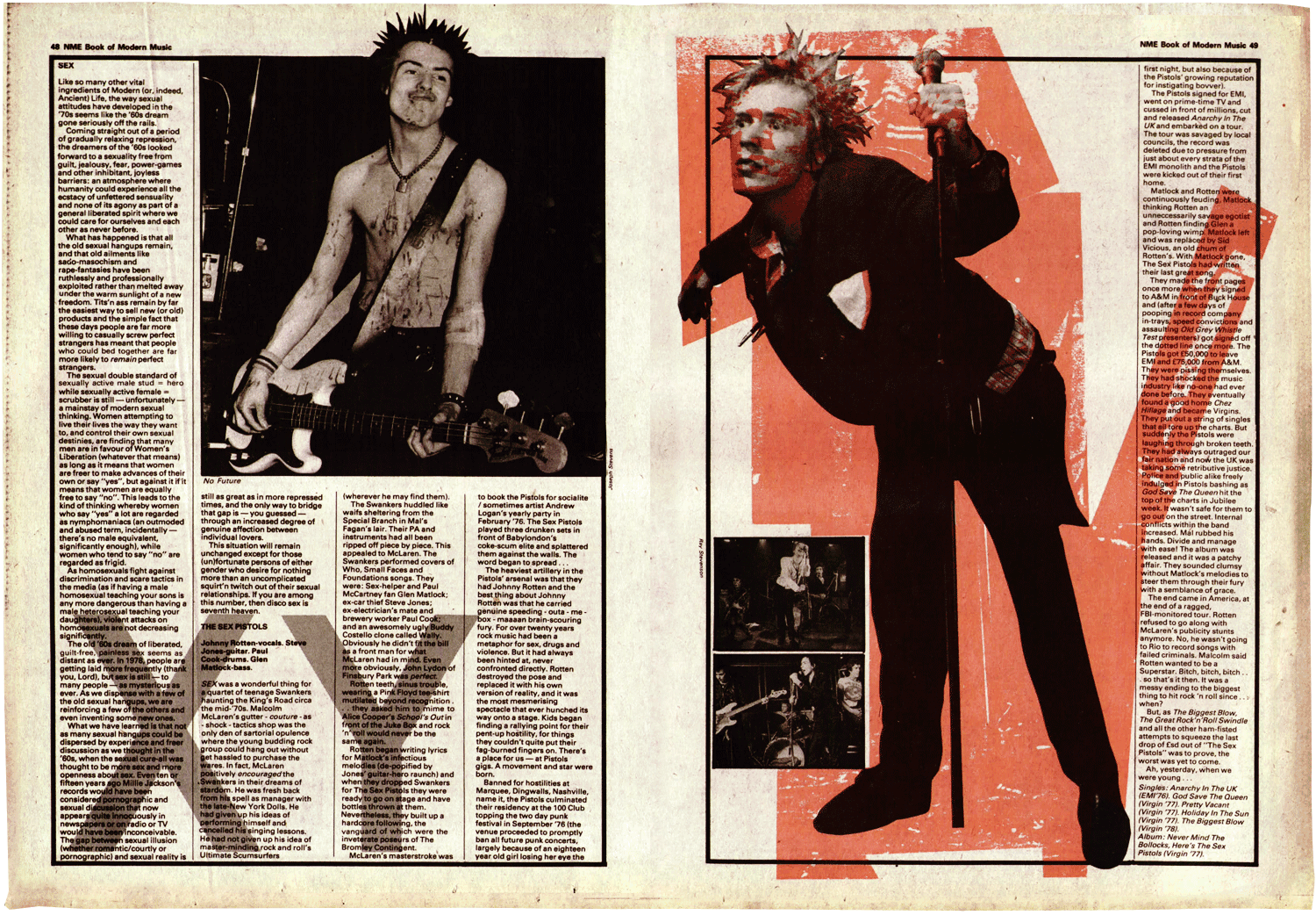
© Estate of Barney Bubbles
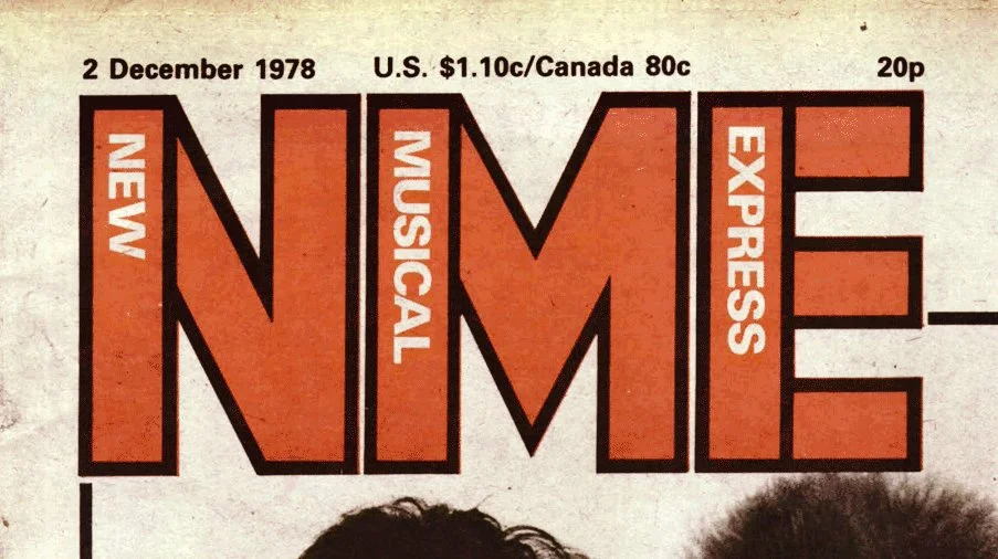
This fearless attitude to the print of NME seemed really heroic for consumer newsprint at the time. It wasn’t until the December 2 issue that Bubbles’ now iconic stencil logo was revealed.
In my opinion, Bubbles’ work in 1978 visually marked the birth of NME’s agenda setting and relevance that has defined the brand through the years.
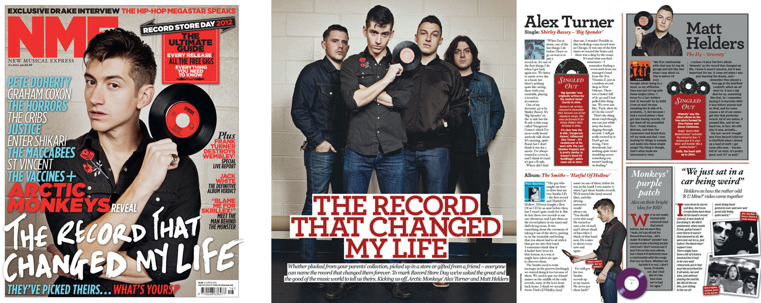
But when I looked at NME design from recent years, well, I was thinking… “Where’s the soul? Where’s the heart?” And how could I put that art back into its heart? Here was an opportunity to see how far we could take a more expressive, graphic look for the newsstand NME. One where graphic design is more considered and issues feel independent, valuable and collectible.
It was also an opportunity to unify the design of the brand with one identity. Like a great band logo, t-shirt or record cover, the NME could connect in the same way. It’s very personal to many and its audience should feel like they belong to the club. It was vital we brought back more substance and attitude, we had relevance and we had a visual language… but it was also vital we didn’t focus solely on the print magazine.
A new design philosophy could play out across the brand. The design team would then work more like a studio for NME and not just a typical art desk for a typical consumer title.
Well aware of how much the landscape had changed for the music press, we had to keep moving forward and develop the brand. Giving NME different fonts from the publisher’s server and calling it a ‘redesign’ was never the plan.
New identity
The logo would be the heart of the club. A one colour, definitive badge.
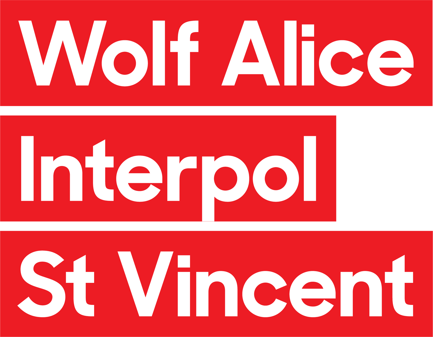
Artists would join the club, highlighted in the same way.
New format
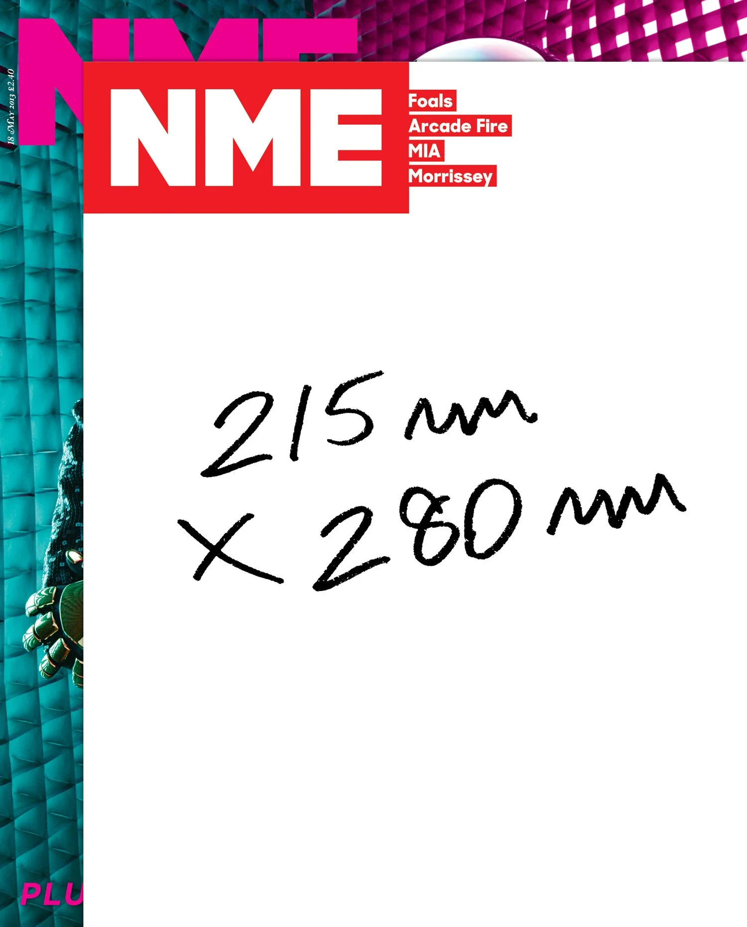
NME had an uncomfortable width like it was grasping onto its newspaper days. It had to keep moving forward and adapt to the times. At the time, the format was also influencing an unnecessary amount of repetitive images. The change in format would allow us to control the content more. It would feel more like the weekly magazine it actually was, sit better on the newsstand and work well on tablet. We were packing more in, giving more definitive guide for the cover price. Every section was bigger so we wanted it to feel personal and expressive. Like a mixtape or notebook bursting with views and ideas but with a distinct, easy to follow relationship between different areas of content. Later, readers welcomed the new format rating it high amongst the design changes.
New type
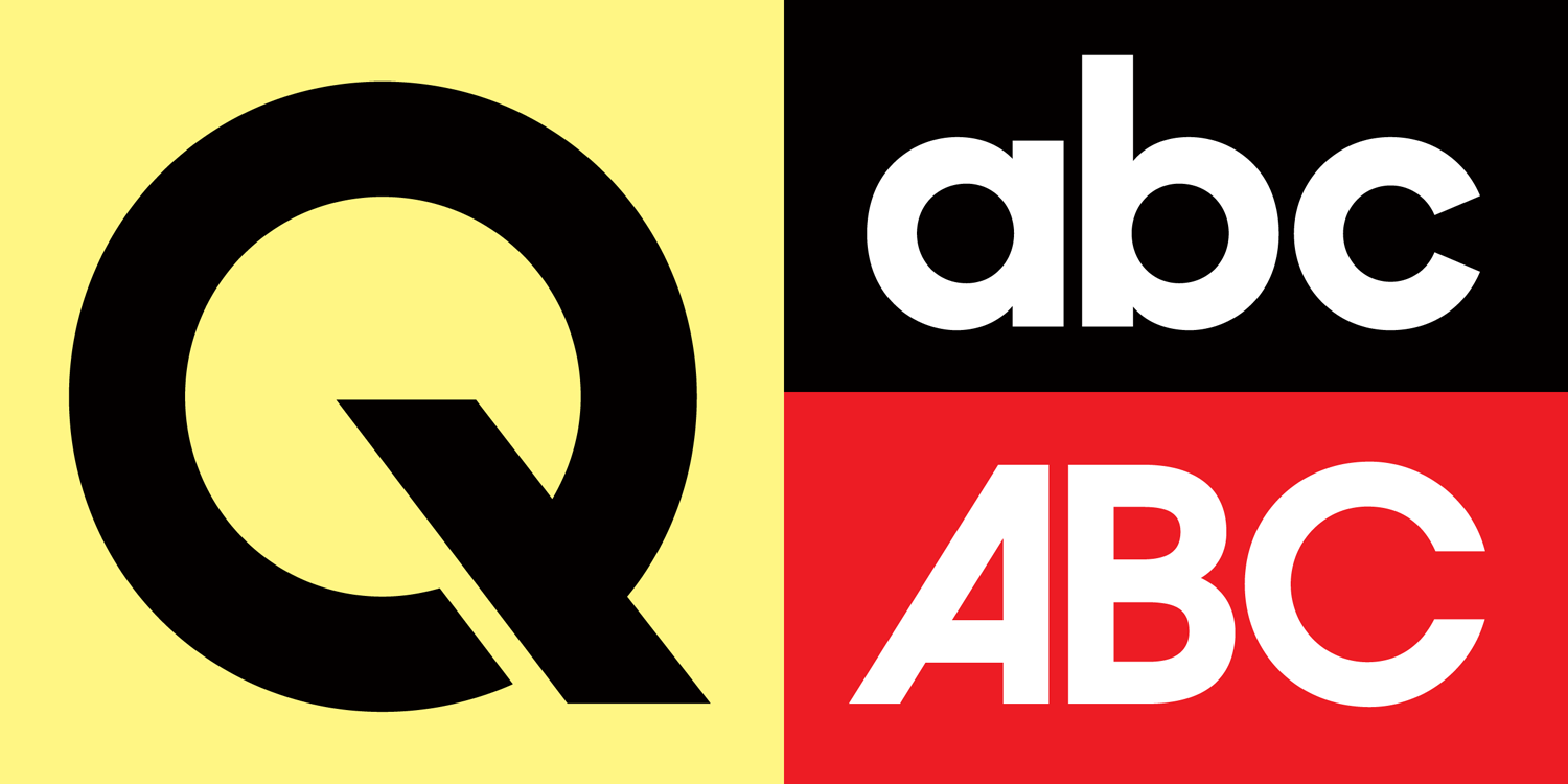
Sharps Sans by Lucas Sharp was the display font for the identity. A modern geometric sans serif that originally celebrated Herb Lubalin’s work on Avant Garde magazine. It looks to the past with its character and, for me, would tip its hat to past graphic design in music – from press adverts to posters to record sleeves..
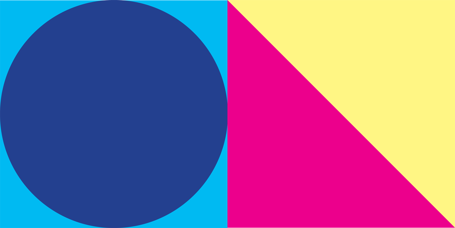
Geometric graphic design naturally started to inform the look.
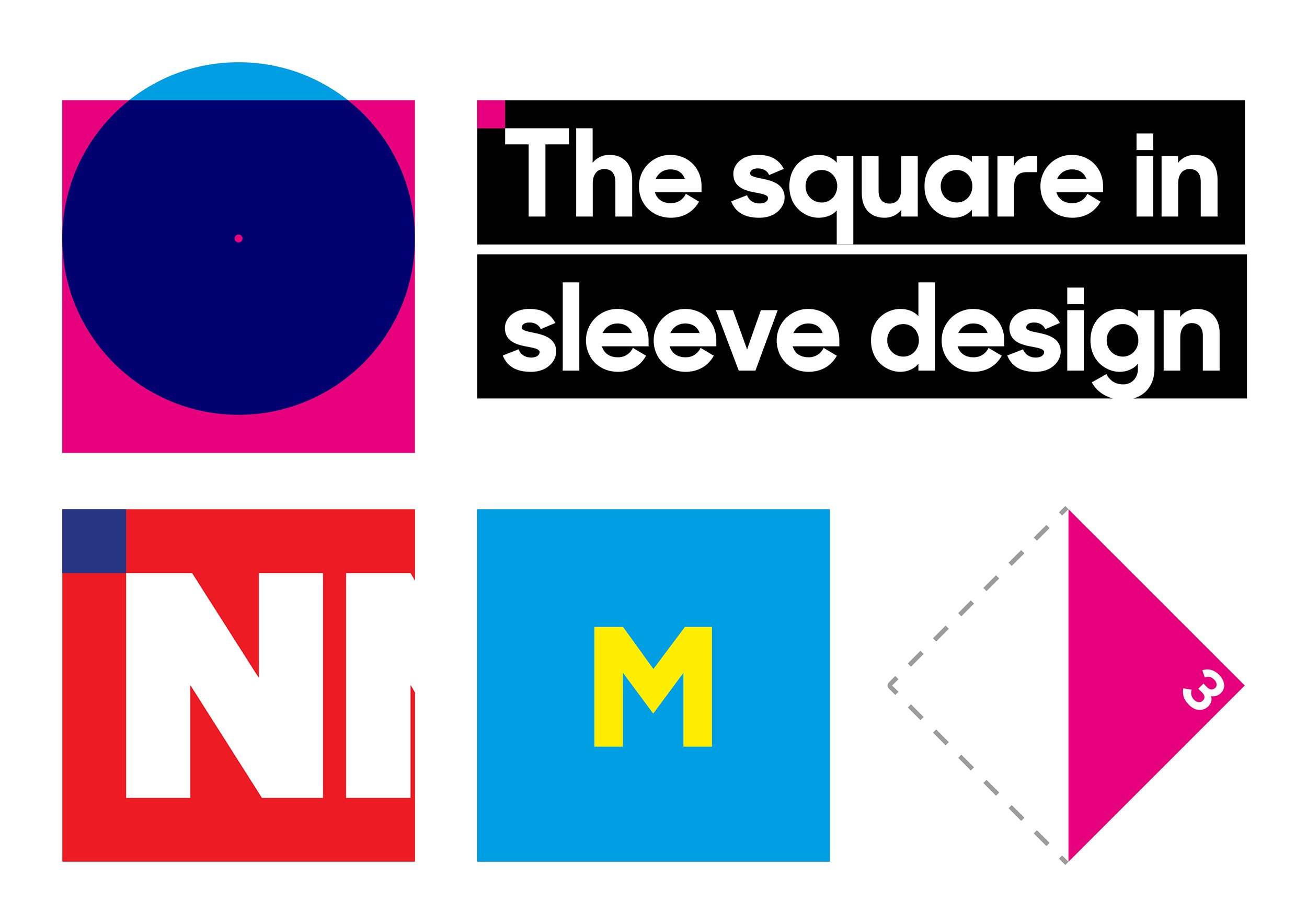
The square in particular, nodding to sleeve design, would shape the design — from spacing to navigation.
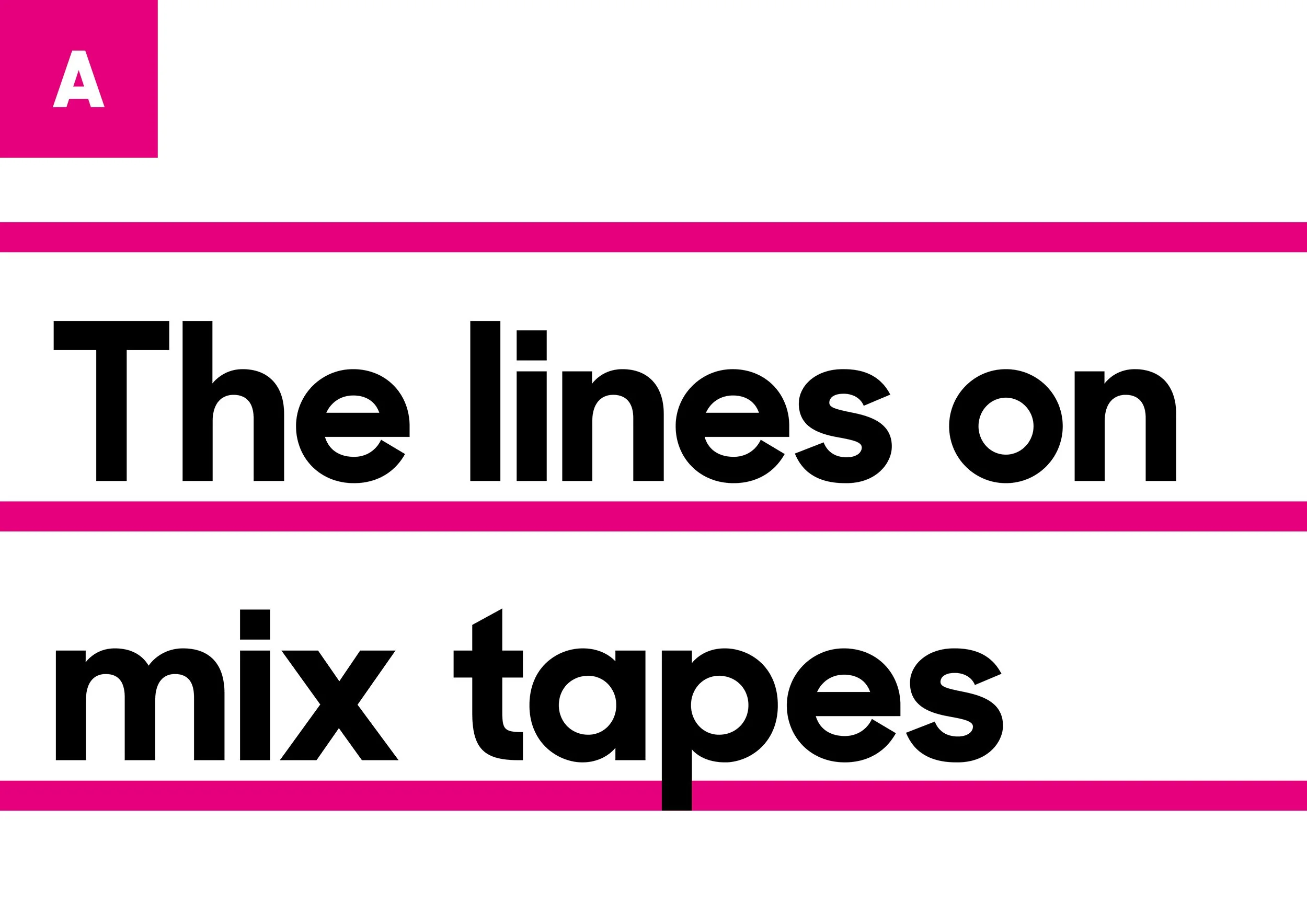
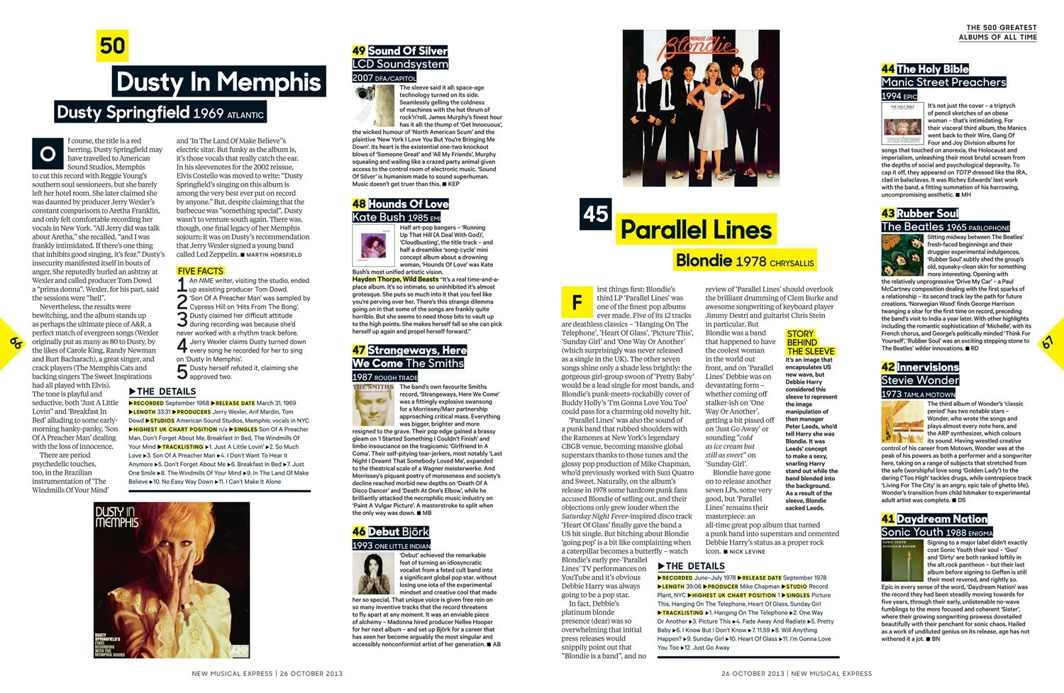
It would also be shaped by physical, personal connections to music — like list making…
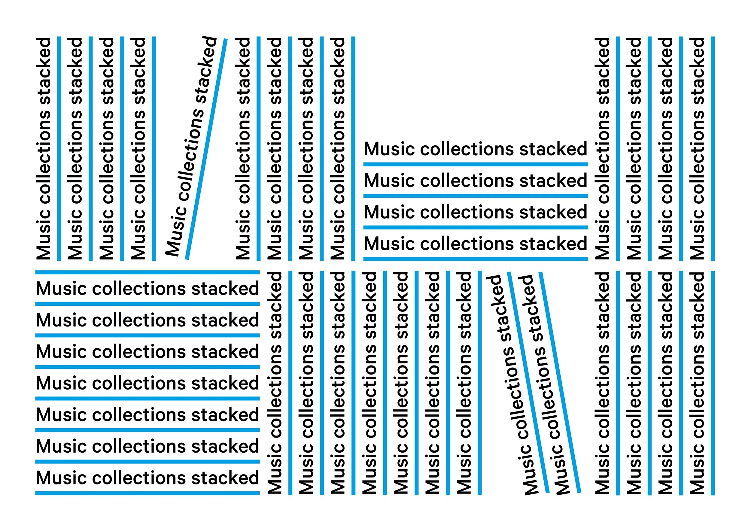
…and stacked music collections.
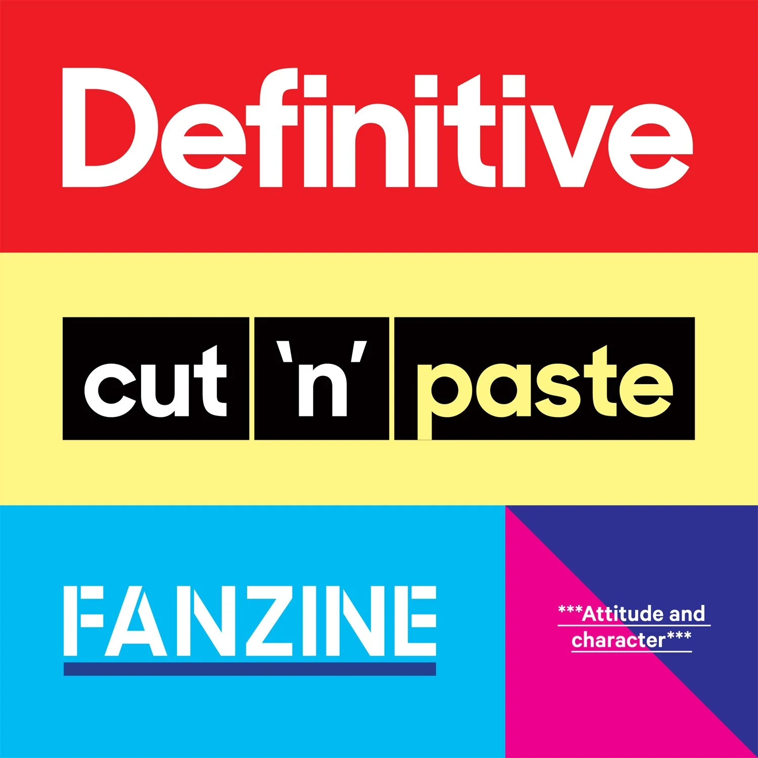
New philosophy
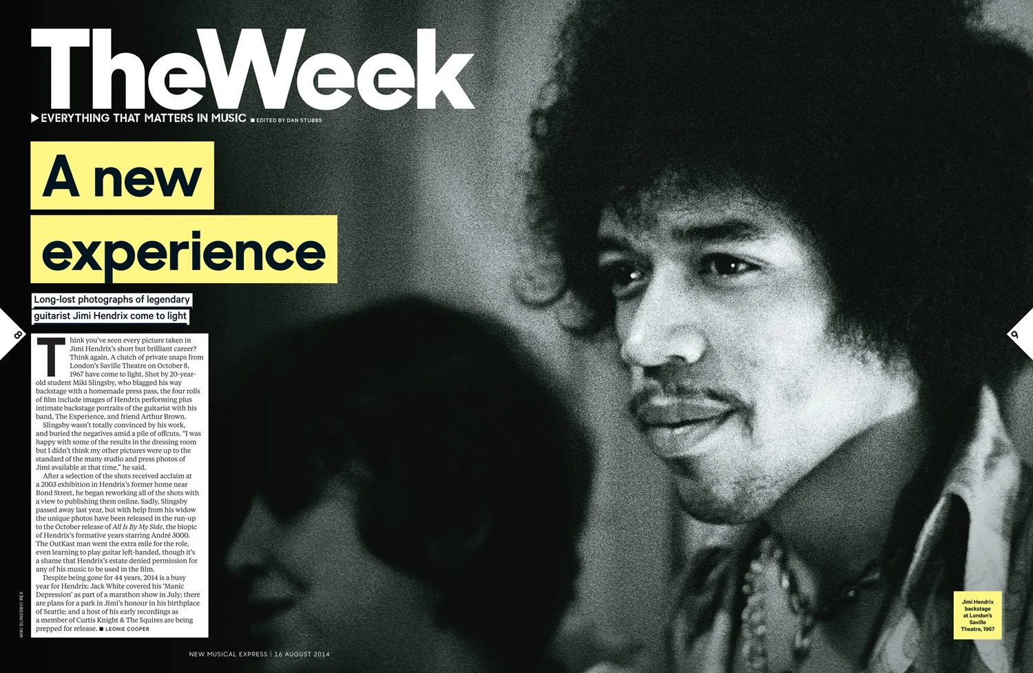
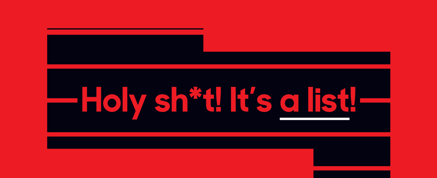
It became clear what kind of visual language would form this design. A cut and paste fanzine but obviously one that could be produced effectively in a modern, weekly publication.
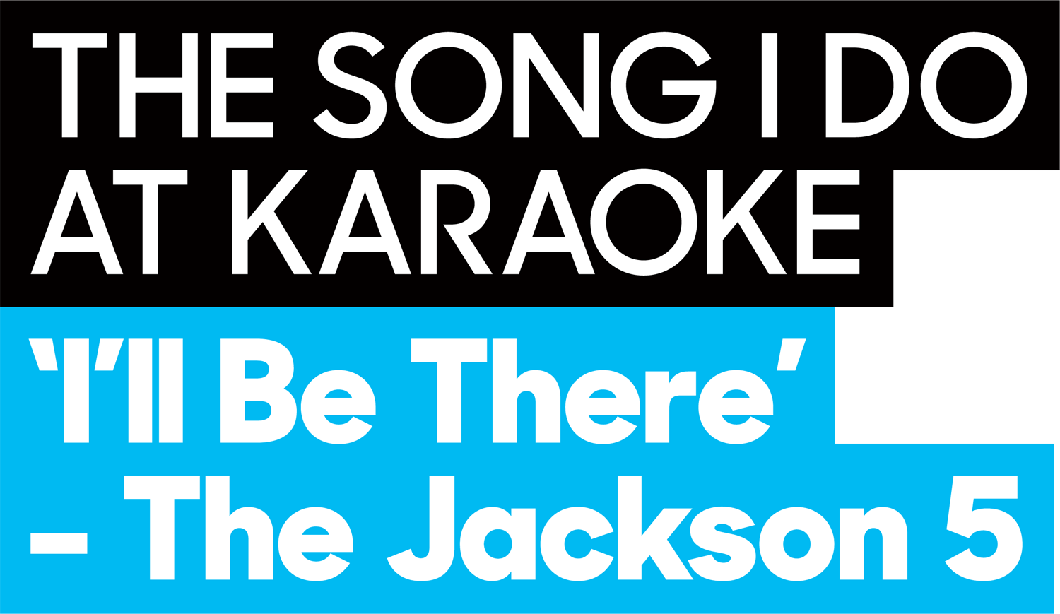
Highlights and underlines started to feel like good techniques to build the definitive identity.
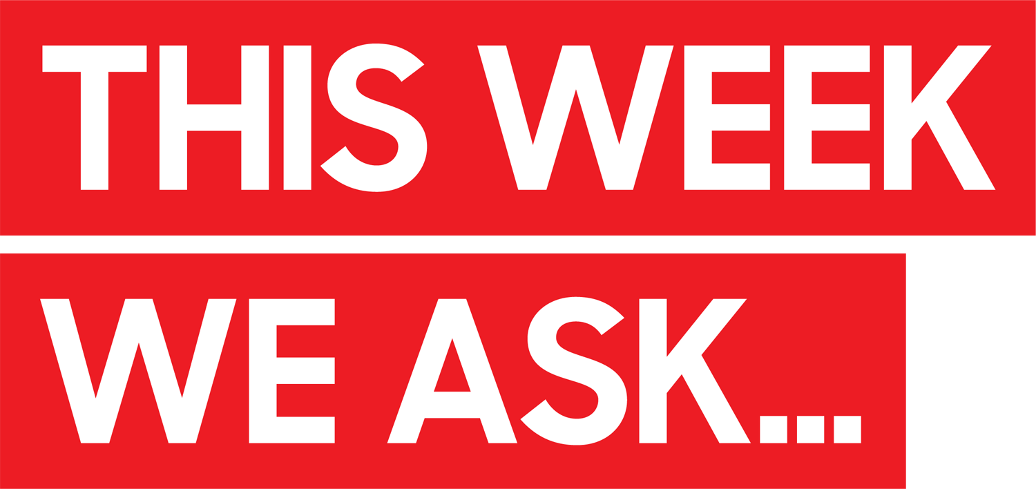
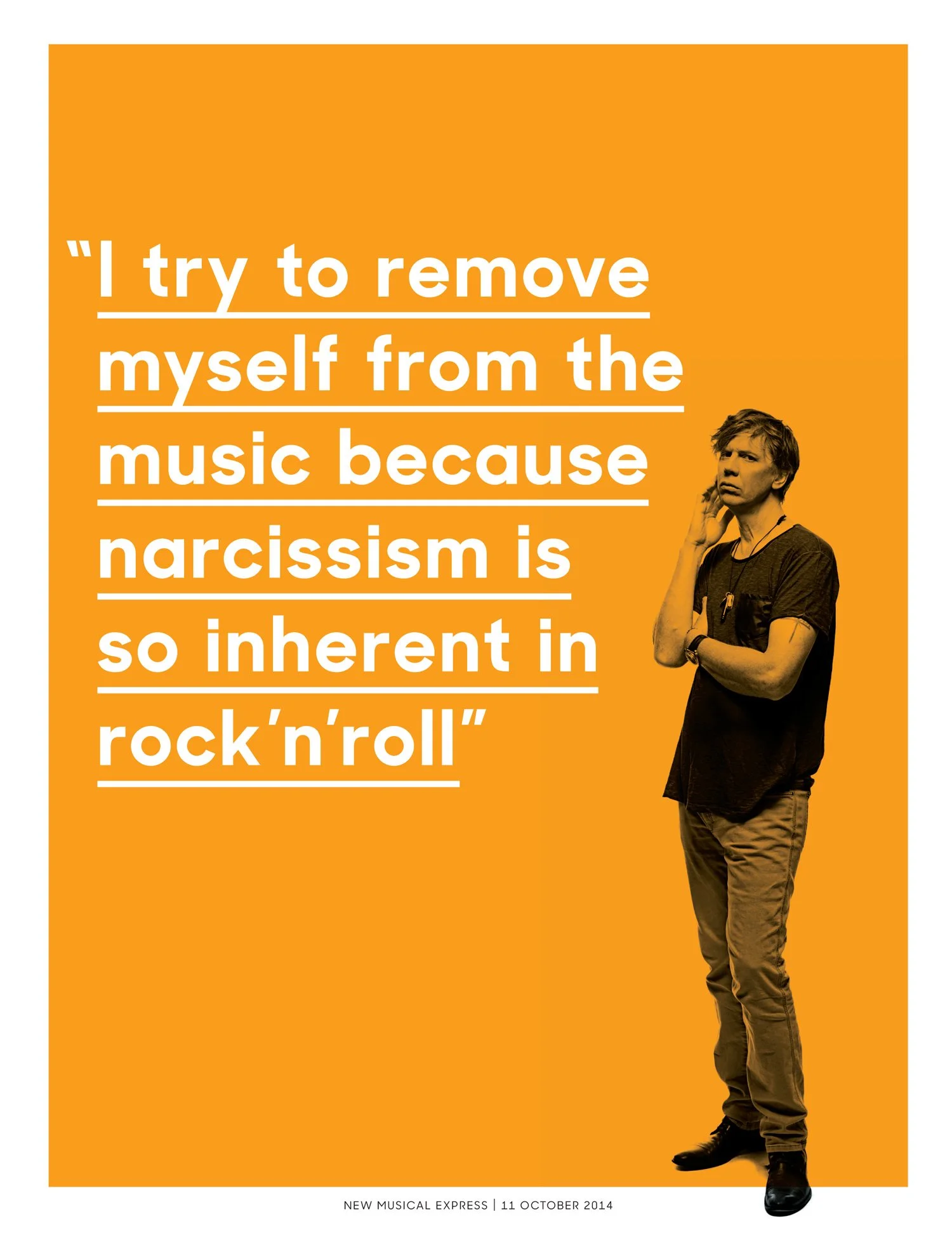
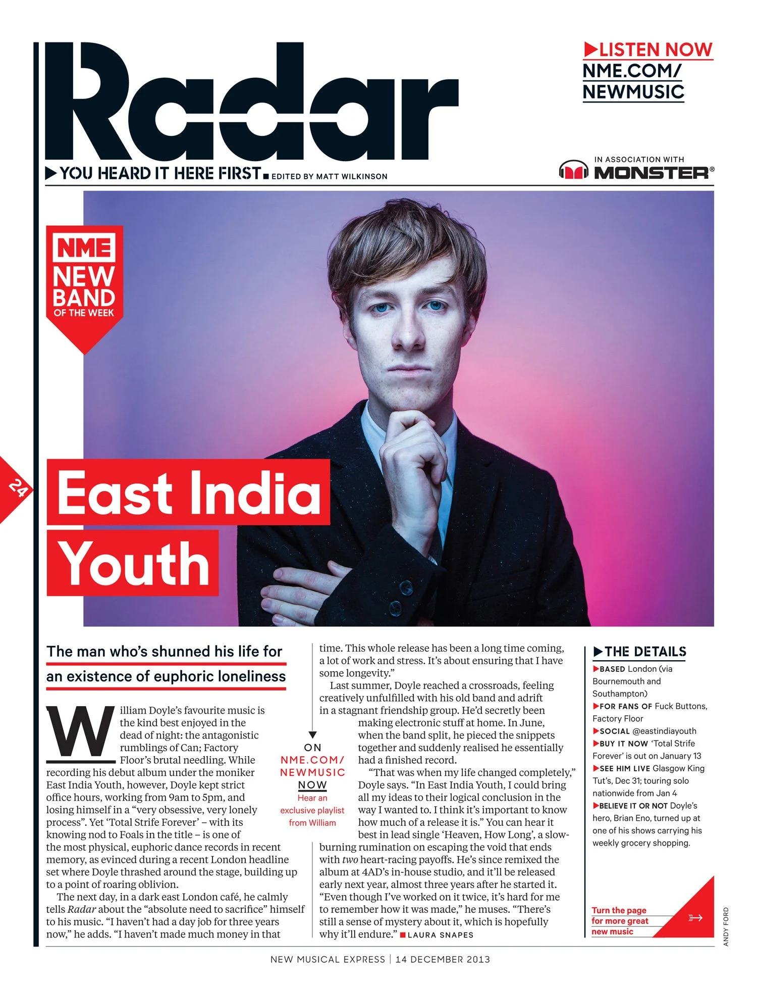
A stencil of Sharp Sans was created for section titles and format titles.
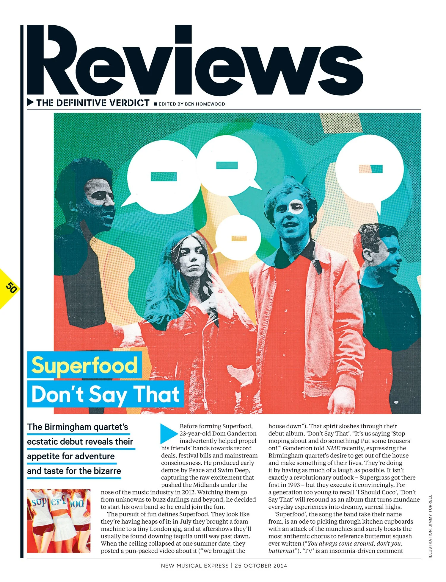
New art
Jimmy Turrell was our regular artist for album reviews. A fearless attitude to print making, Jimmy’s work would nod to the print treatments in the Book of Modern Music from 1978 but provide a new take on the lead album’s artwork every week.
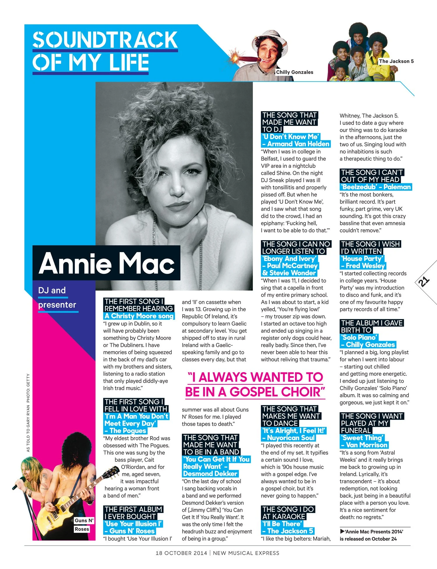
New colour
A bright and bold CMYK palette. The body of the book at the time was still printed on newsprint. I wanted to see how far we could go with graphic colour much like Bubbles did in 1978.
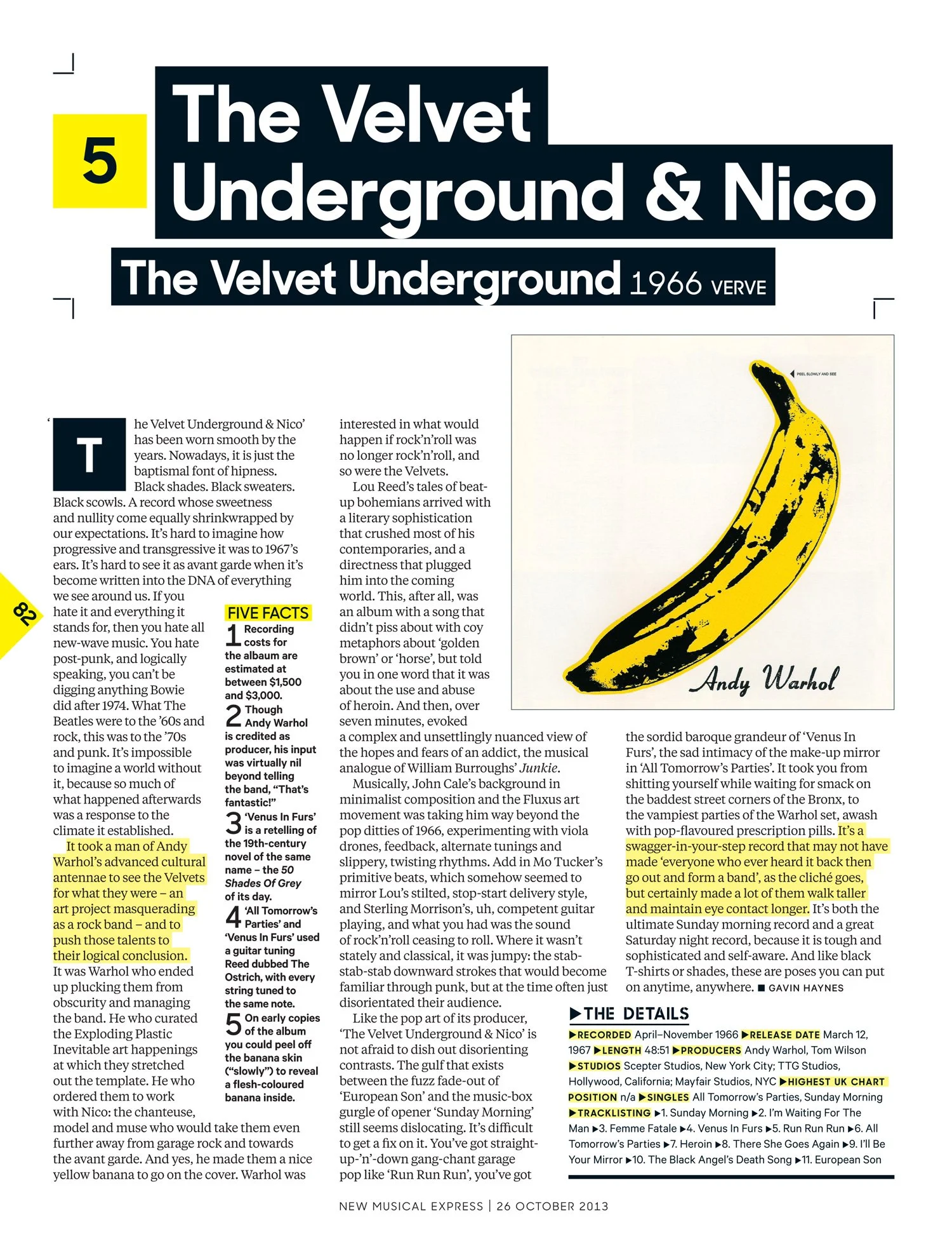
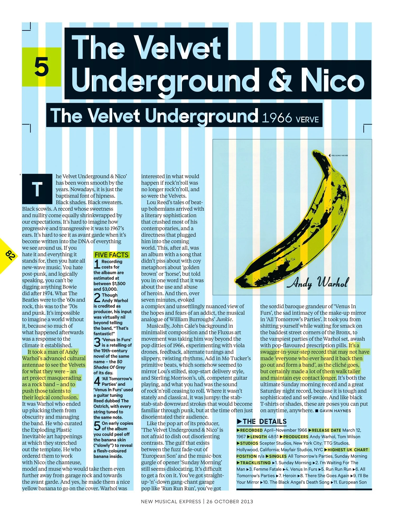
New order
The cut and paste concept was built on a grid of 15 columns. With this in place, designers could be more playful with layouts.
New attitude
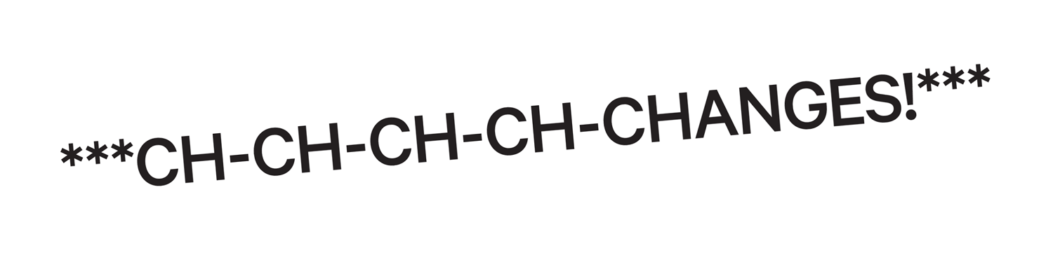
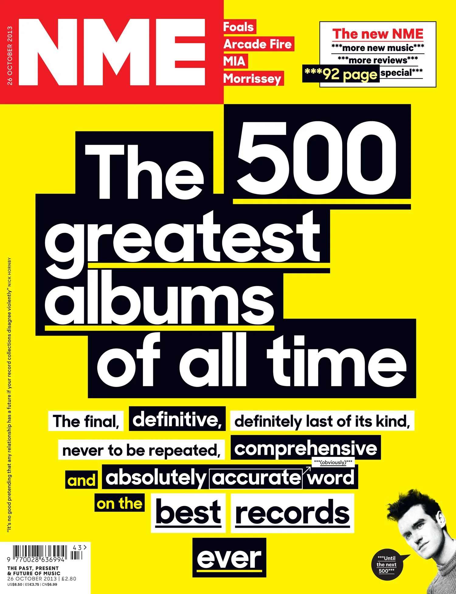
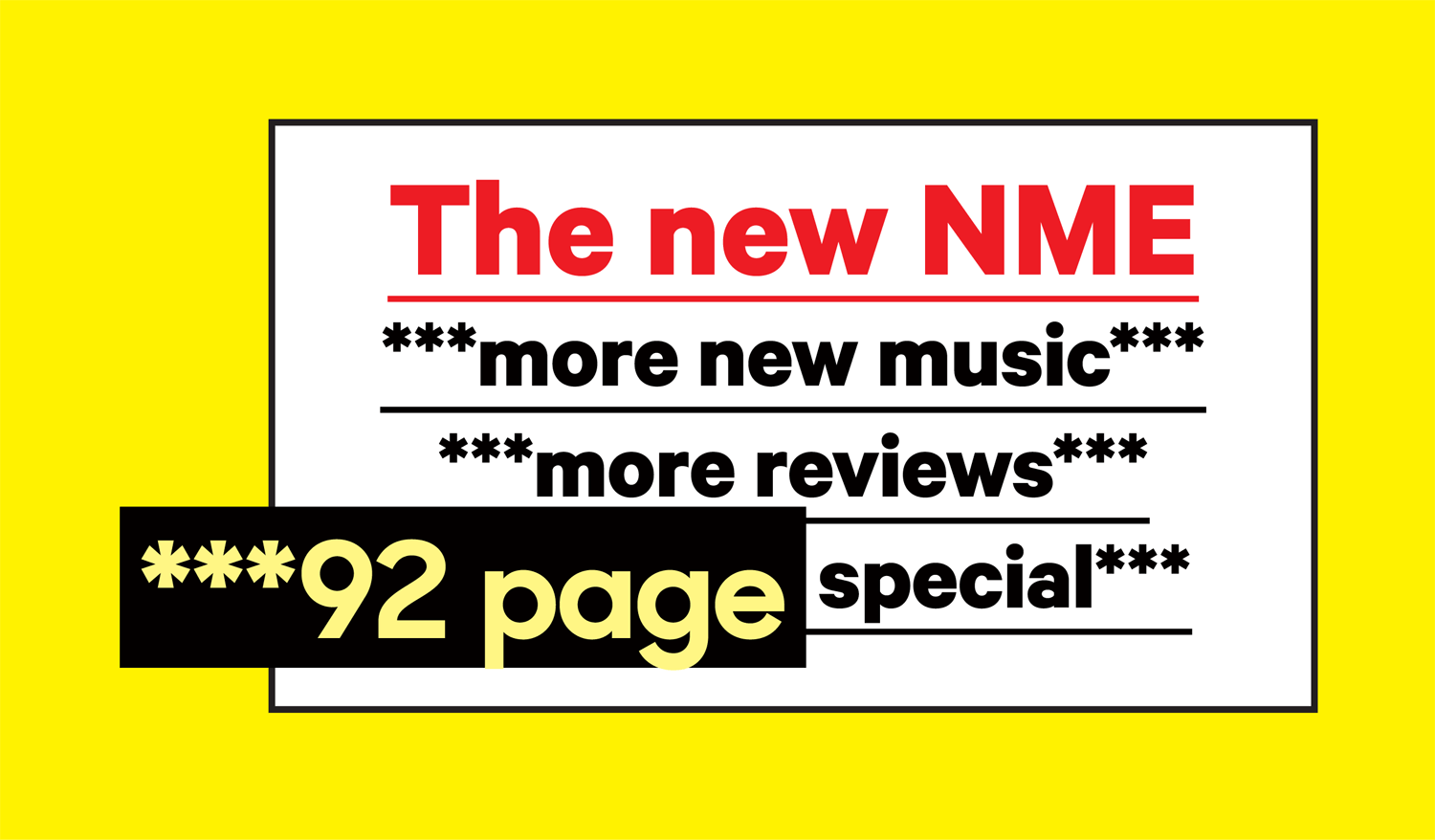
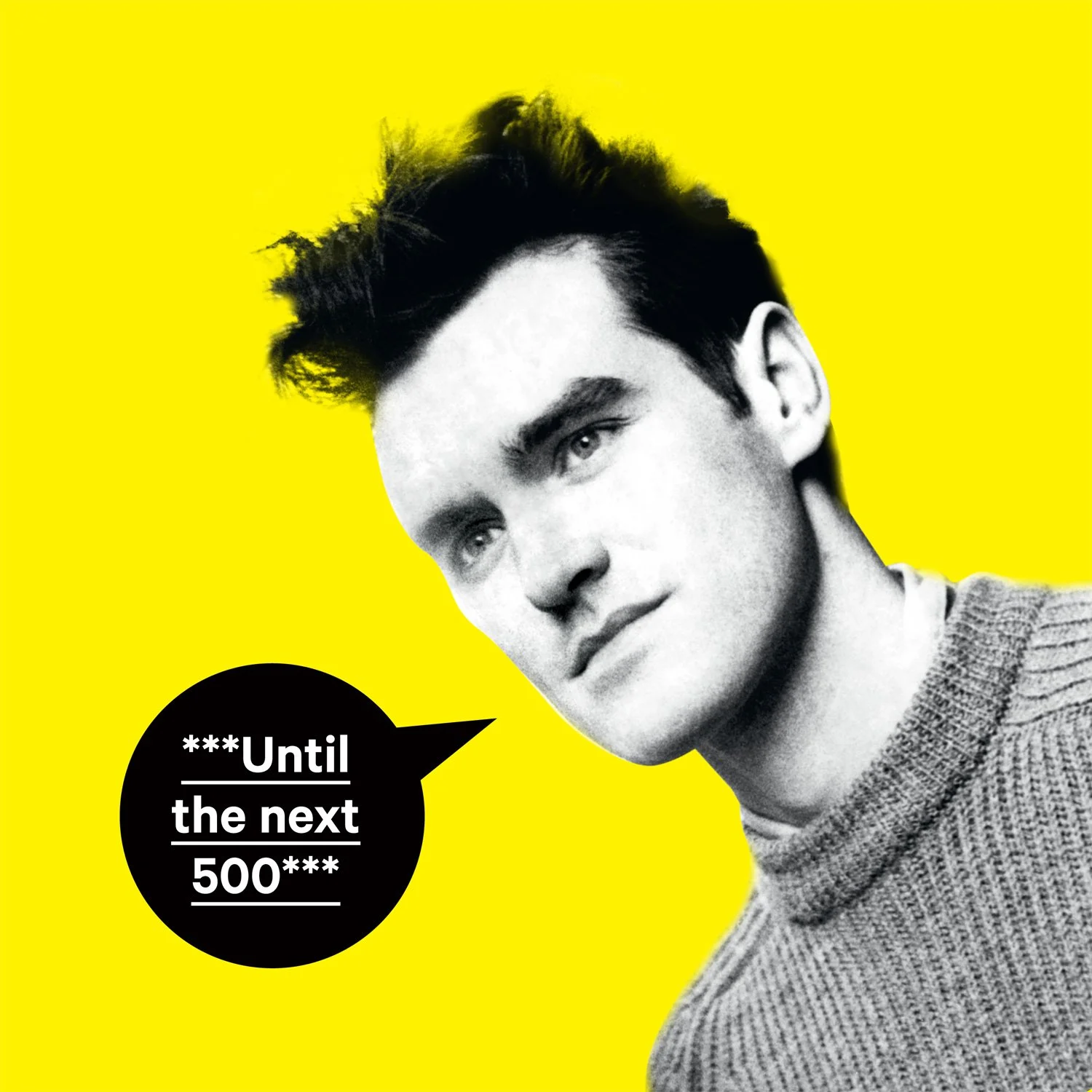
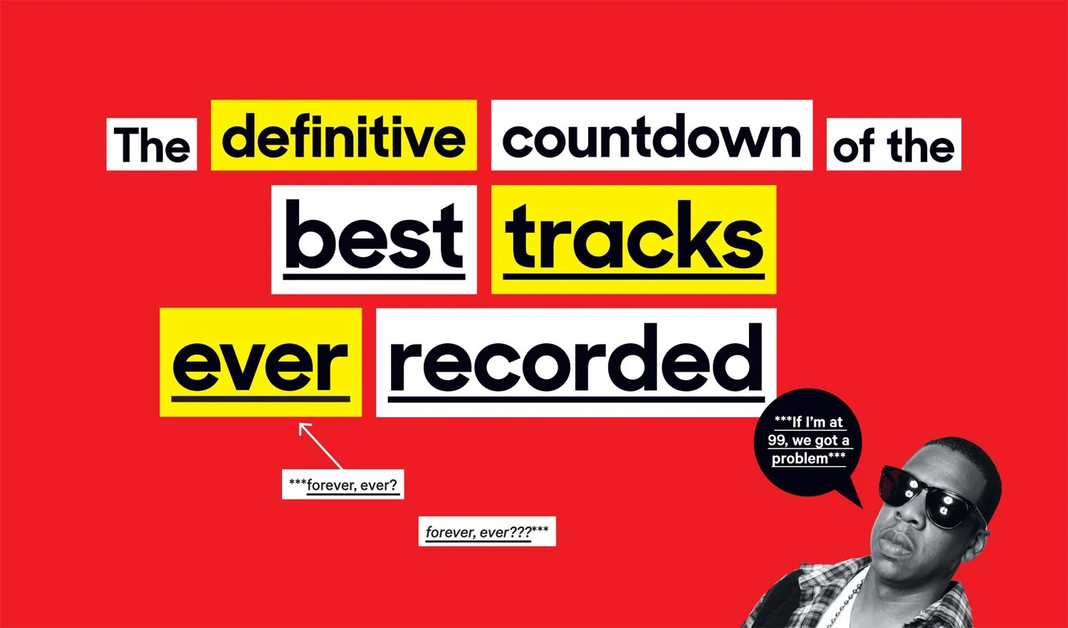
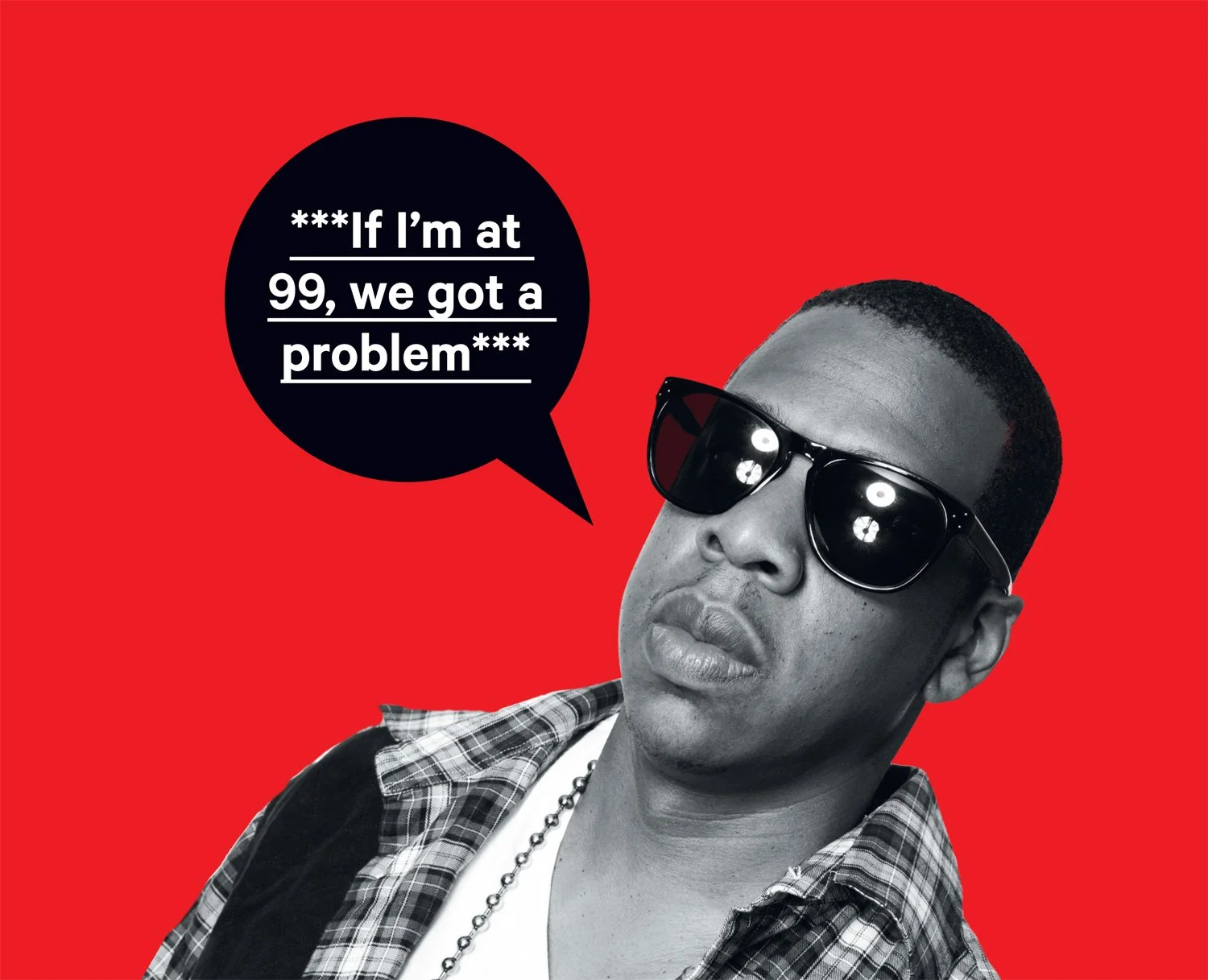
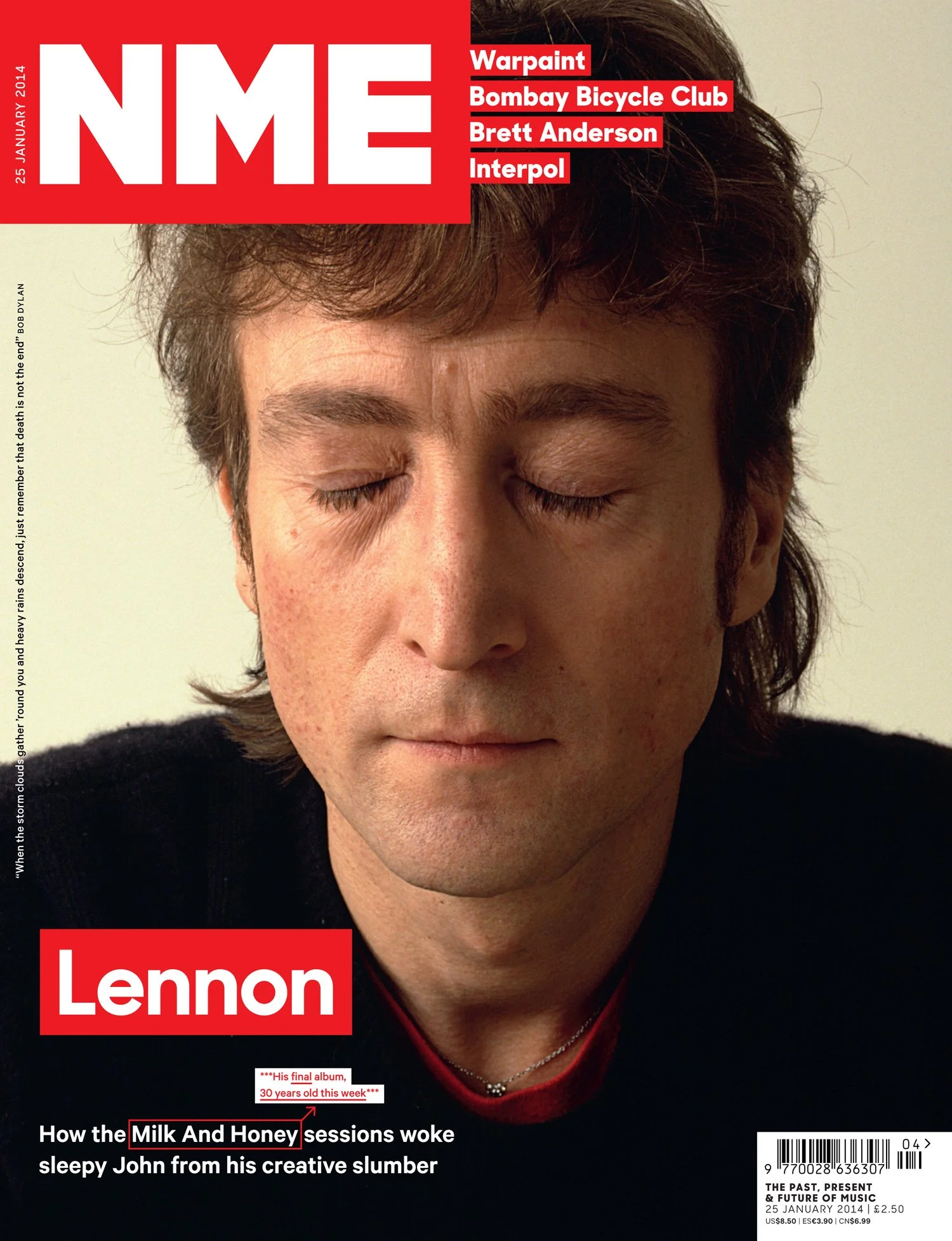
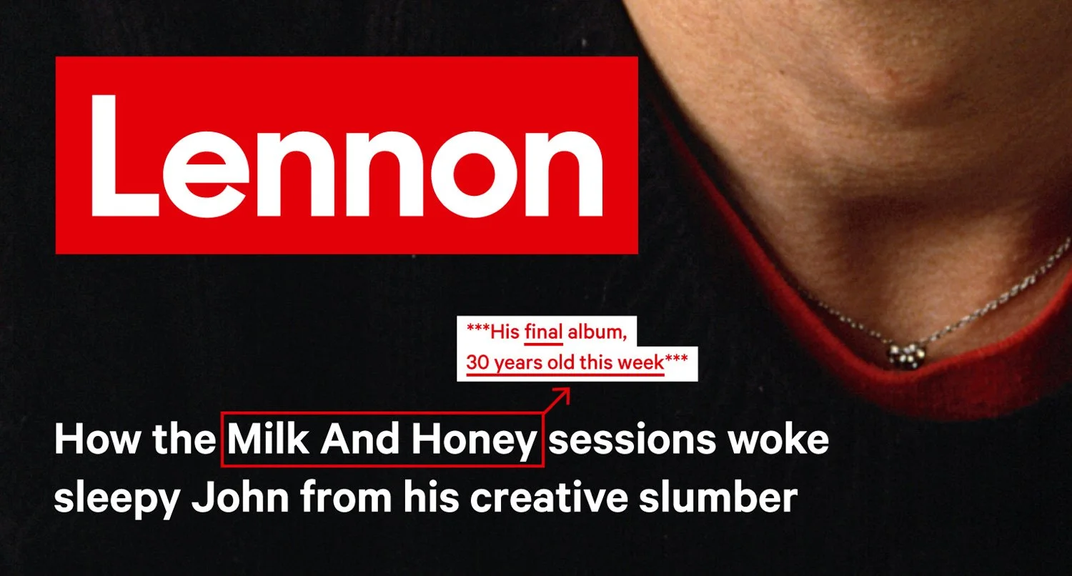
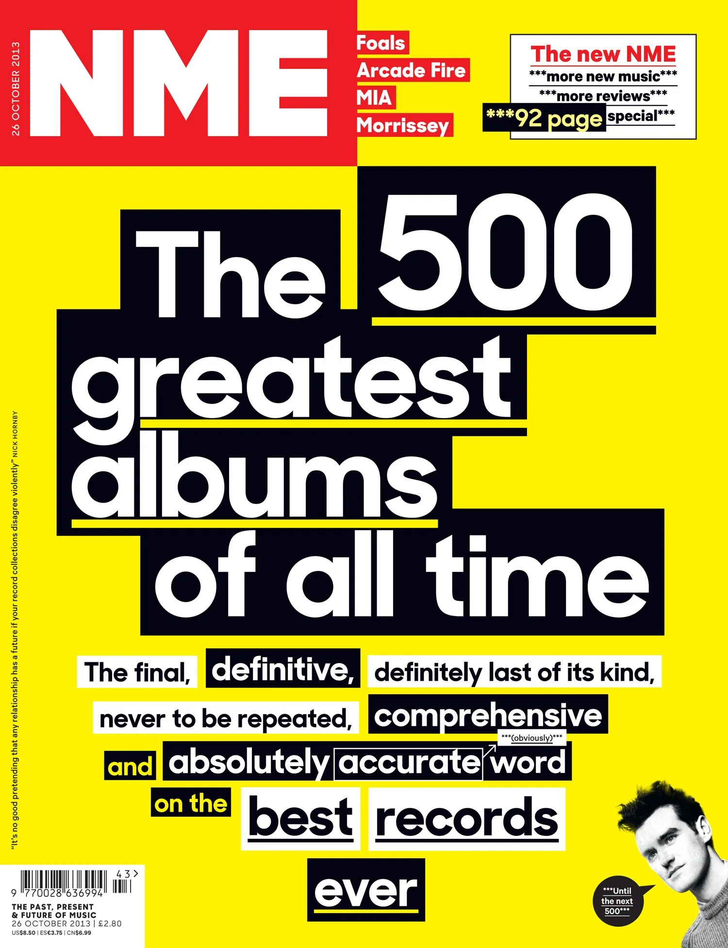
The NME had lost some visual character over the years. There was a certain witty attitude that talked to the reader. We wanted to salute that but create a new voice for the new identity. The deliberate “***” expressions would enforce this attitude in a playful way or simply give more context to a story.
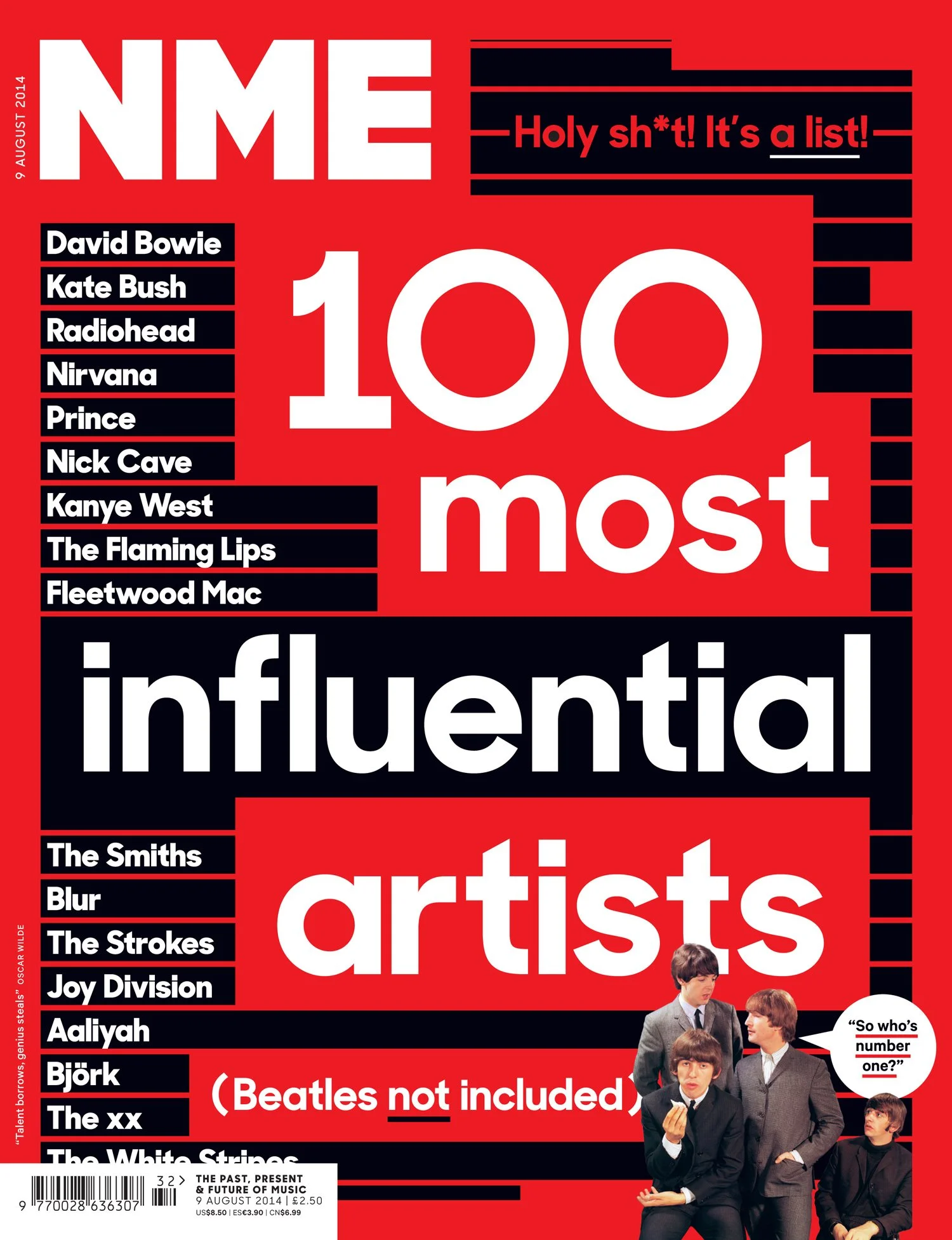
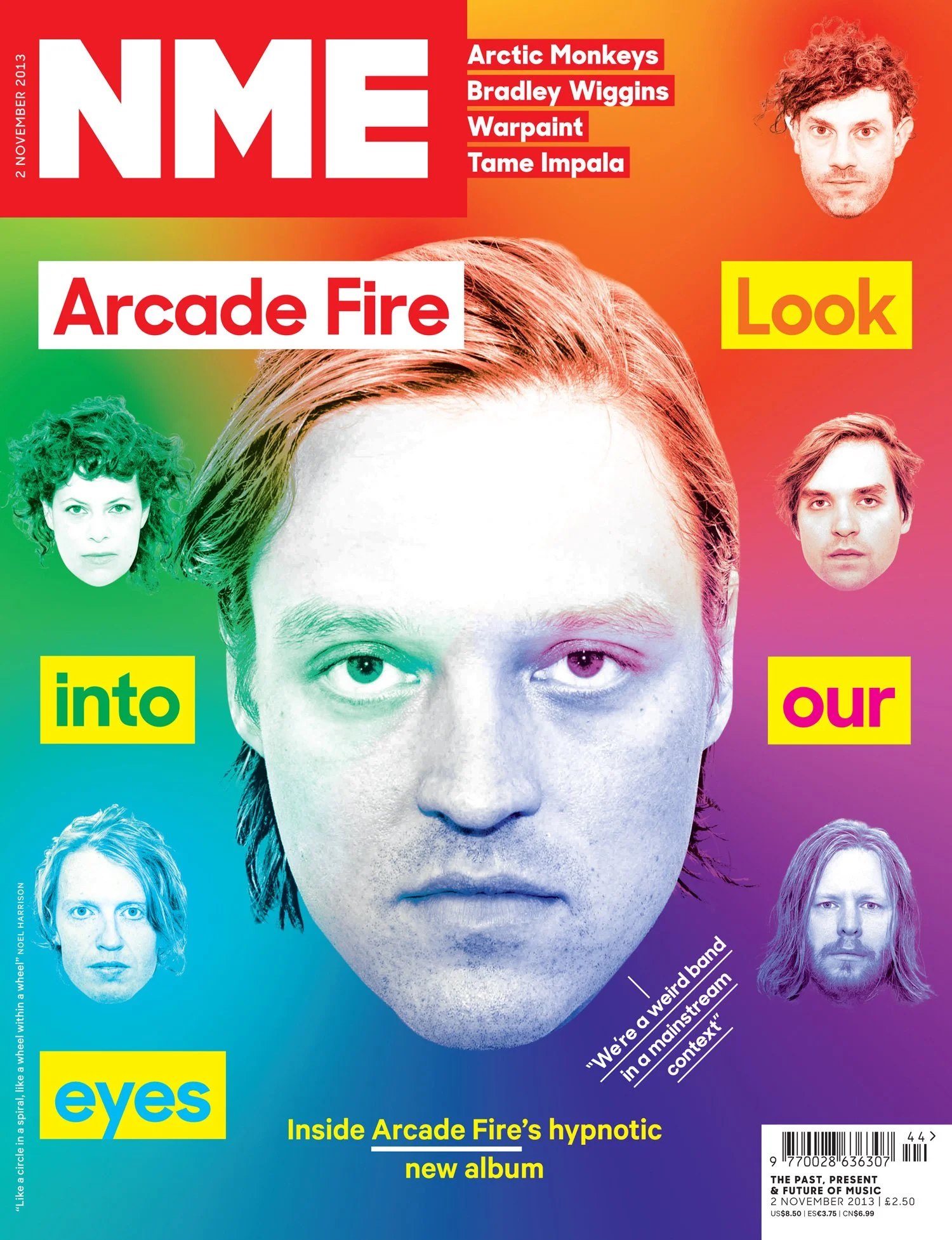
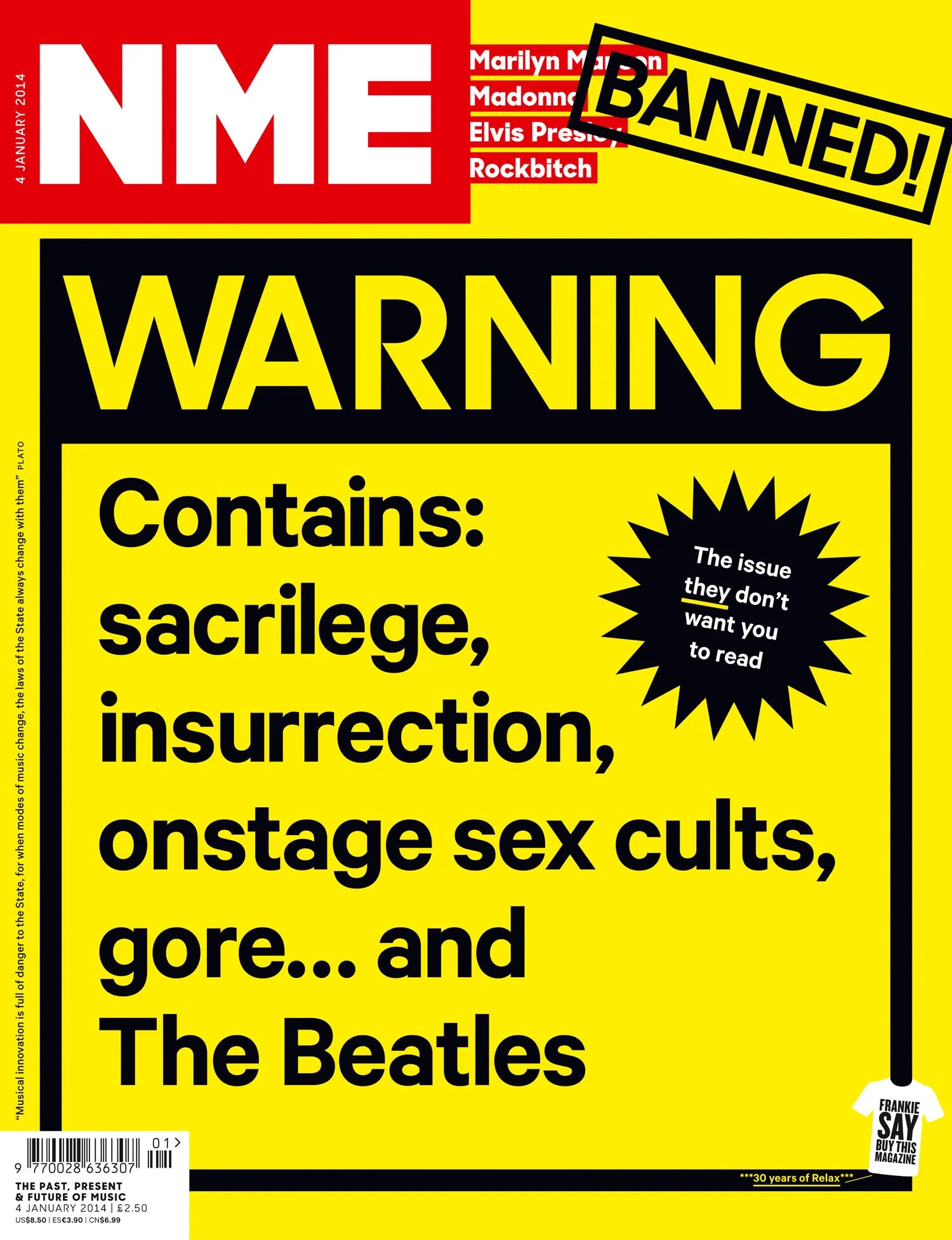
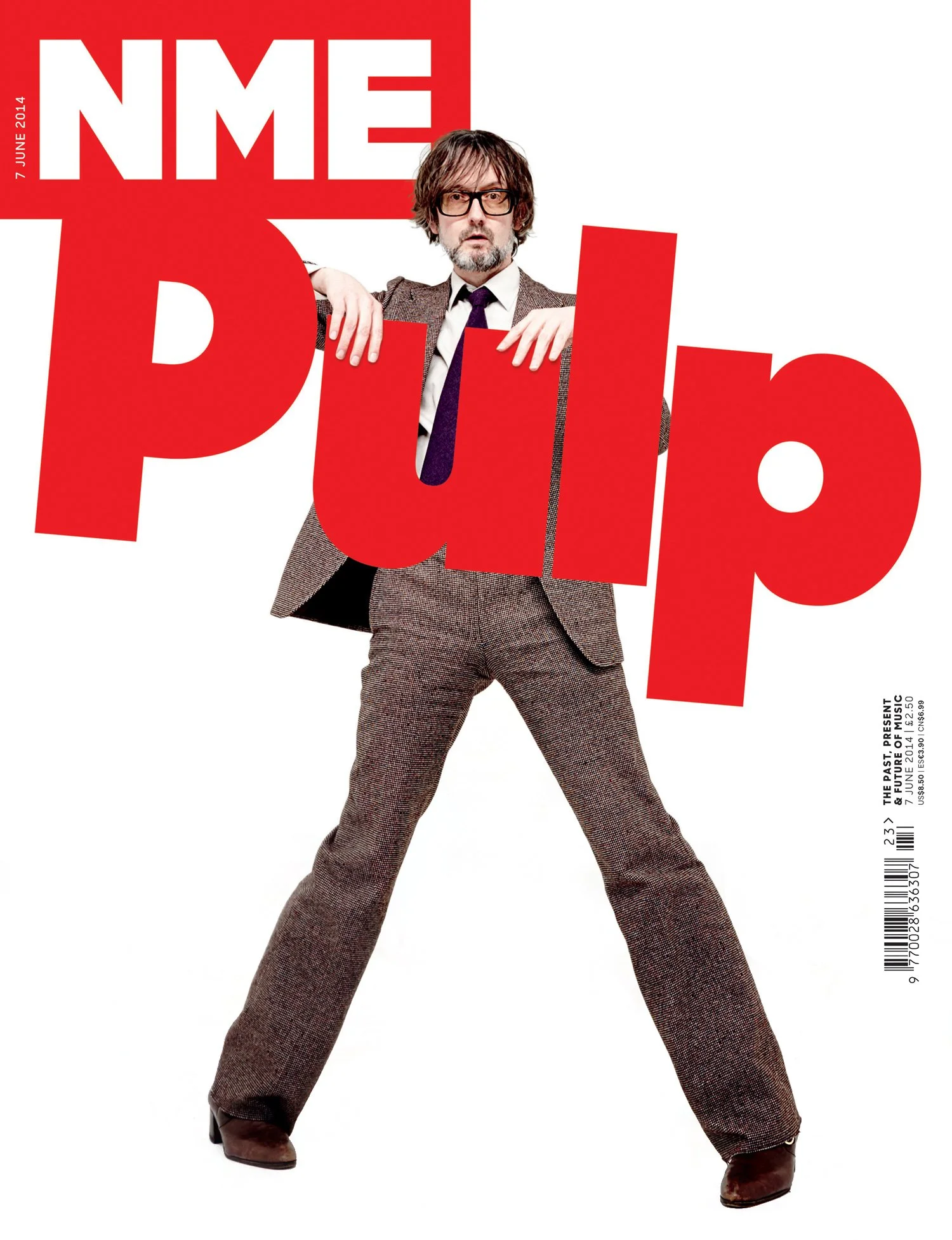
New covers
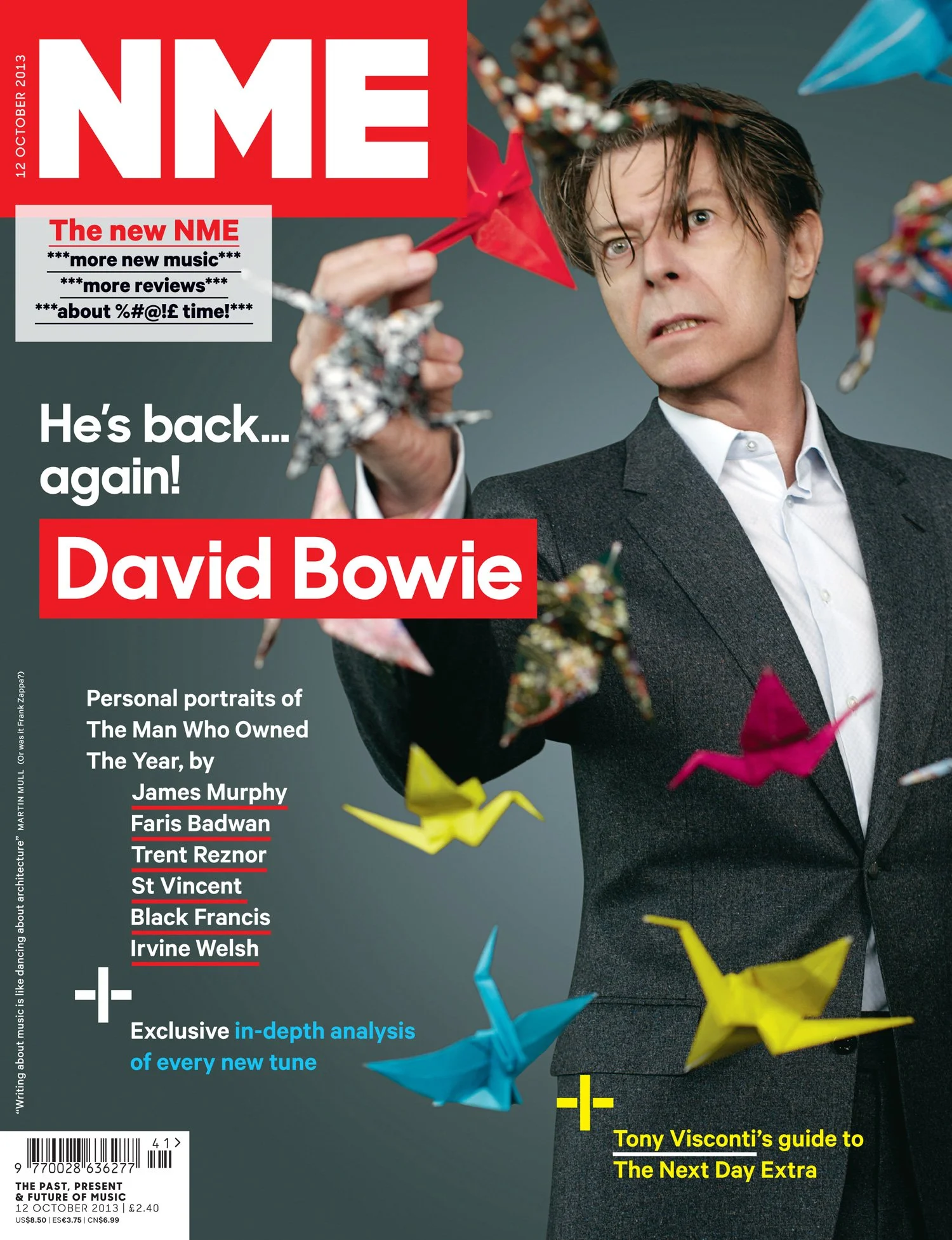
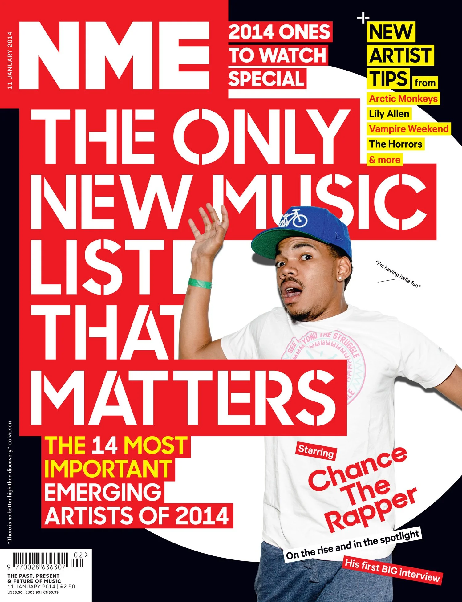
NME has a rich heritage of iconic music photography, especially on the cover. There was no need to change any of that but we did want to be different. David Bowie supplying the art for our reinvention was the perfect scenario.
We could also have fun with the new character of NME and create graphic designs rather than the celebrity led covers of typical consumer titles.
This was different cover thinking for the NME. From type-based to photographic to cut and paste punk visuals, I wanted the NME cover to feel more independent, be visually exciting again.
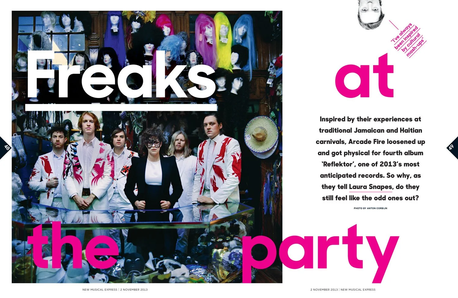
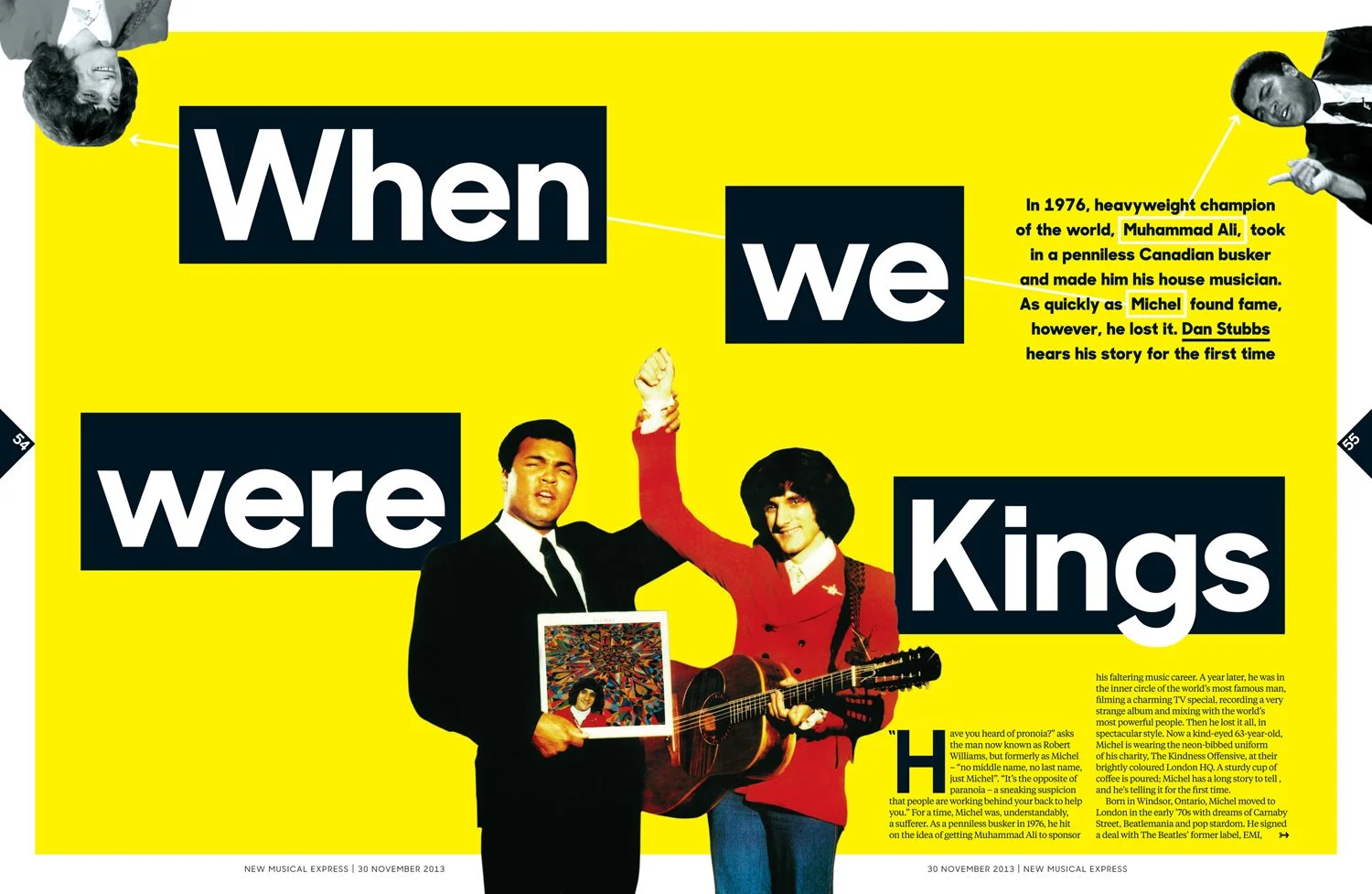
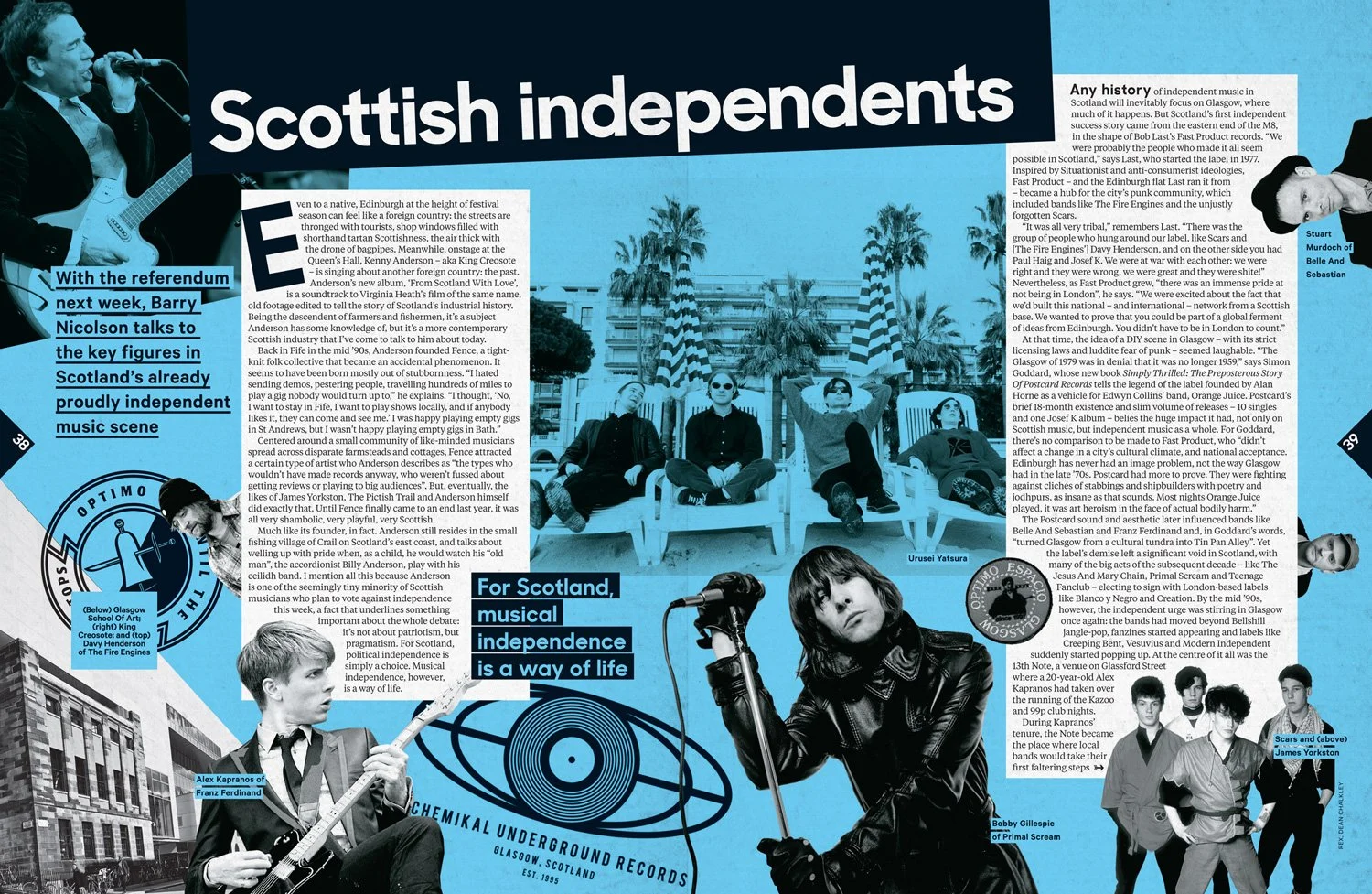
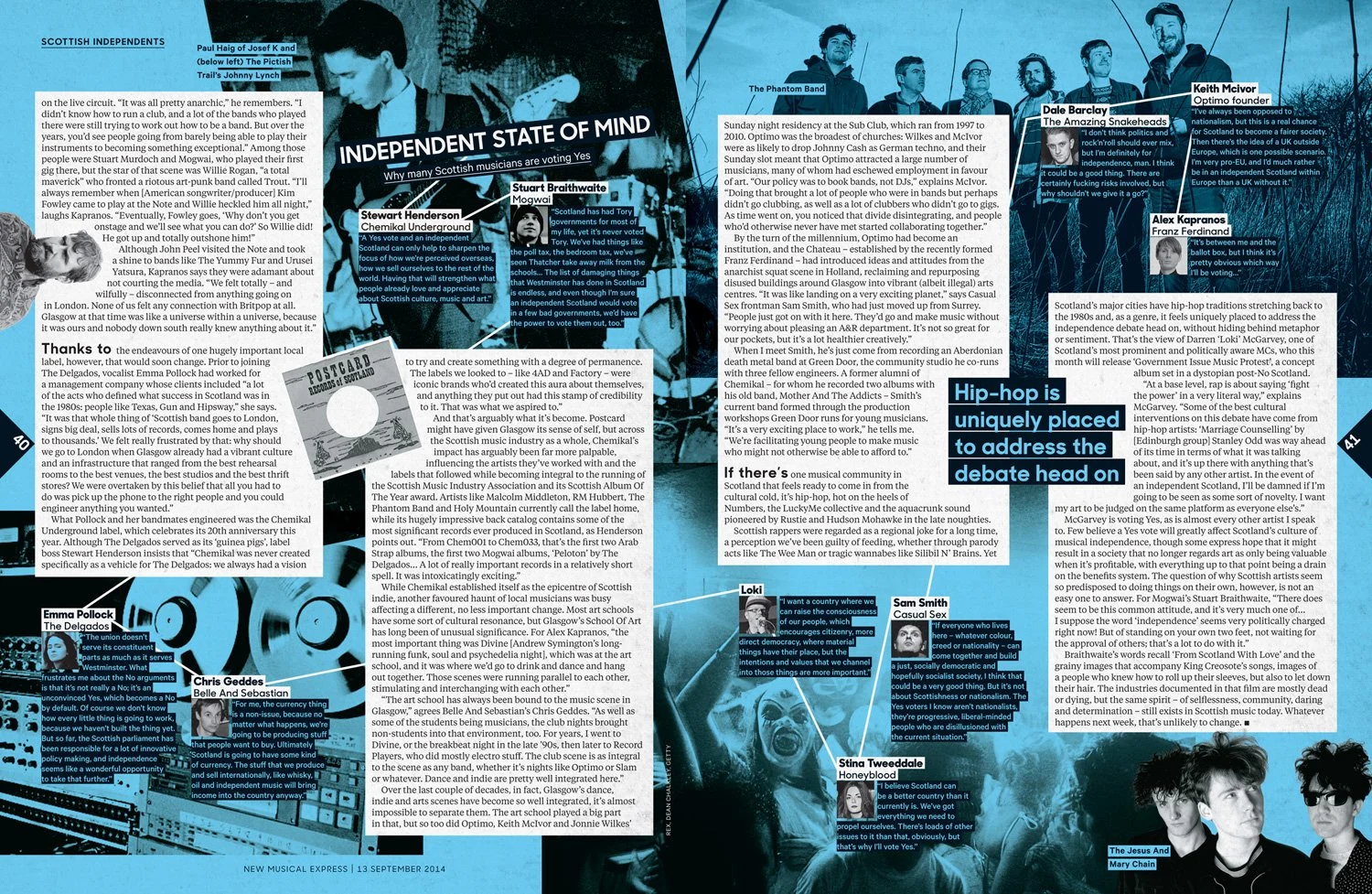
New Musical Expression
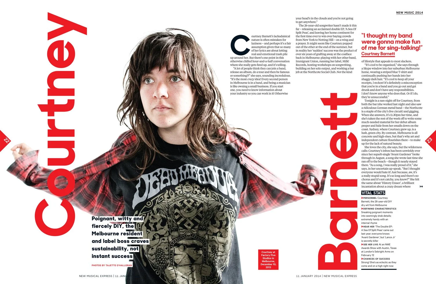
The new identity provided the designers with the tools to express more personality to the book. There was no need to constantly reinvent the wheel every week and over-design the pages with different type families and textures. The design team now had the toolkit in place. All content and collateral that was created for the brand was consistent – in design and attitude.
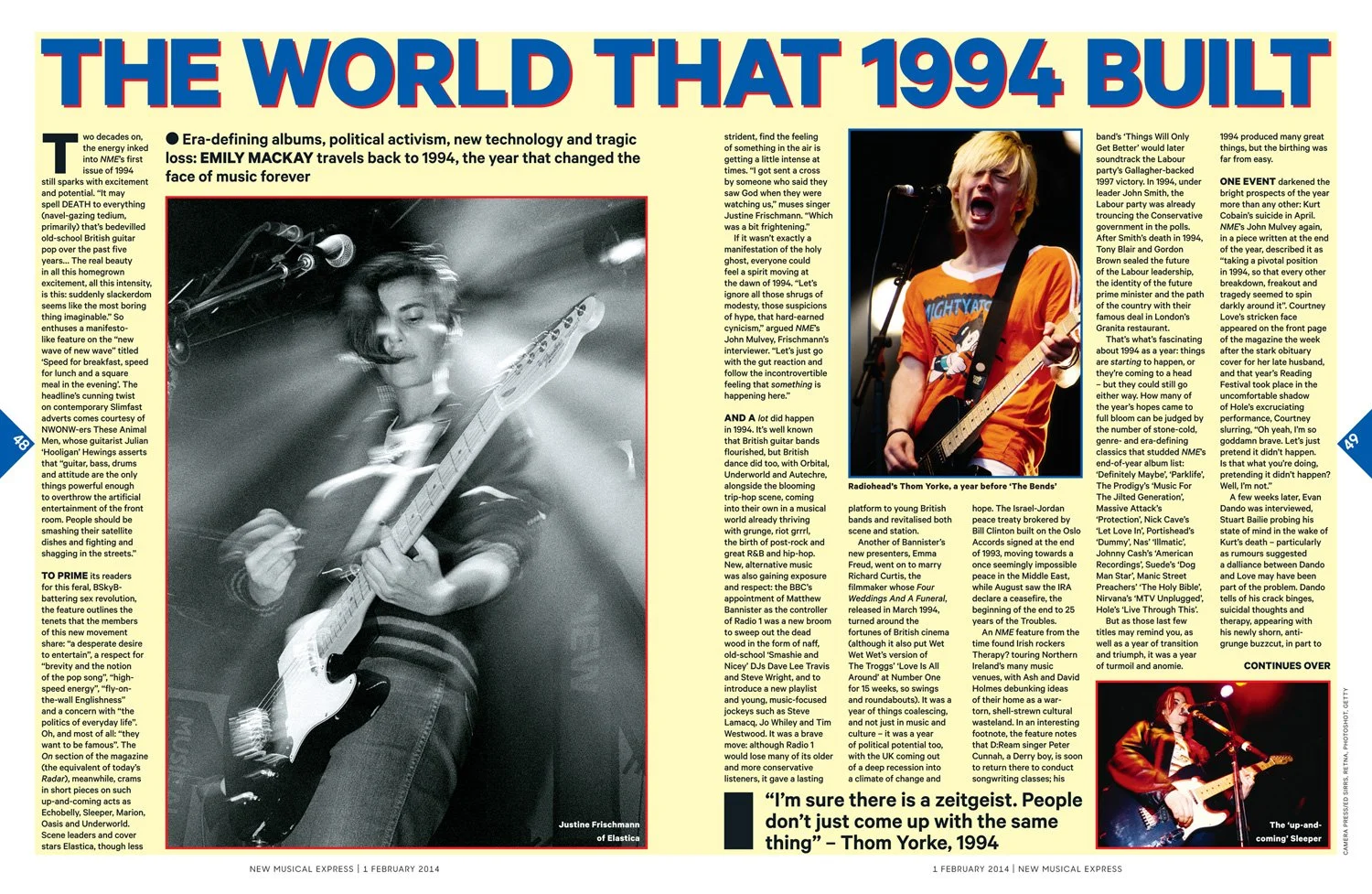
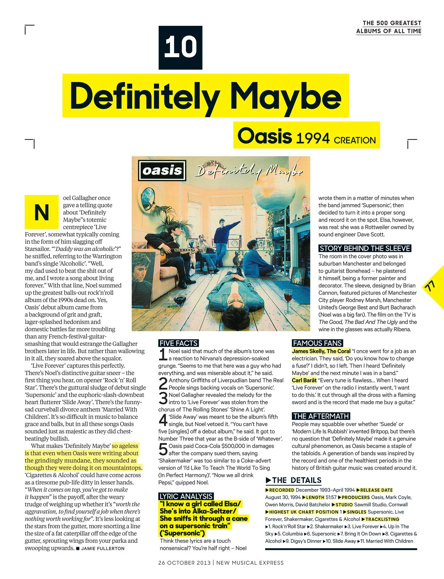
The typographic identity, modern fanzine philosophy and new attitude gave unity to NME’s design. We could pack the pages with content without it feeling uncomfortable and new confidence would give us a sense of freedom to do whatever we wanted to — like design a 1994 cover story in a 1994 NME style.
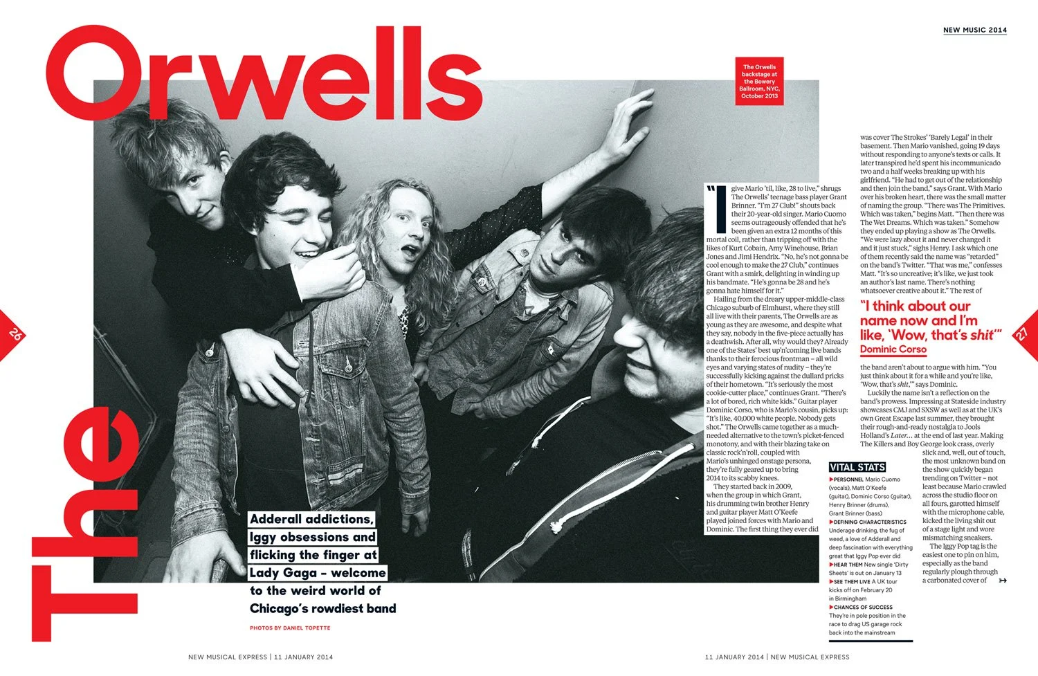
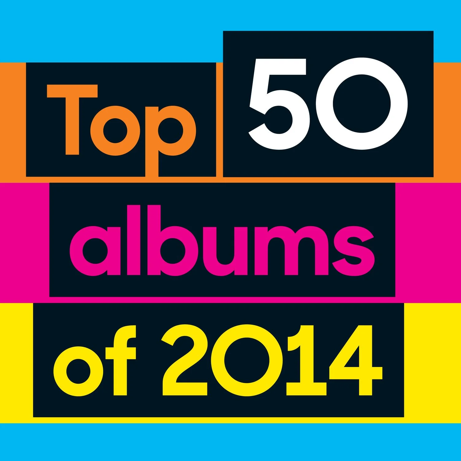
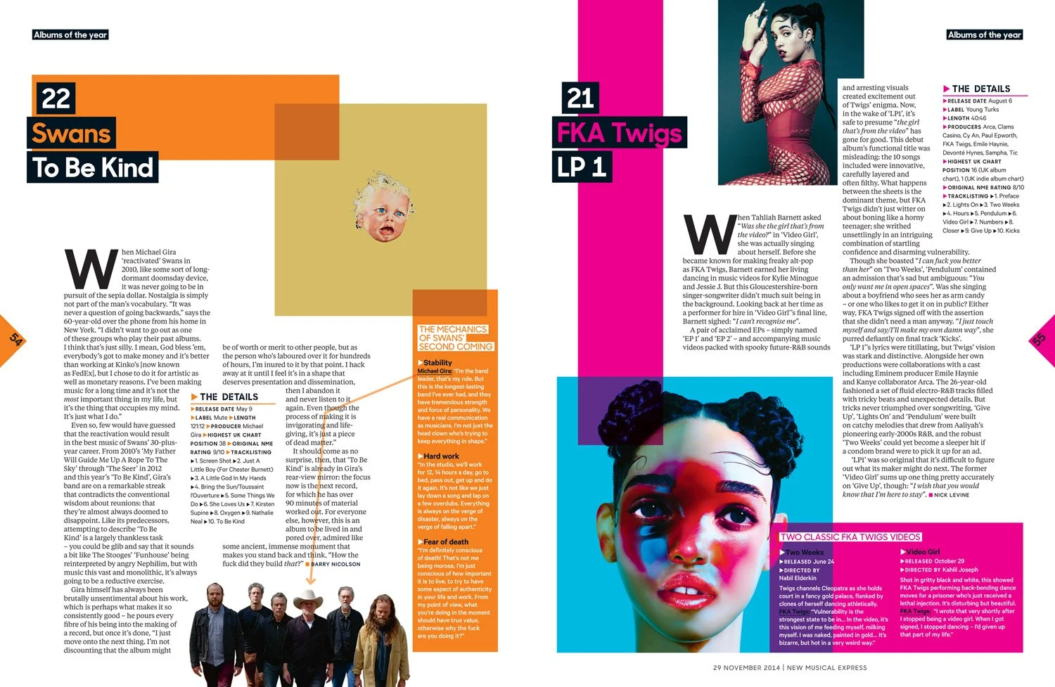
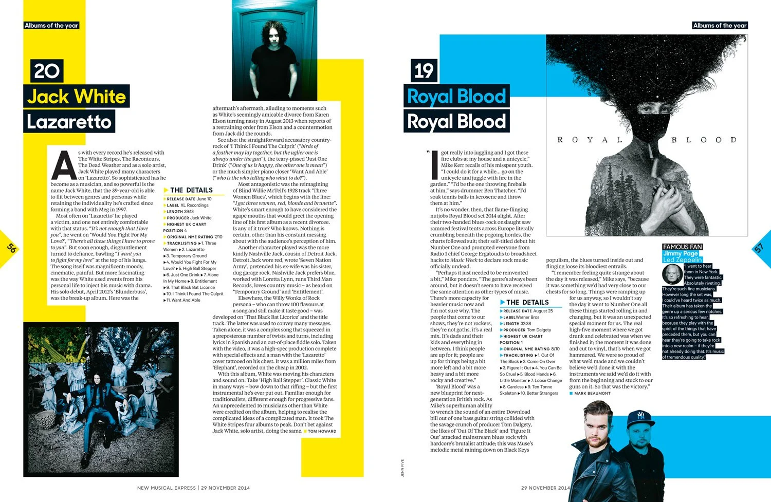
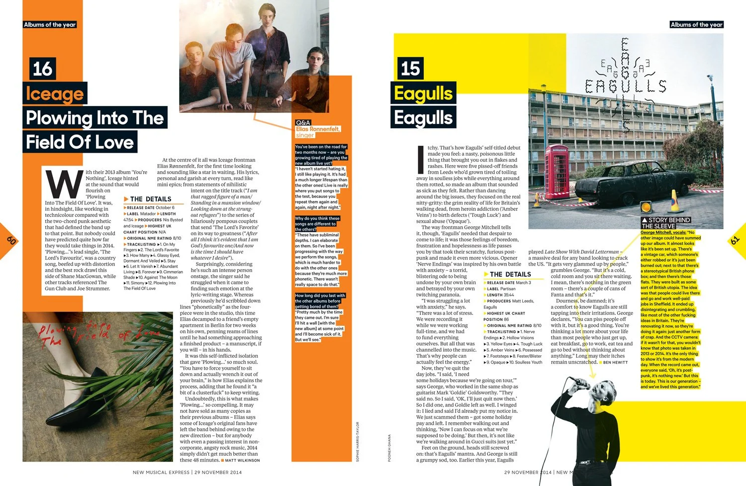
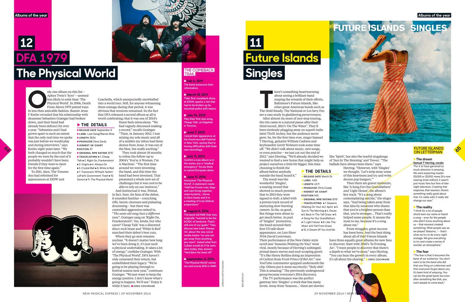
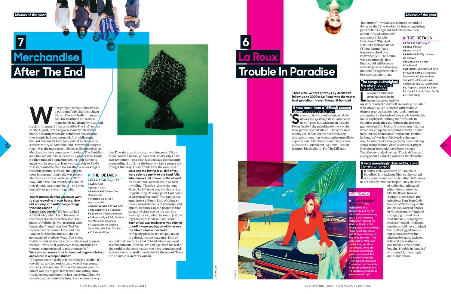
New detail
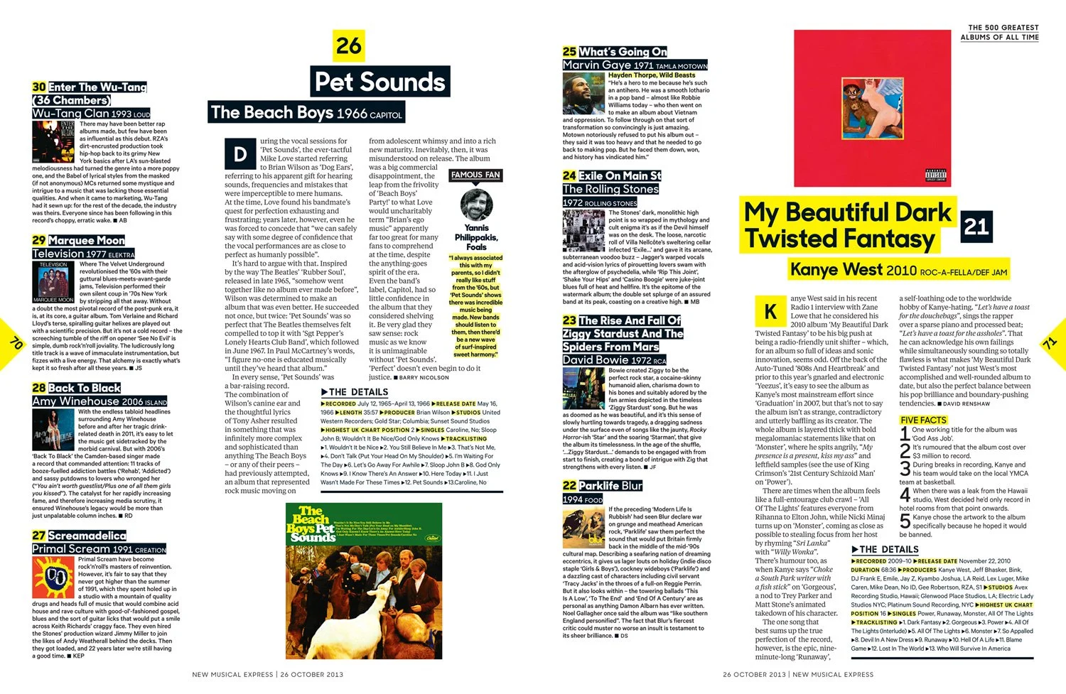
Bursting at the seams with all the info, NME lists were now more fun, personal and, we hoped, more collectible. Meaty features from the past would be highlighted with ‘sidenotes’ from the present. Special editions followed the same design philosophy as the weekly magazine. Even the subscription ads followed in style and meaning.
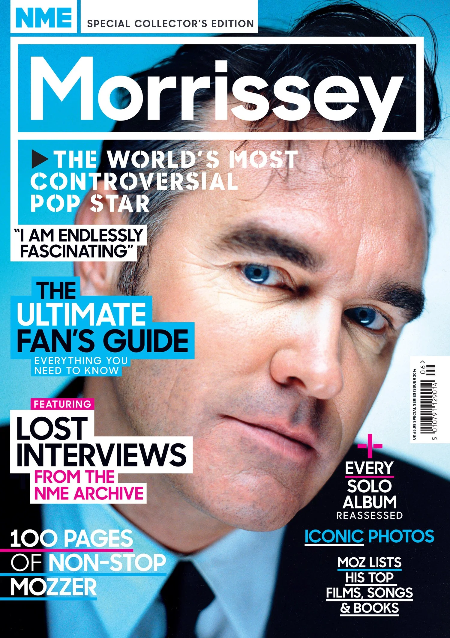
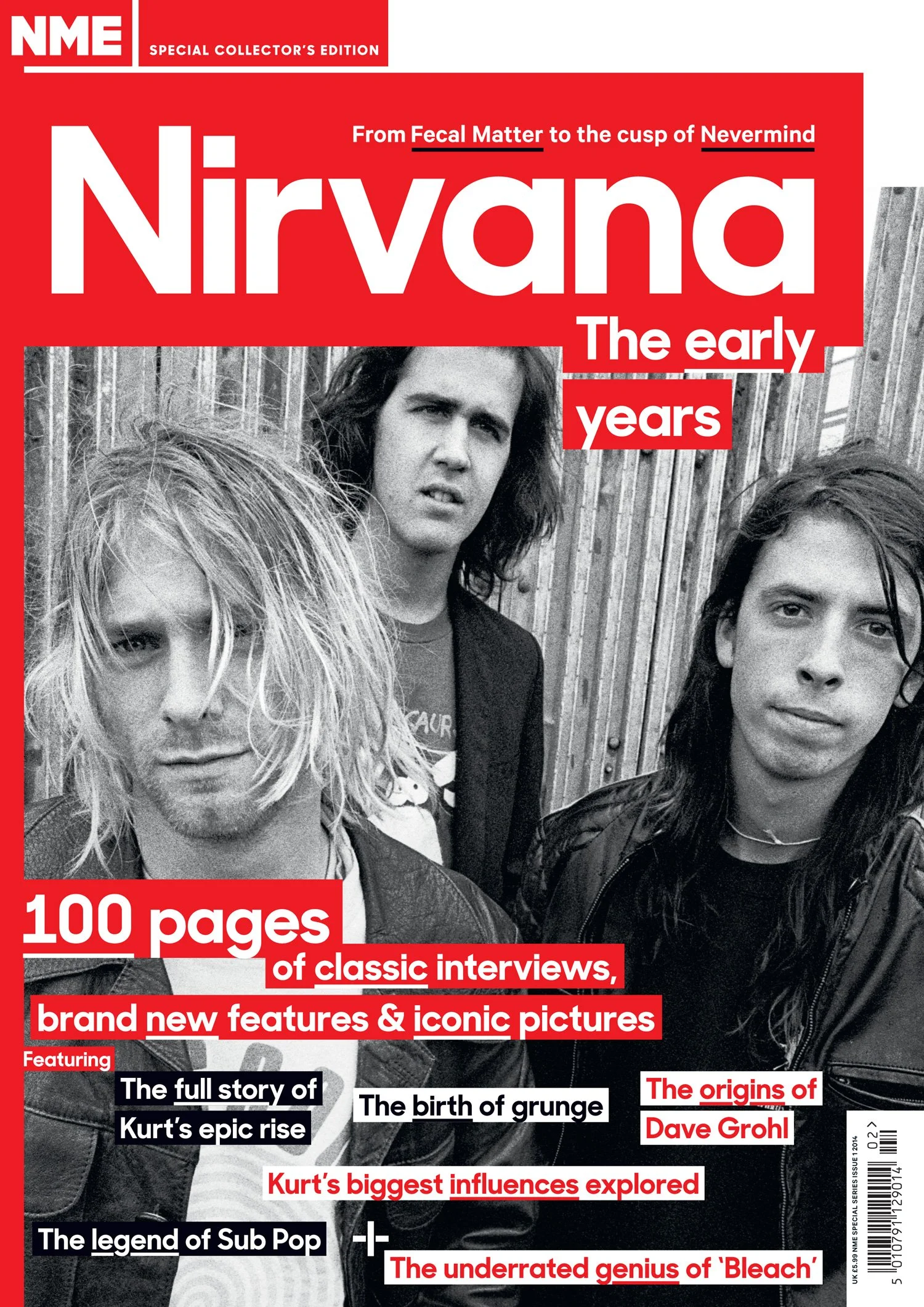
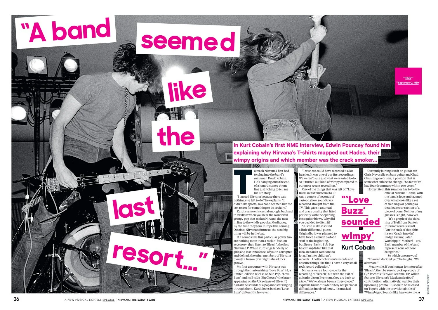
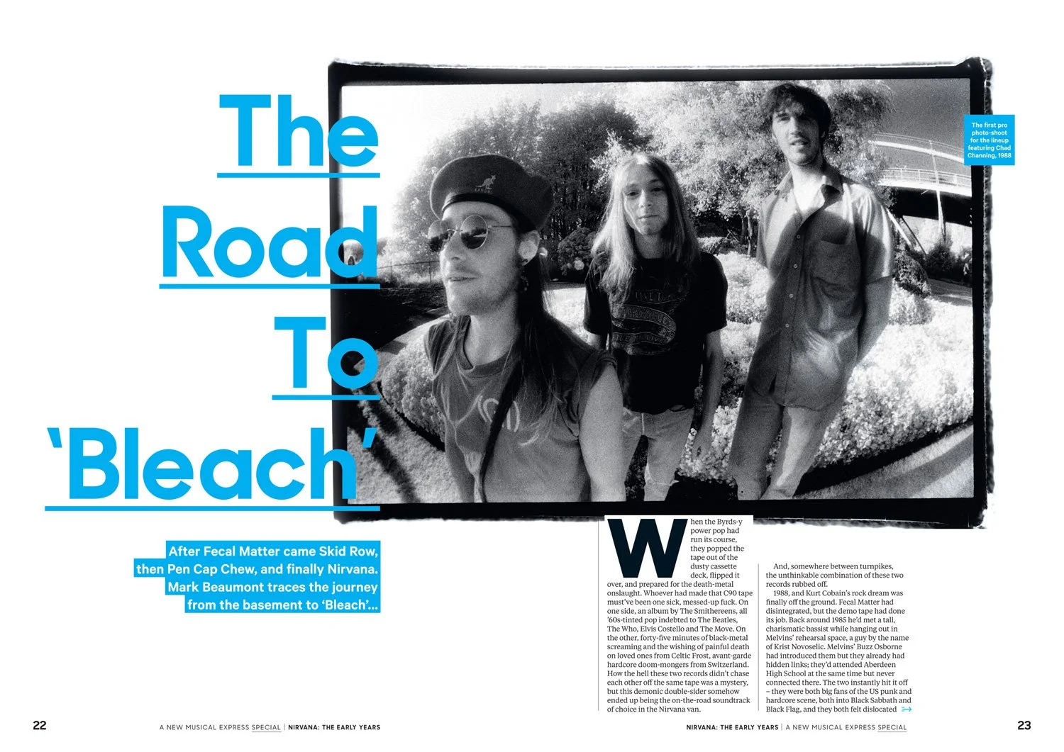
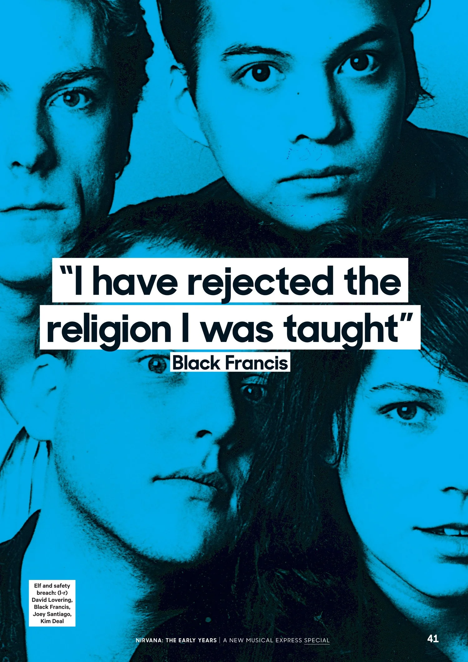
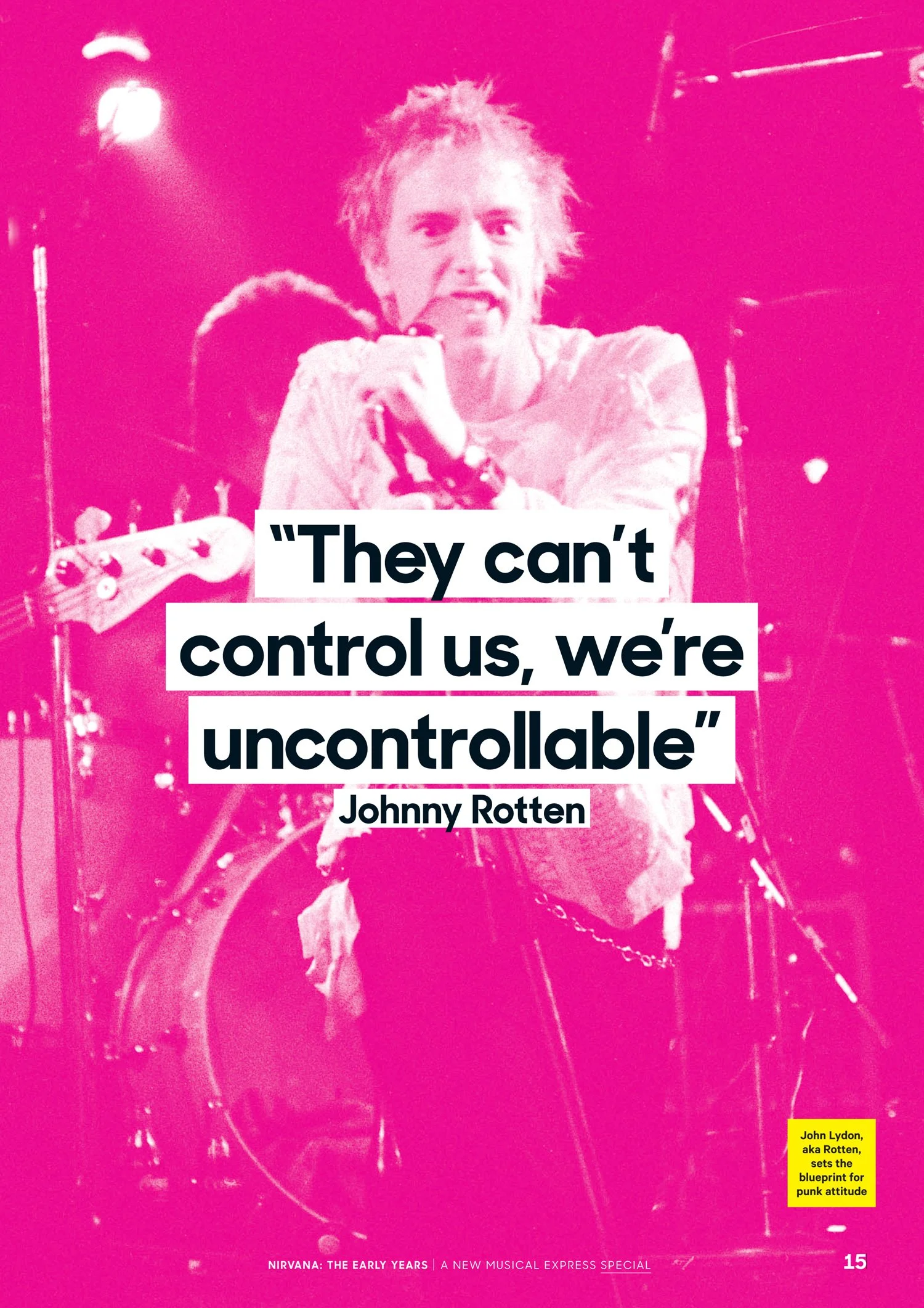
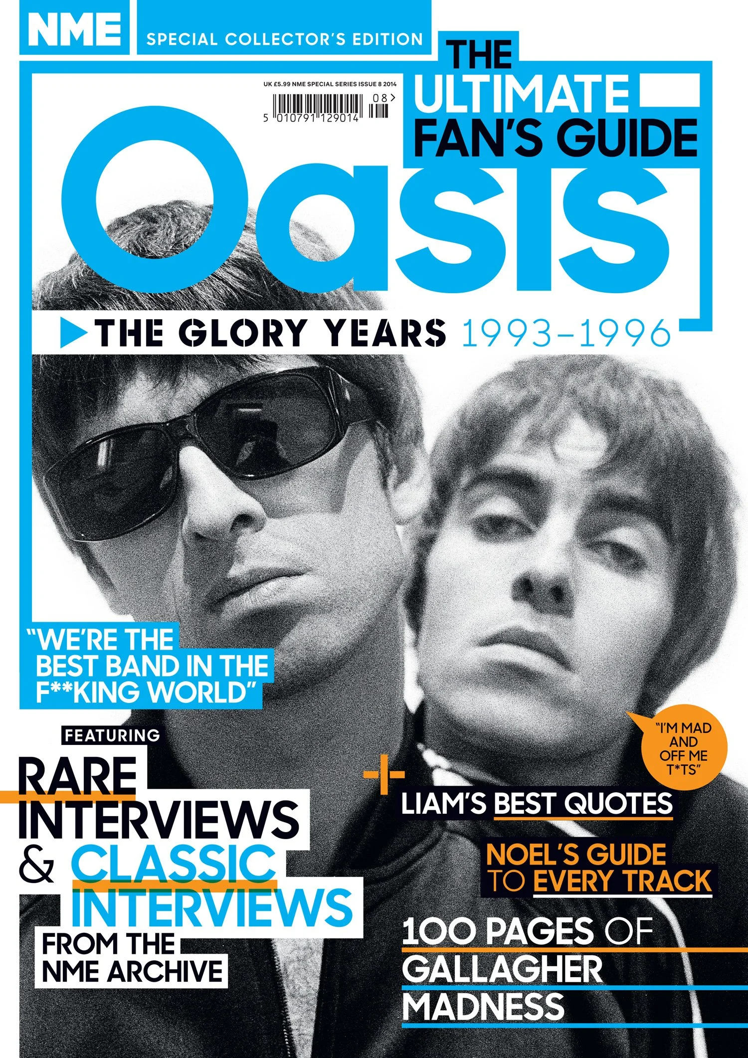
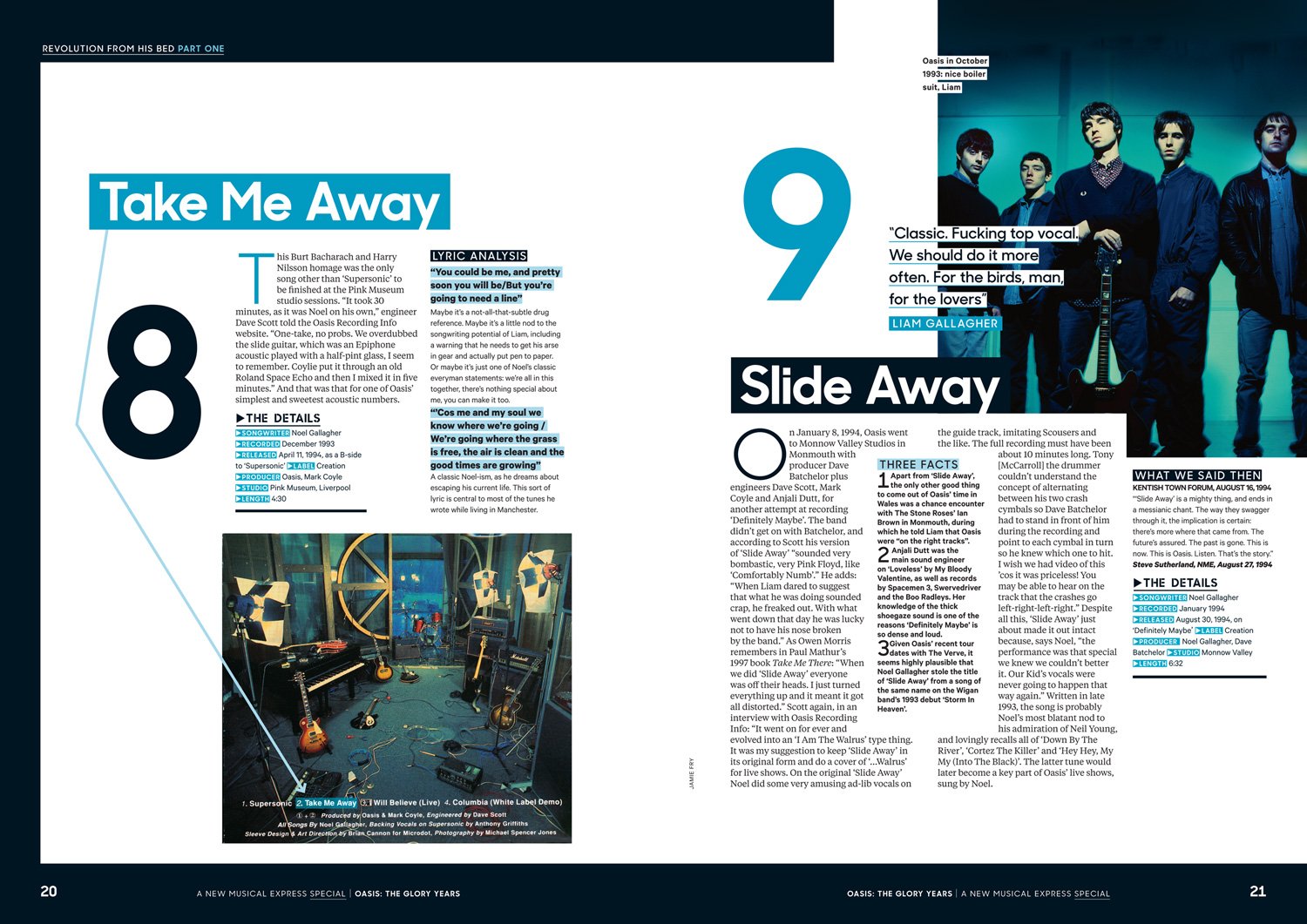
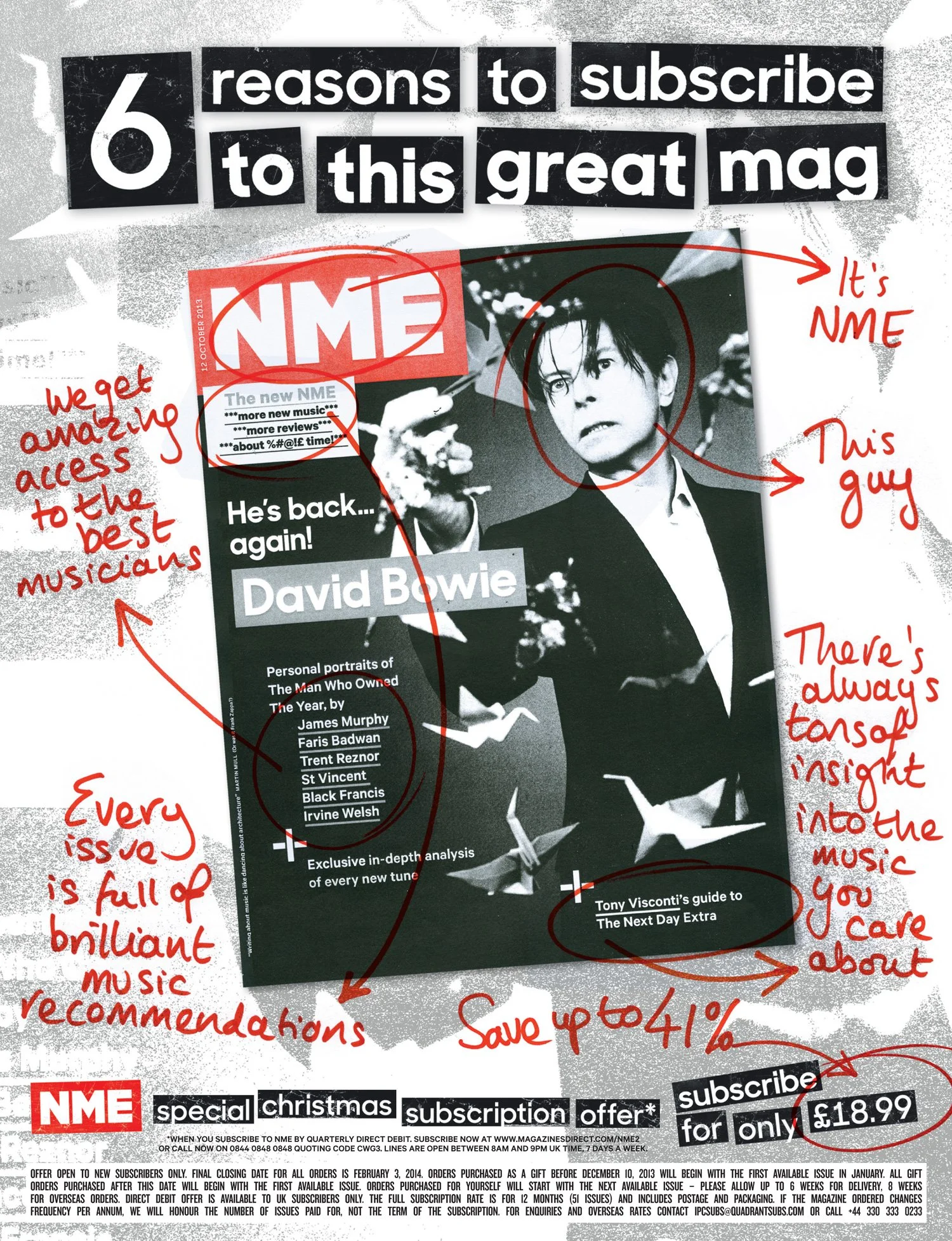
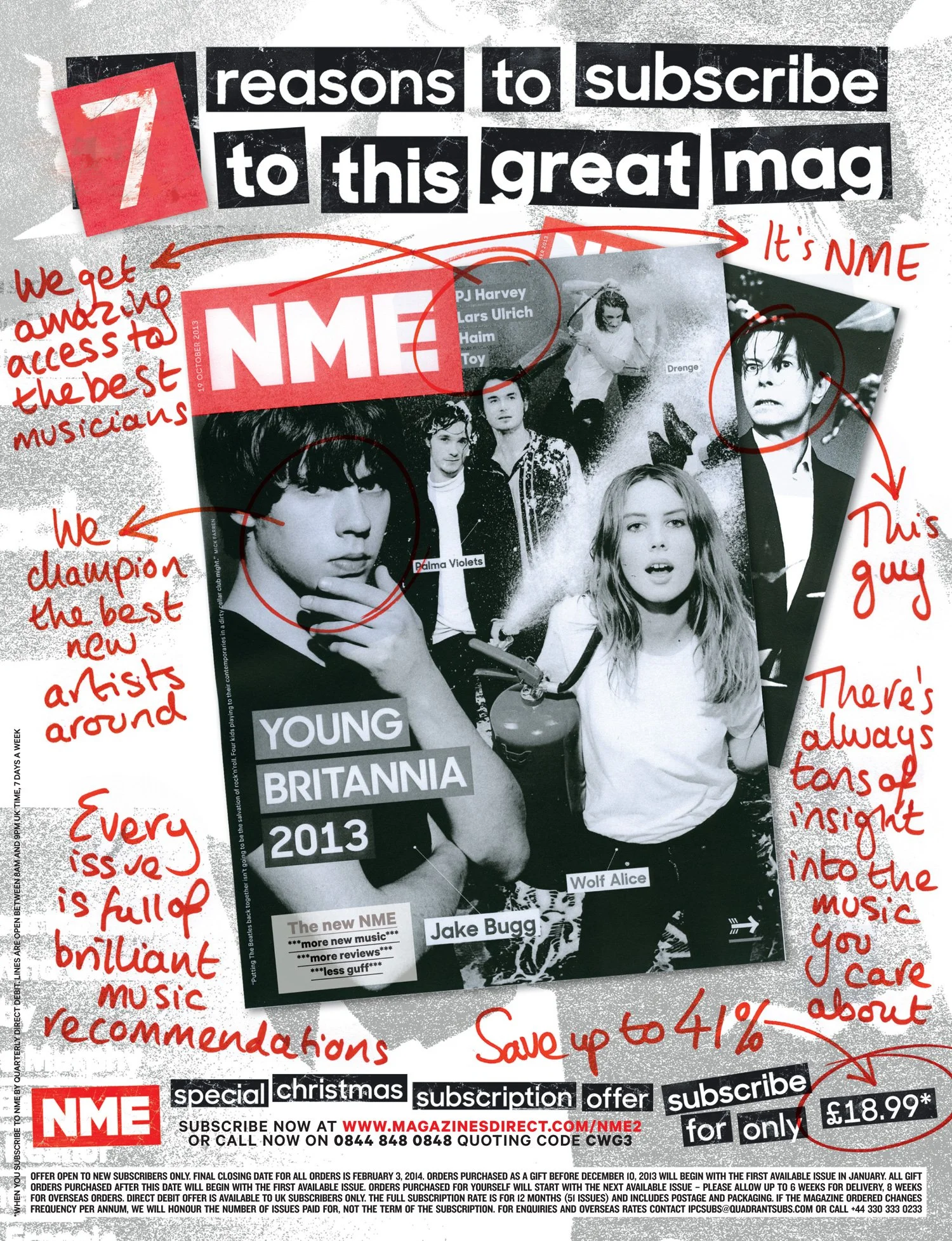
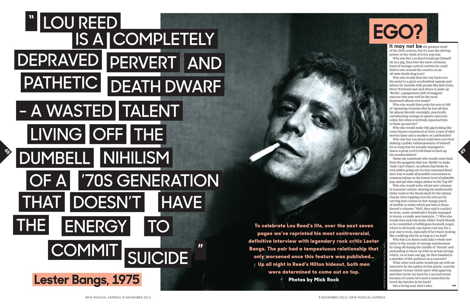
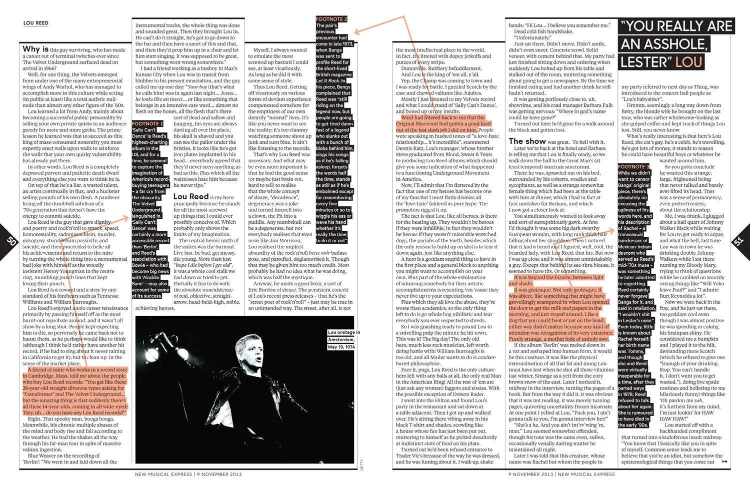
We were celebrating the ink and the print, being more expressive. Maybe the average punter couldn’t care less about all this but, in my opinion, it wouldn’t be the NME if we weren’t trying to mess things up a bit. The design was the last NME design for the newsstand.
-
Deputy Art Director Tony Ennis
Designer Dani Liquieri
Digital Designer Jon MooreEditor Mike Williams
With thanks to all collaborators
Typefaces
Sharp Sans by Lucas Sharp, Sharp Type Co.
Calibre and Tiempos Text by Kris Sowersby, Klim Type Foundry