Method
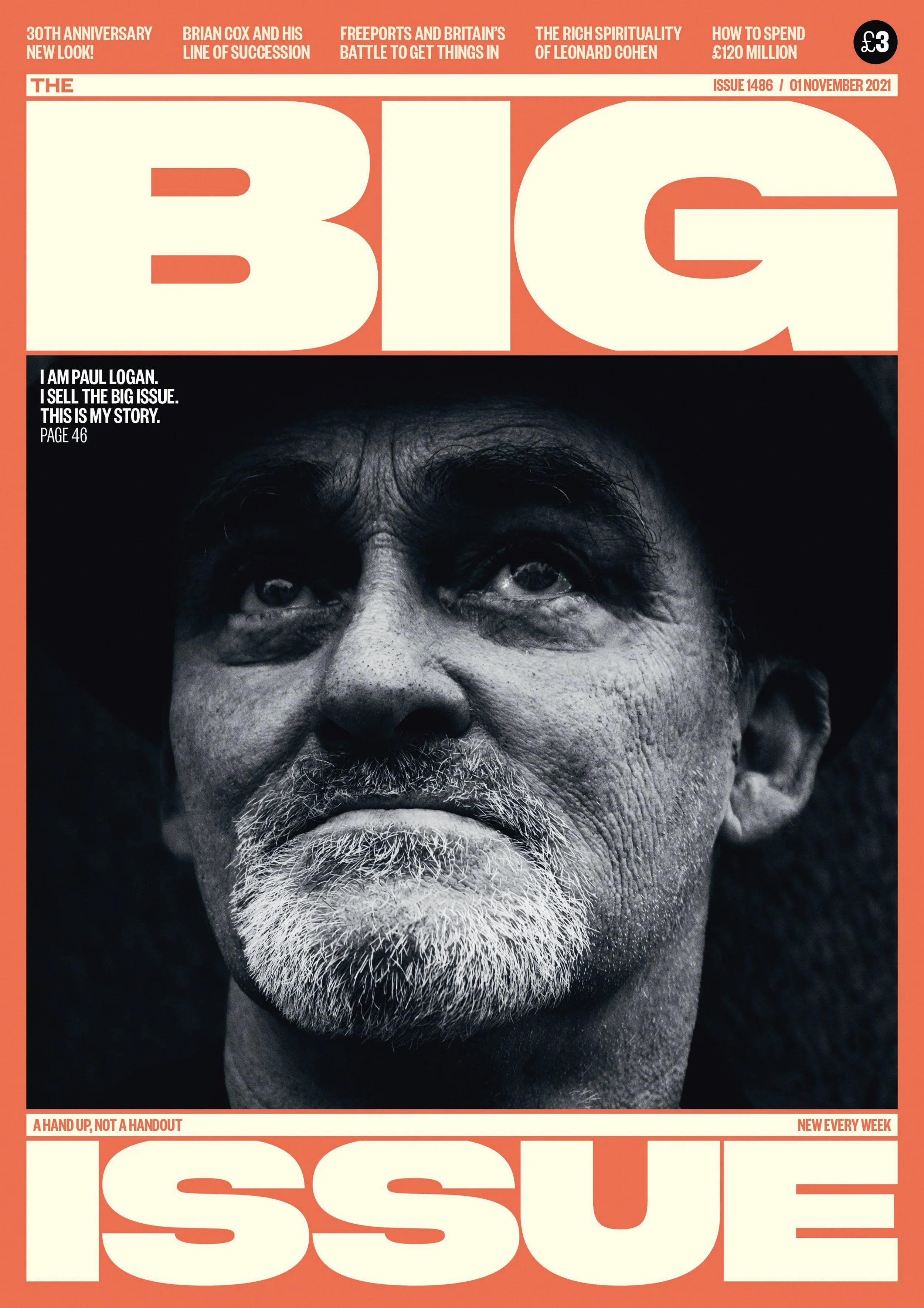
Big Issue, more than a magazine
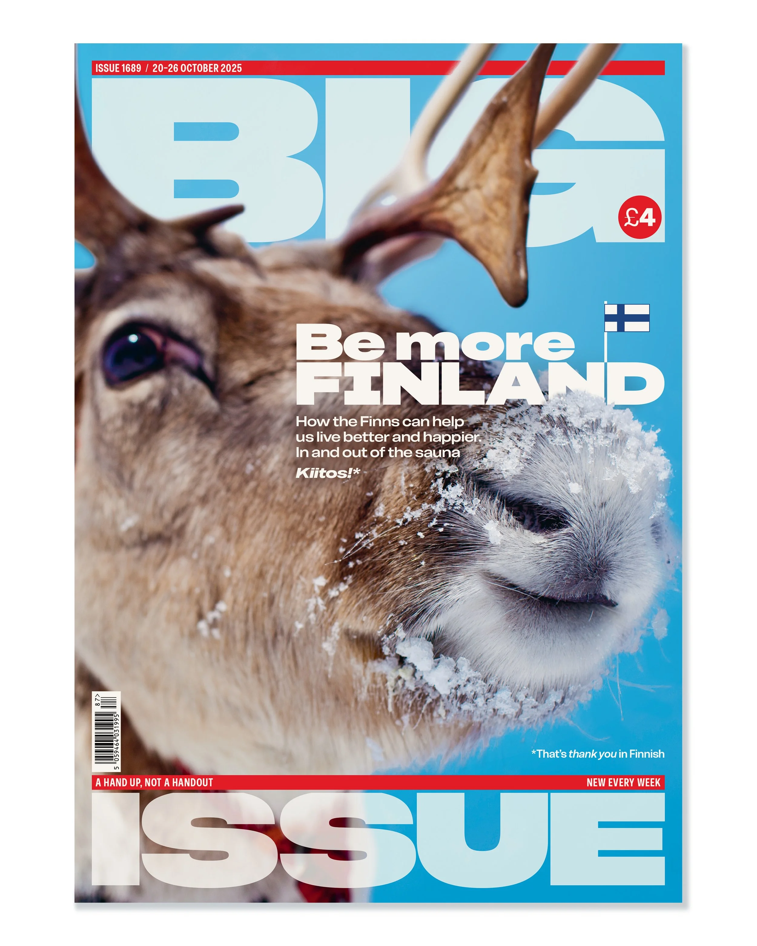
Image: The Big Issue redesigned by Matt Willey, Pentagram for its 30th anniversary, November 2021
More than a magazine, Big Issue is a voice for change. Homeless and vulnerably housed individuals sell The Big Issue to earn a legitimate income as micro-entrepreneurs rather than begging. The organisation provides a vital stepping stone for those who face barriers to traditional employment — such as a lack of permanent address, legal right to work, or struggles with mental health and addiction.
More than a magazine, it is also a typeface.
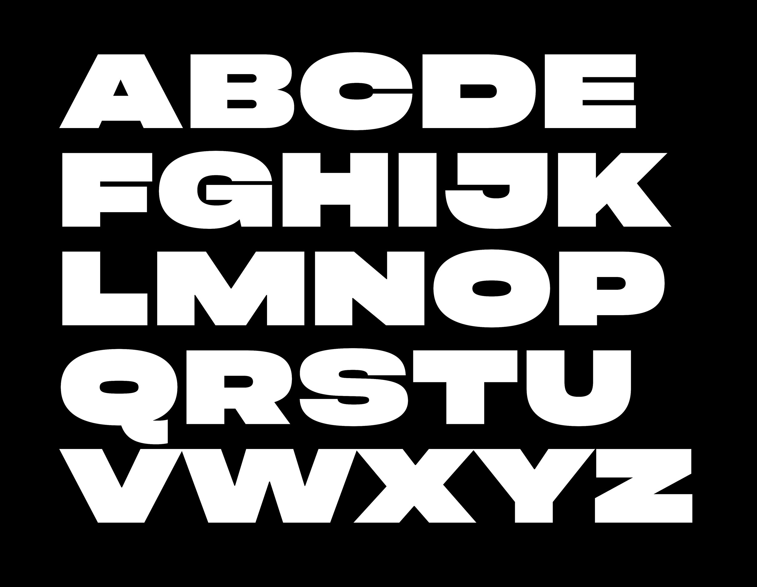
I have been art director for Big Issue twice, returning to art direct the 30th anniversary relaunch in late 2021. At the heart of this design was the font Big Issue Fat, a single-weight, all-caps font created by Matt Willey and Blast Foundry. Matt designed this primarily for The Big Issue front cover identity. It was then also used for various branding across the company — the Big Issue logo is constructed from Big Issue Fat.
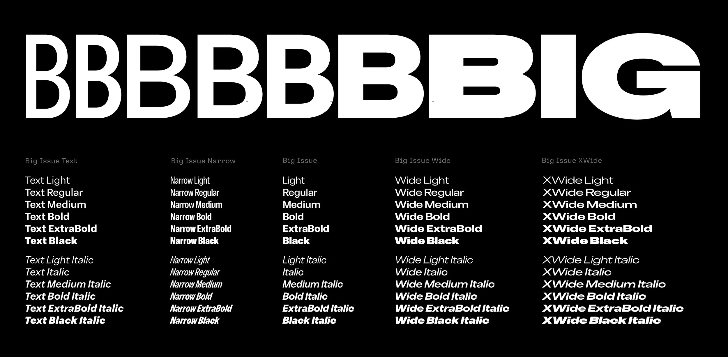
As the heavy-weight all-caps display face was being mis-used across the company remotely — as body copy, for example — I realised very quickly we needed to expand the type. Working with Barbara Bigosińska and Diana Ovezea at Blast Foundry we would make one superfamily which related back to Big Issue Fat but gave us unlimited possibilities. At this stage, there was no talk of featuring it in a new editorial design. It was initially designed to work on all company collateral across the business.
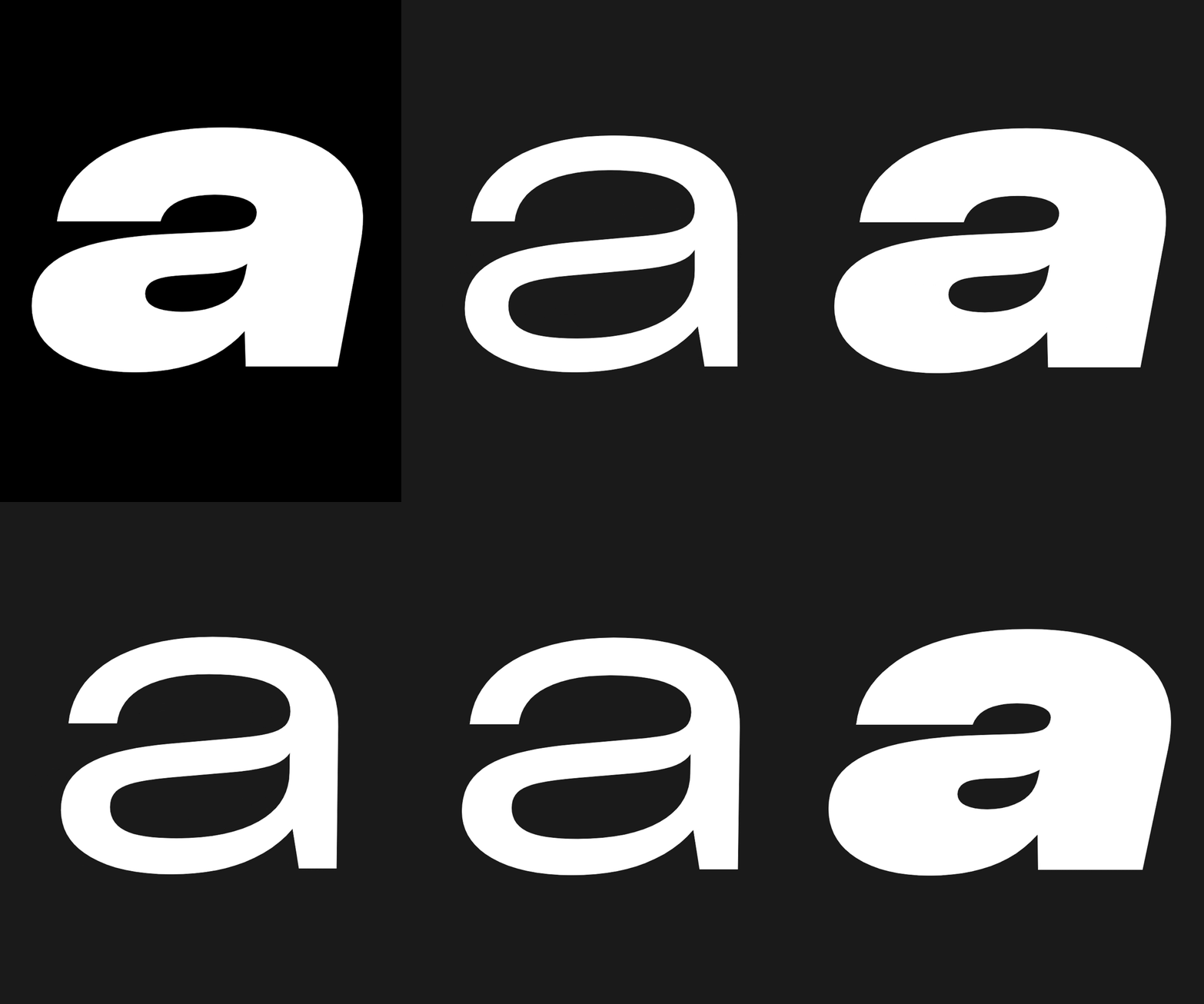
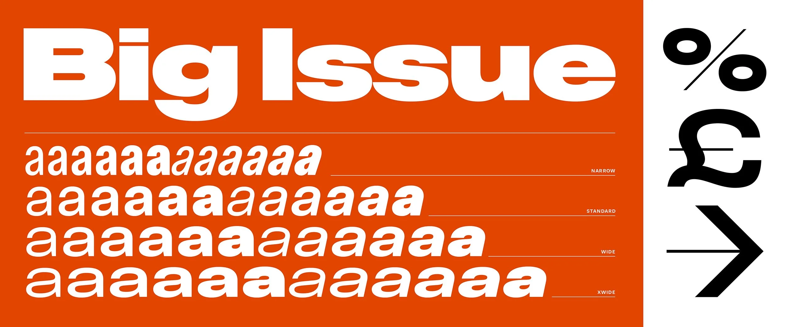
Through thick and thin
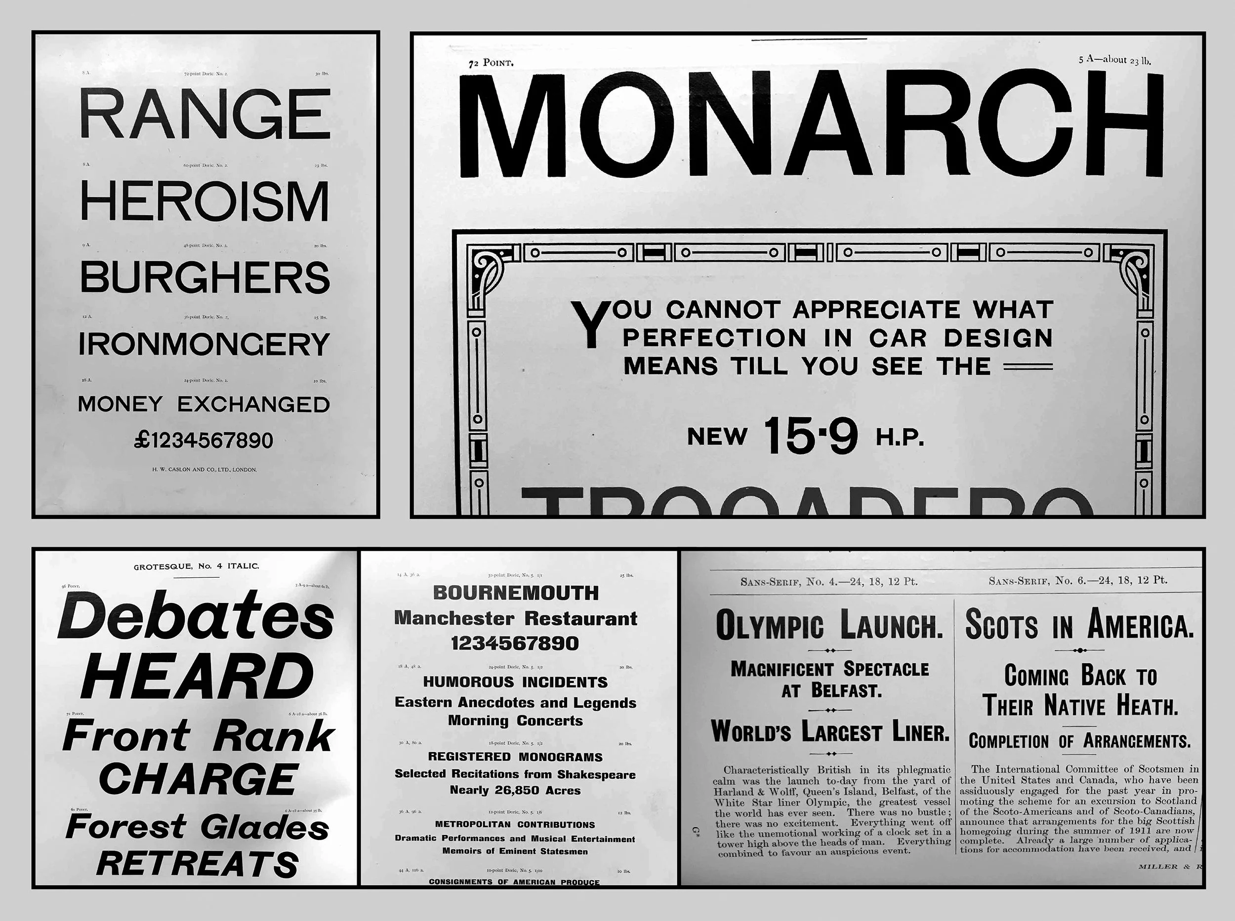
We looked to classic British grotesque faces as inspiration and worked backwards from Big Issue Fat to Big Issue Narrow giving ourselves different width and weight options for different uses at different sizes — XWide, Wide, Regular, Narrow as well as a Text family for body copy, all in six weights.
Through thick and thin, the font represents ‘support and change for good’. The crossbar variant of the capital i and the capital J — these are industrious in appearance and say ‘Big Issue’ to me. The font says “let’s go to work, let’s make a difference”. The design of special characters such as arrows also reinforced the ‘thick and thin’ sentiment.
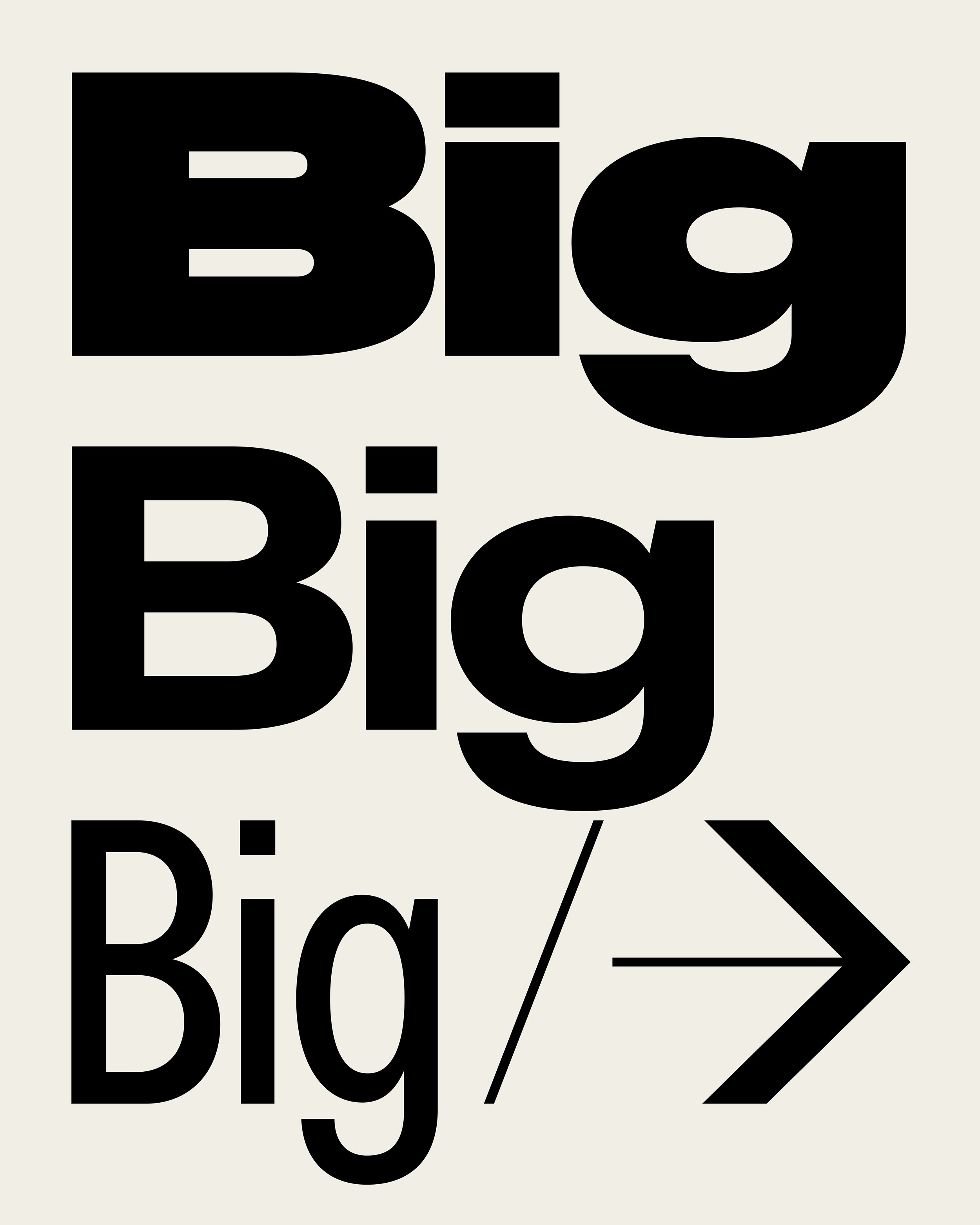
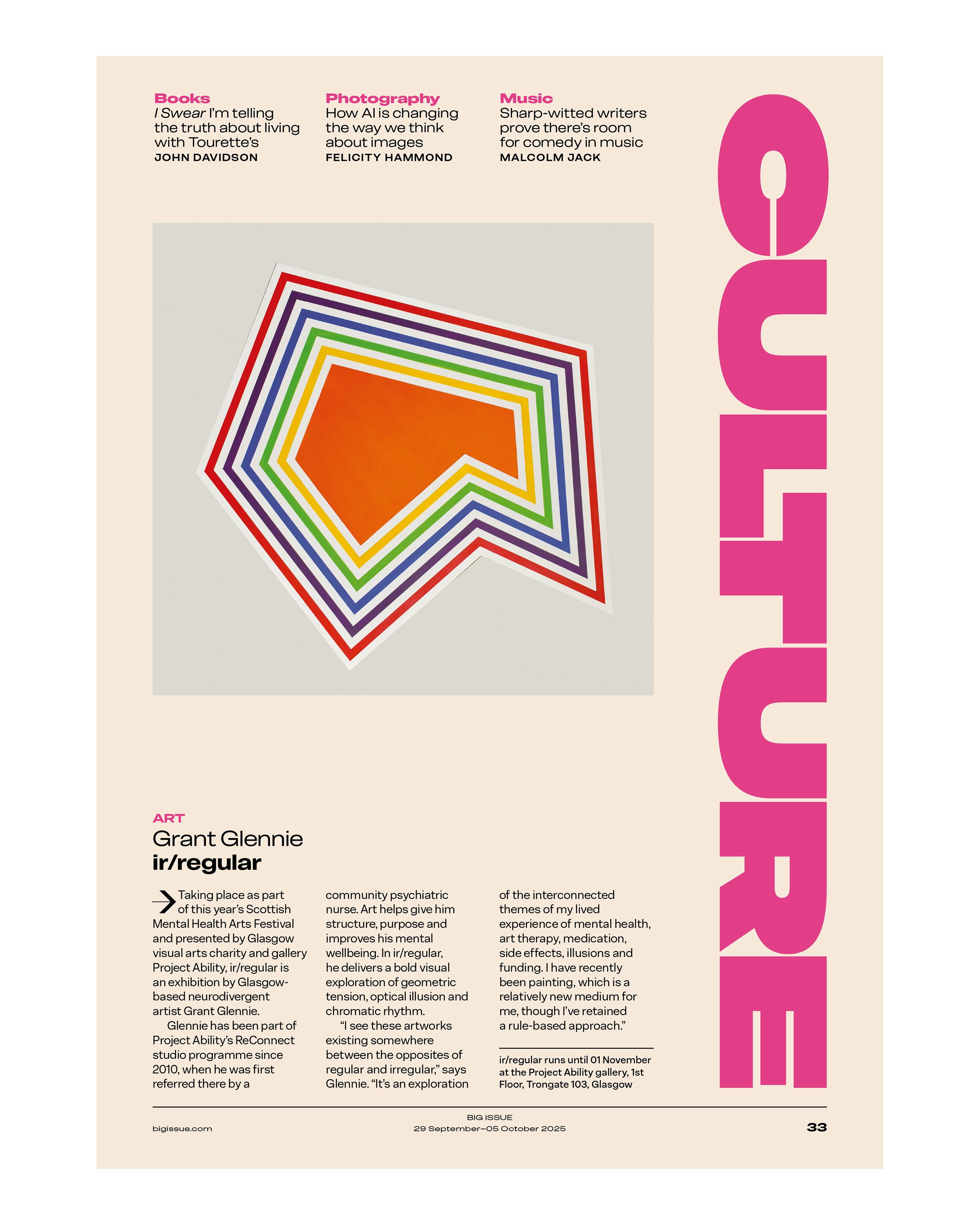
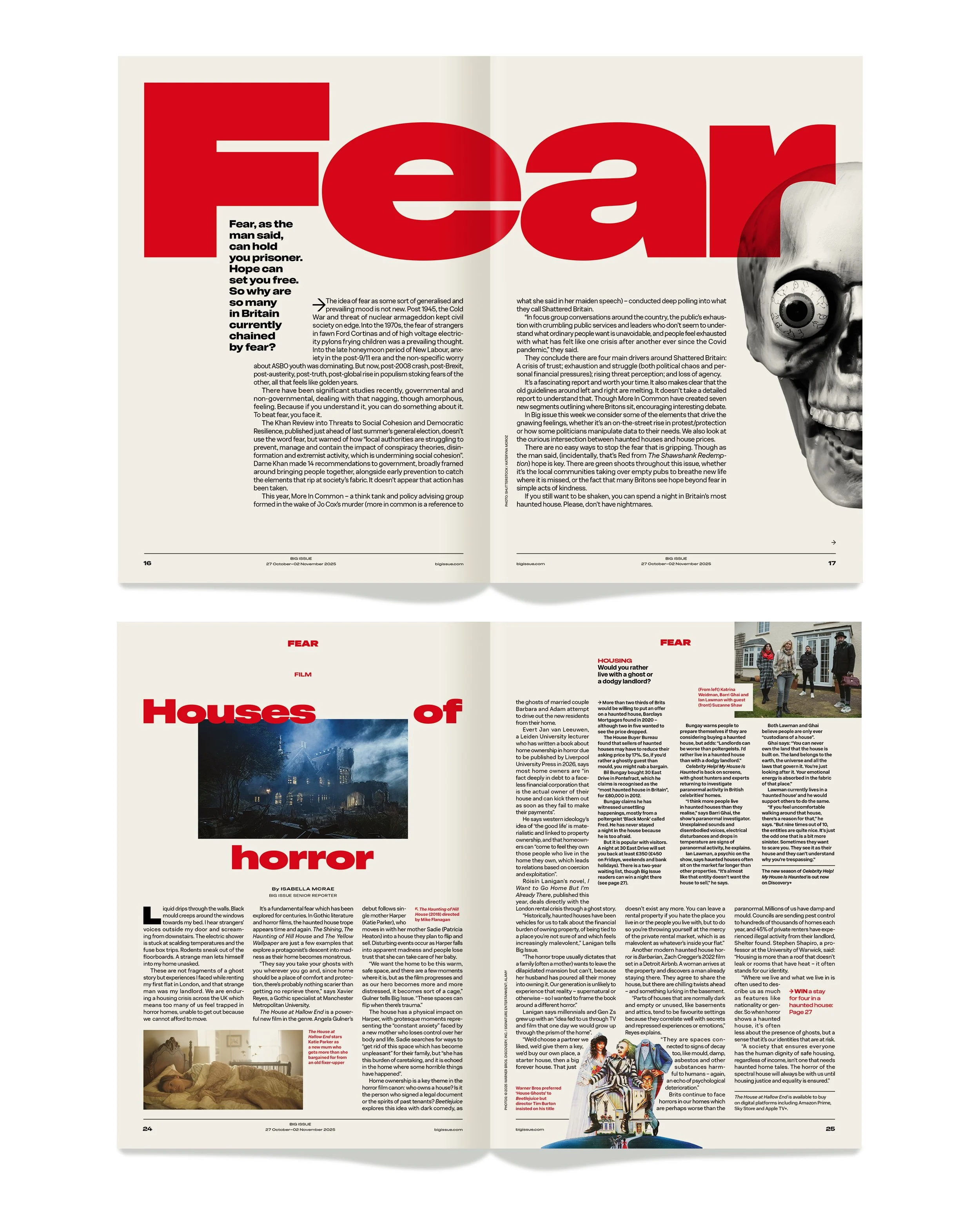
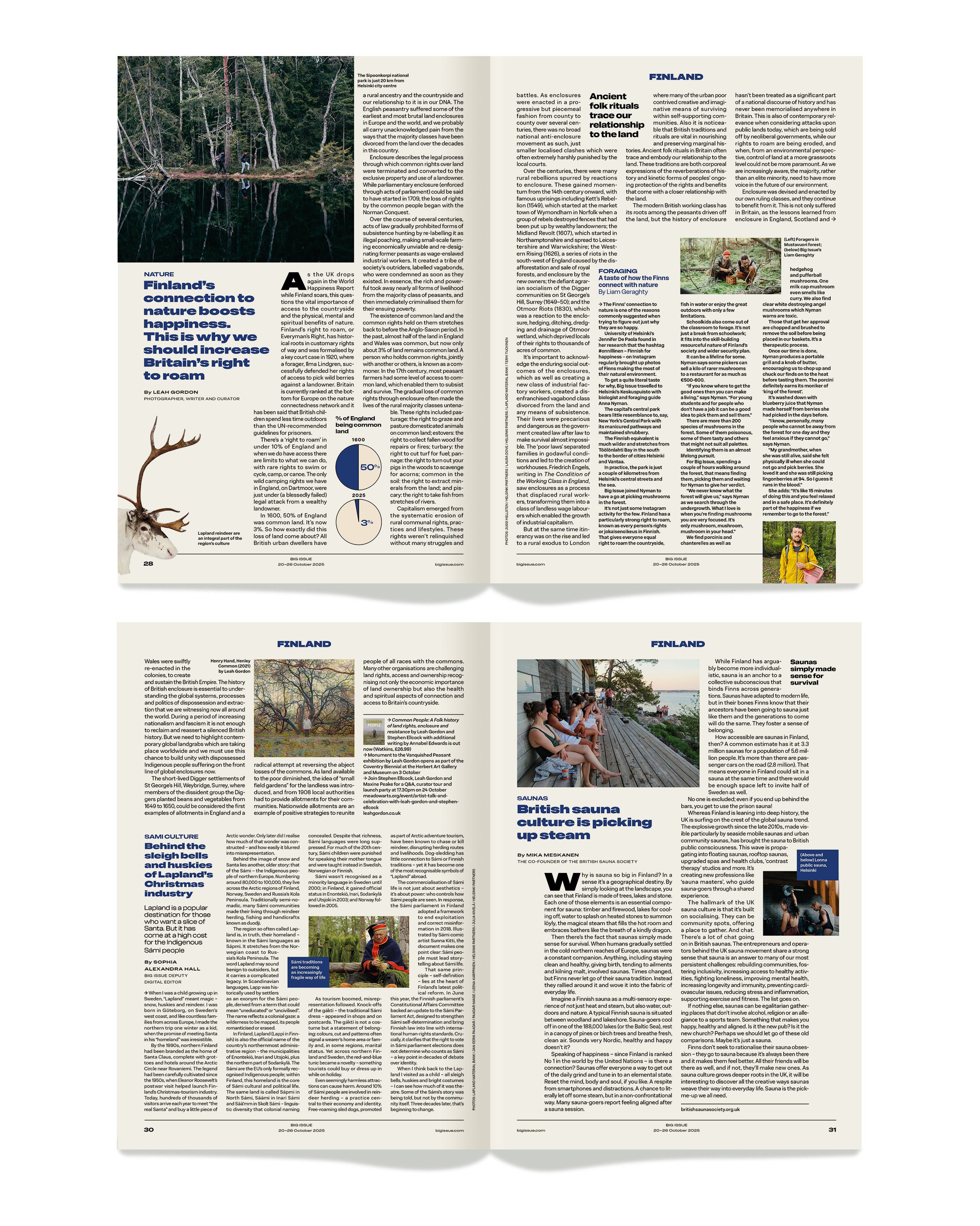
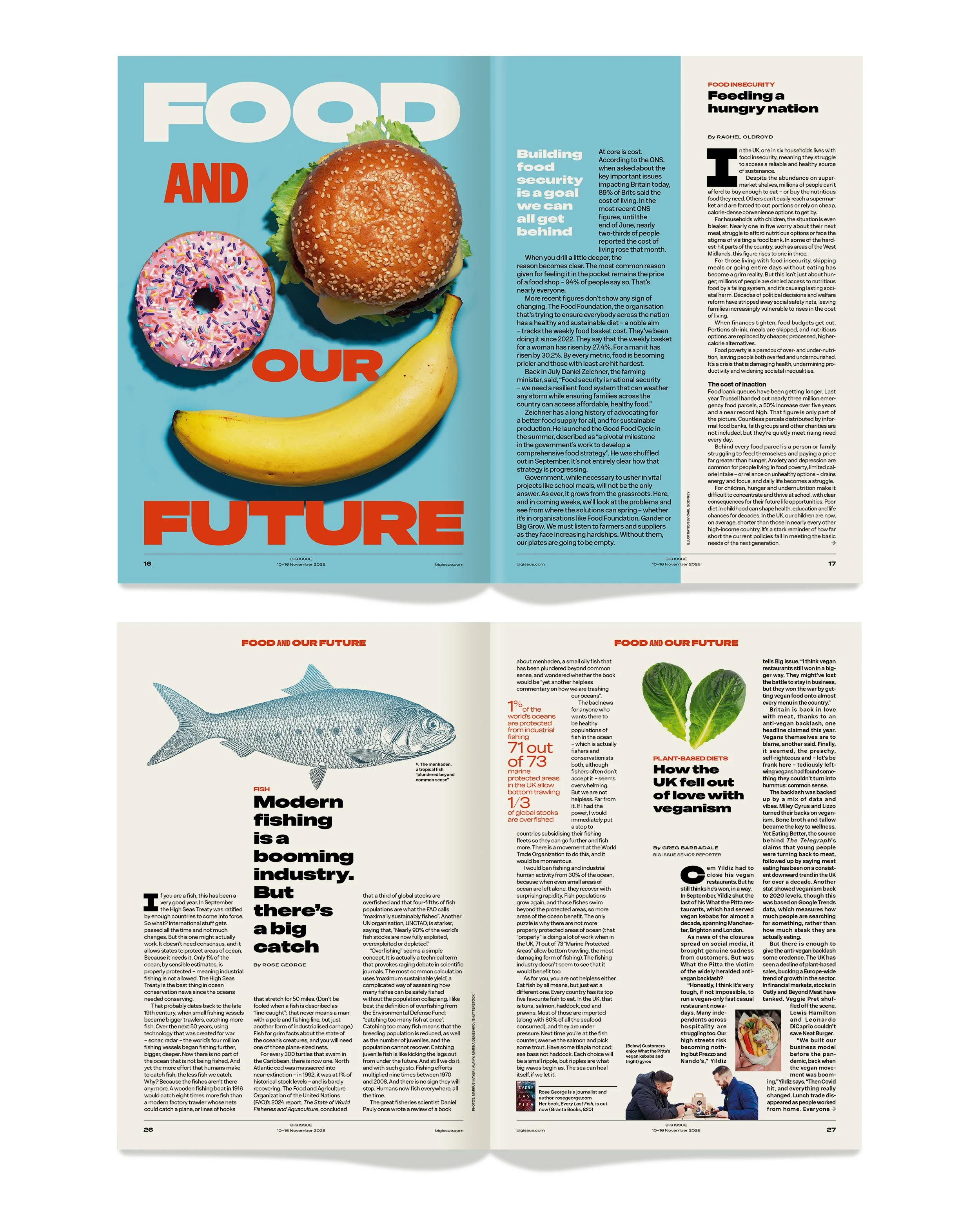
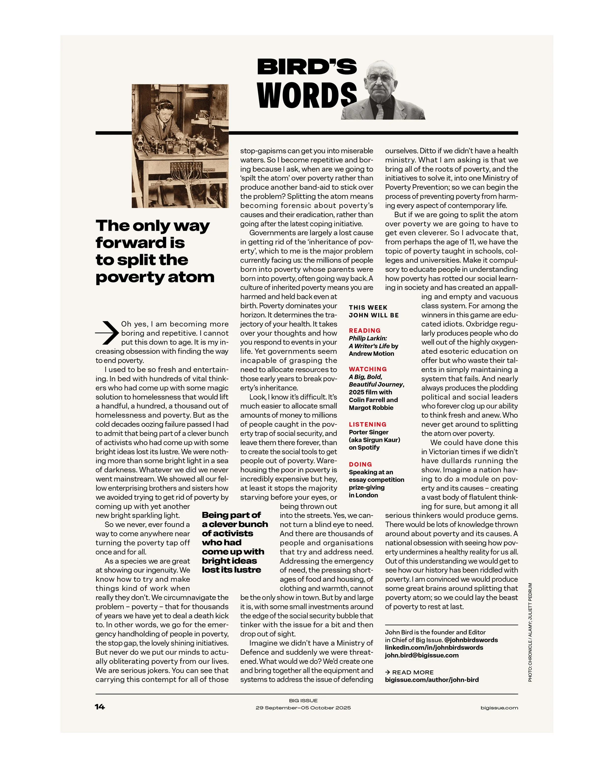
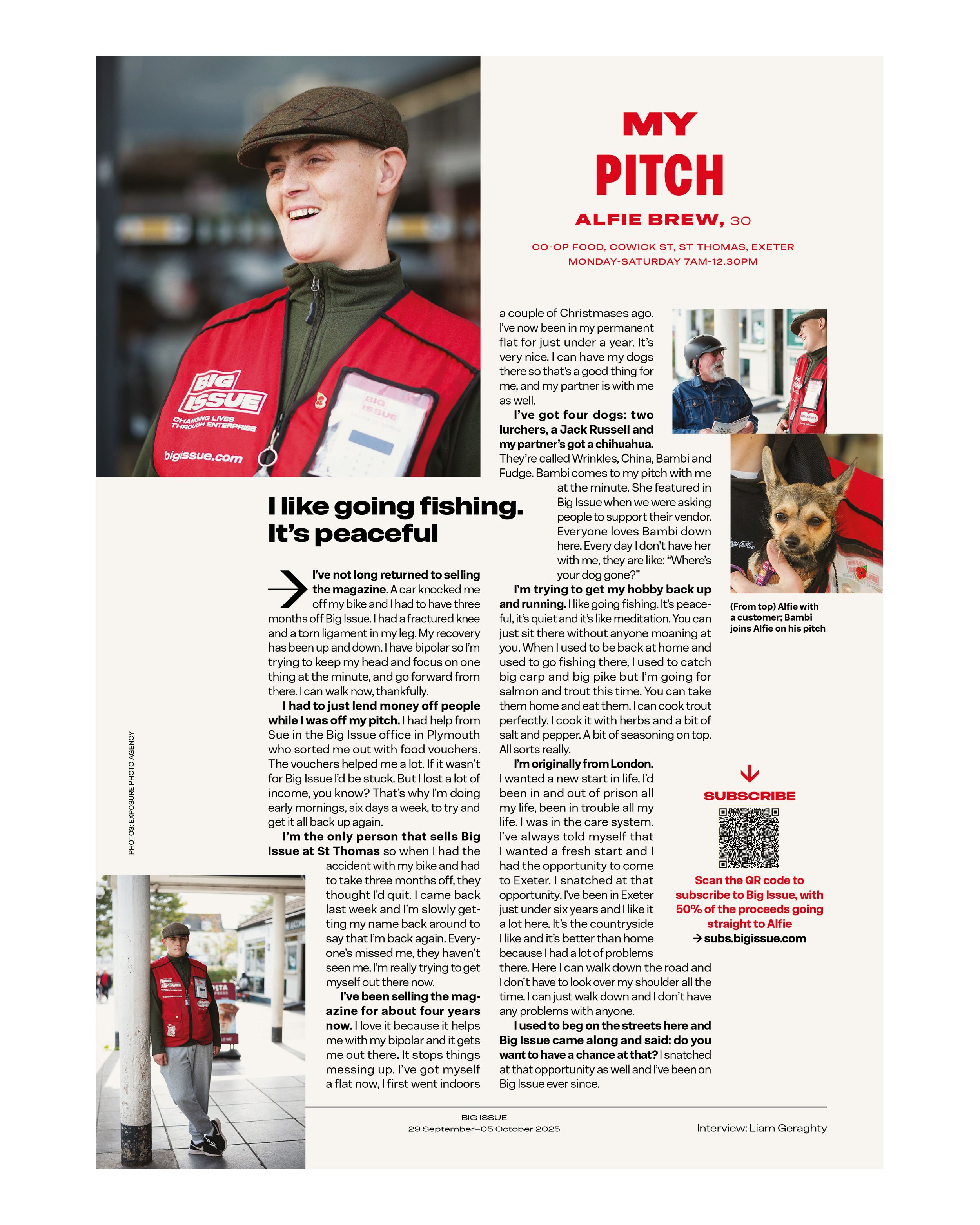
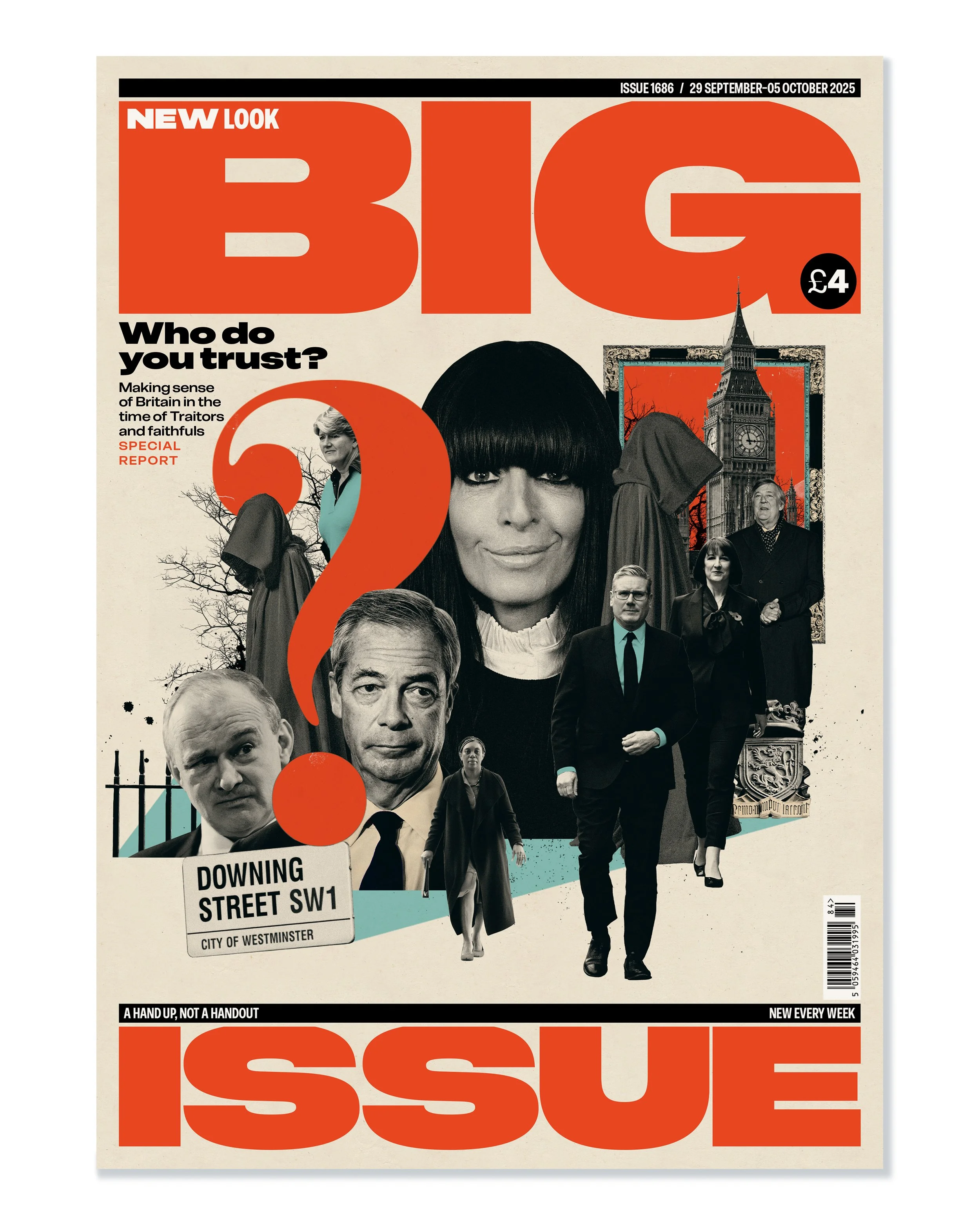
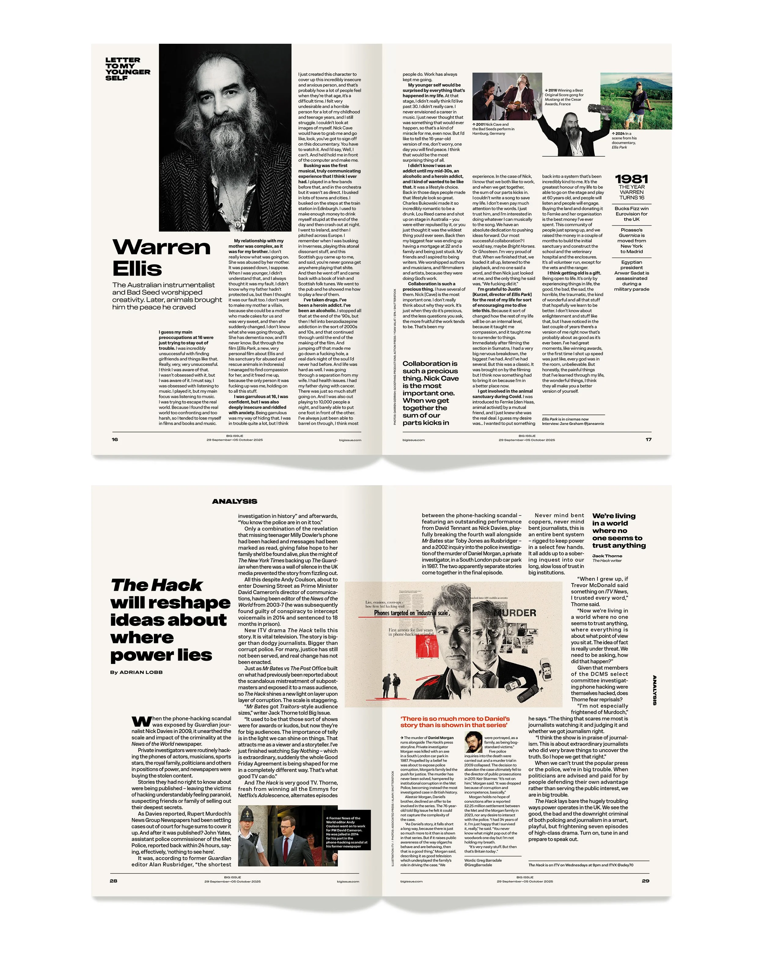
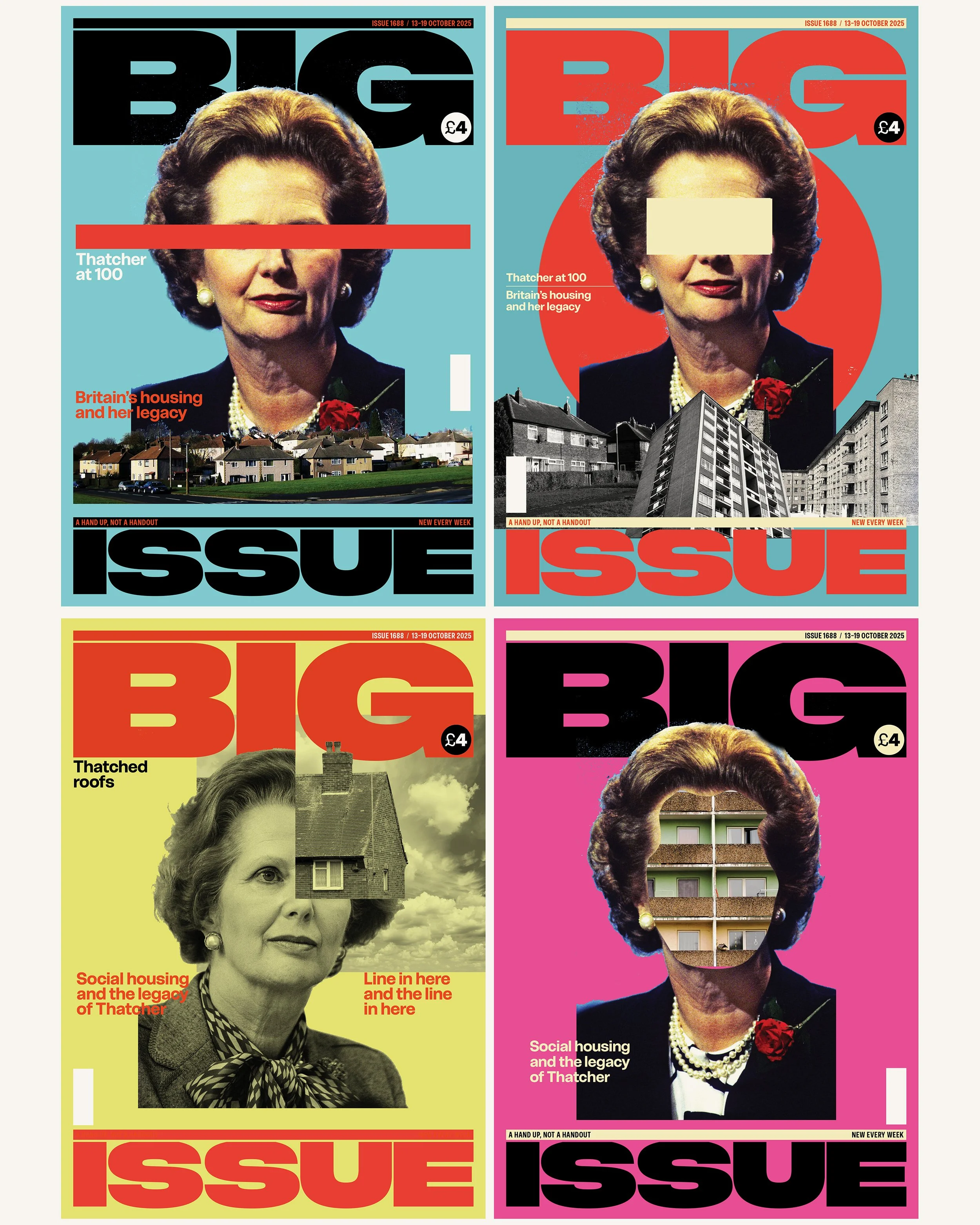
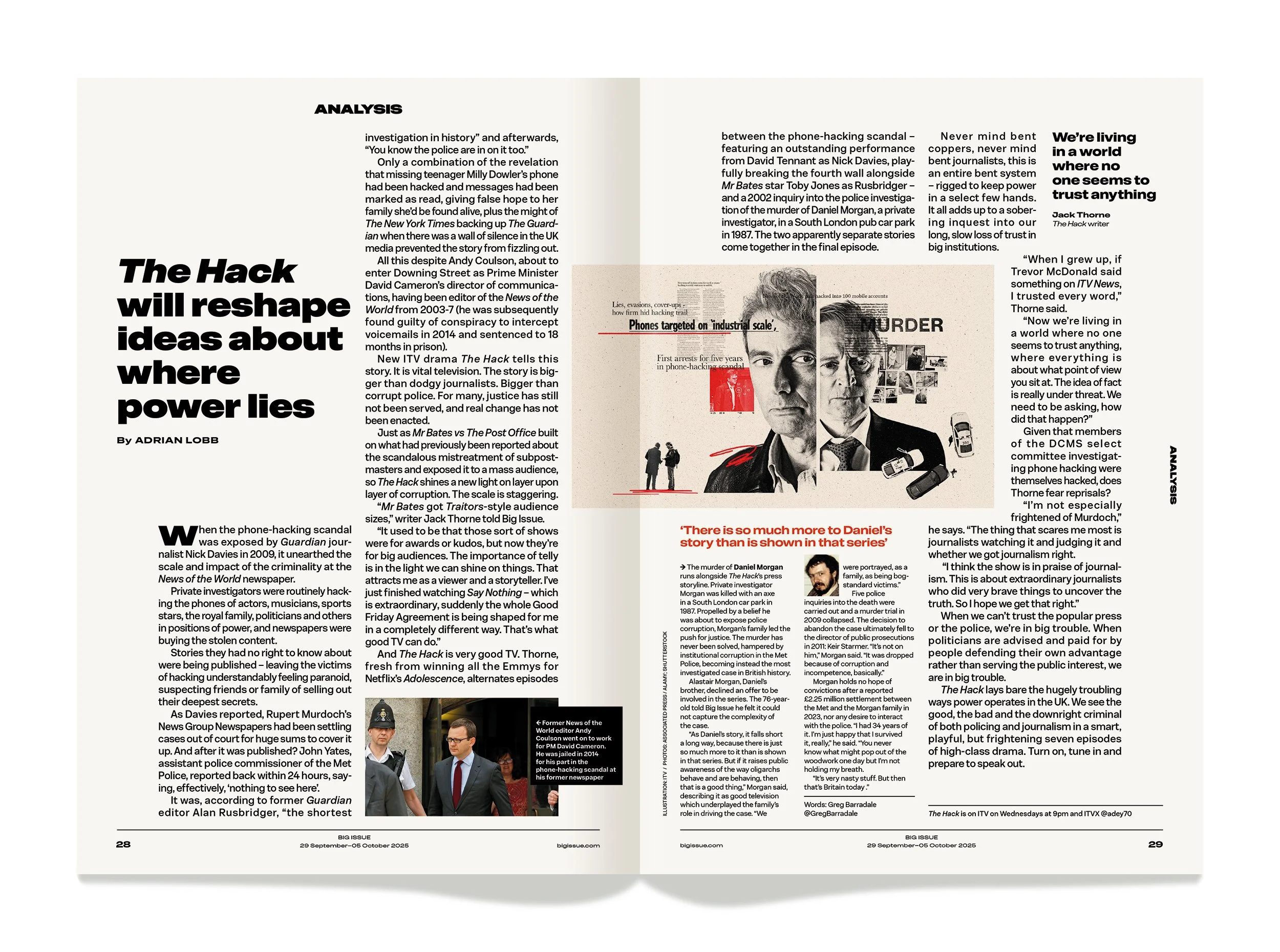
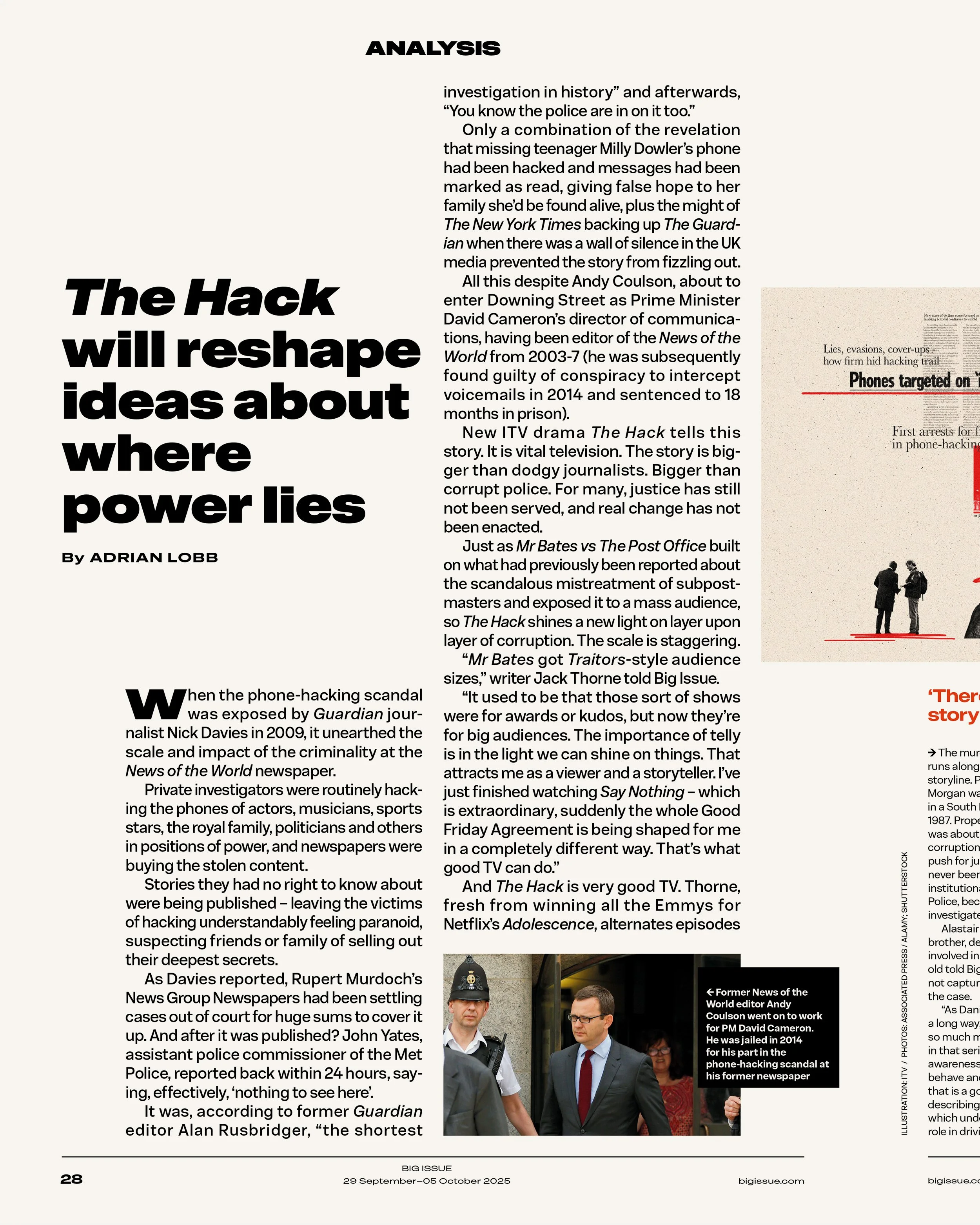
In 2025, it was decided the content of Big Issue was to evolve. Each week we would focus on one big theme / one overarching subject — Trust, Fear, Food etc. With a text-heavy textbook design with multiple sizes, weights and widths across a disruptive, but systematic grid, it appears busy but content is easily defined with the multiple sizes and weights of the family. A particular highlight of the design was a ‘big’ body copy size used for analysis pieces.
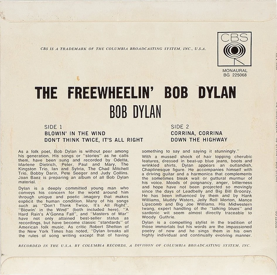
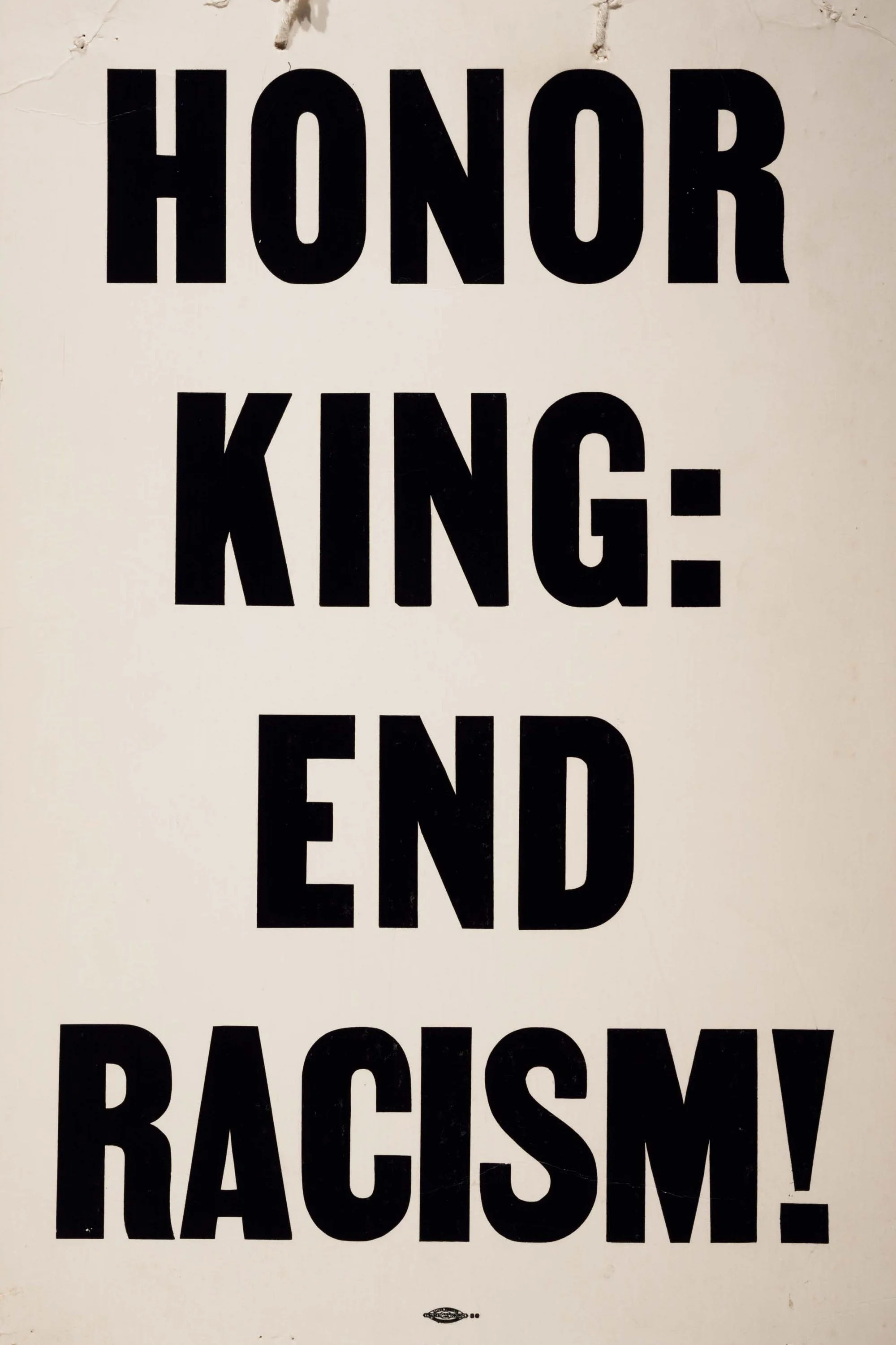
The editorial design looked to Brutalist principles — bold typography, master the grid/break the grid, deliberate disruption, overlap elements, embrace imperfections, make a statement… Signposting in the magazine, such as ‘BIRD’S WORDS’ and ‘MY PITCH’ naturally looked to vintage protest poster designs where statements are minimal but have big impact. The type setting on vintage record sleeves was another cue. I particular enjoy these visual experiments — looking back to make something new. The multiple widths of the type family made this possible.

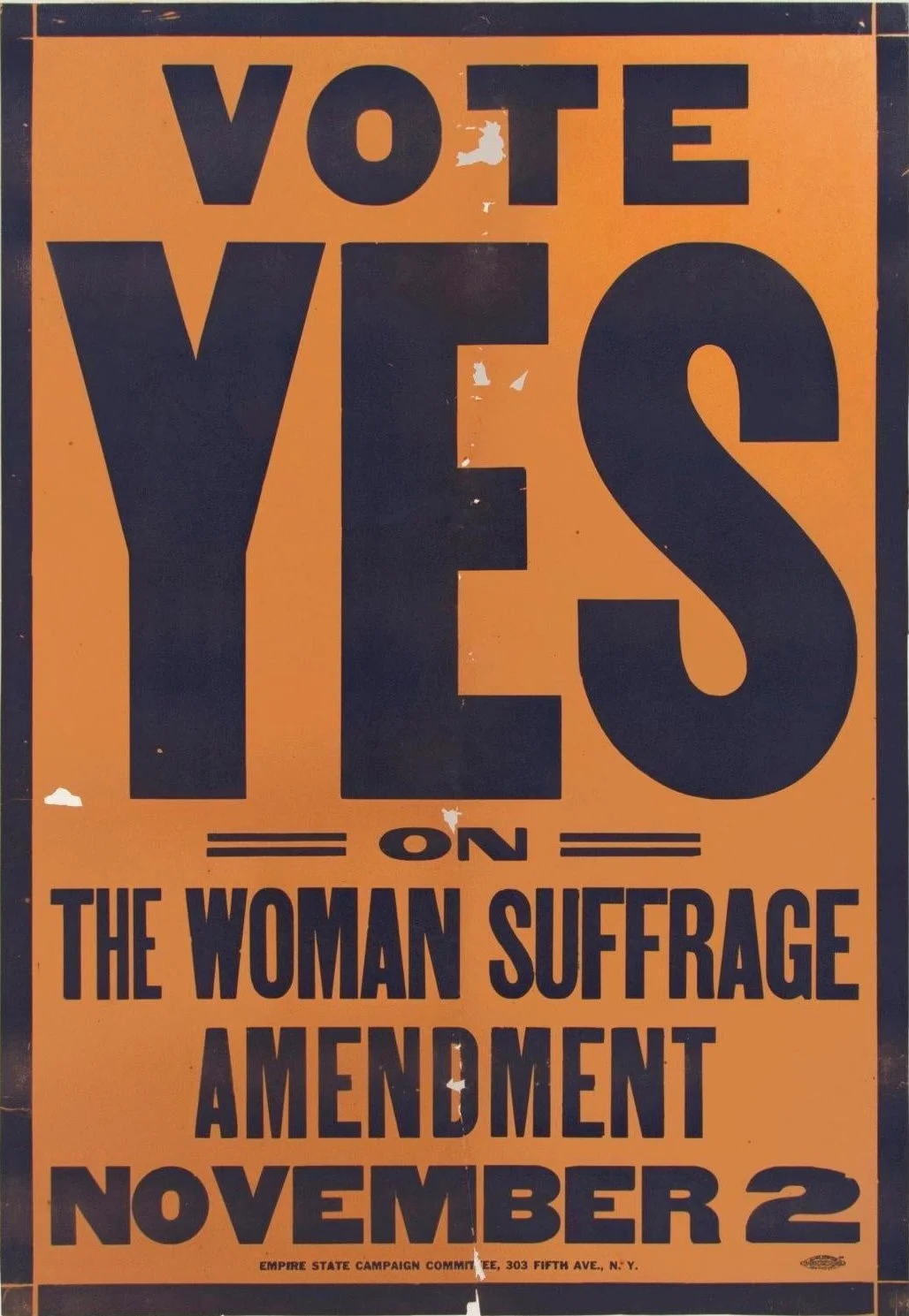
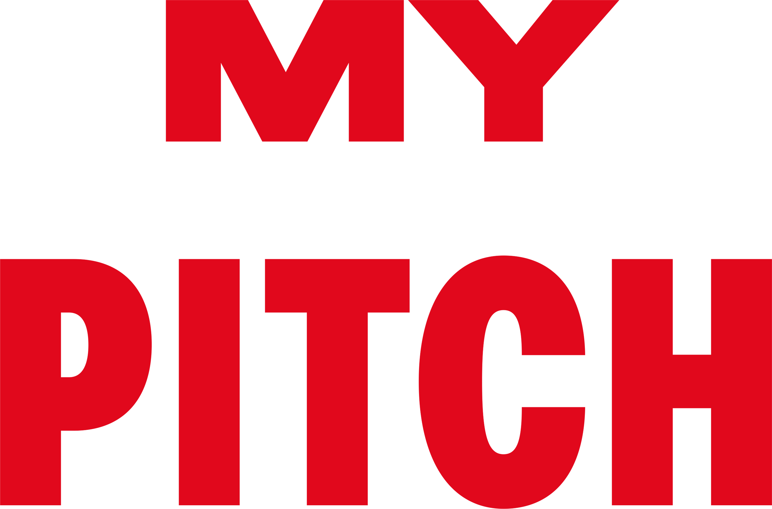
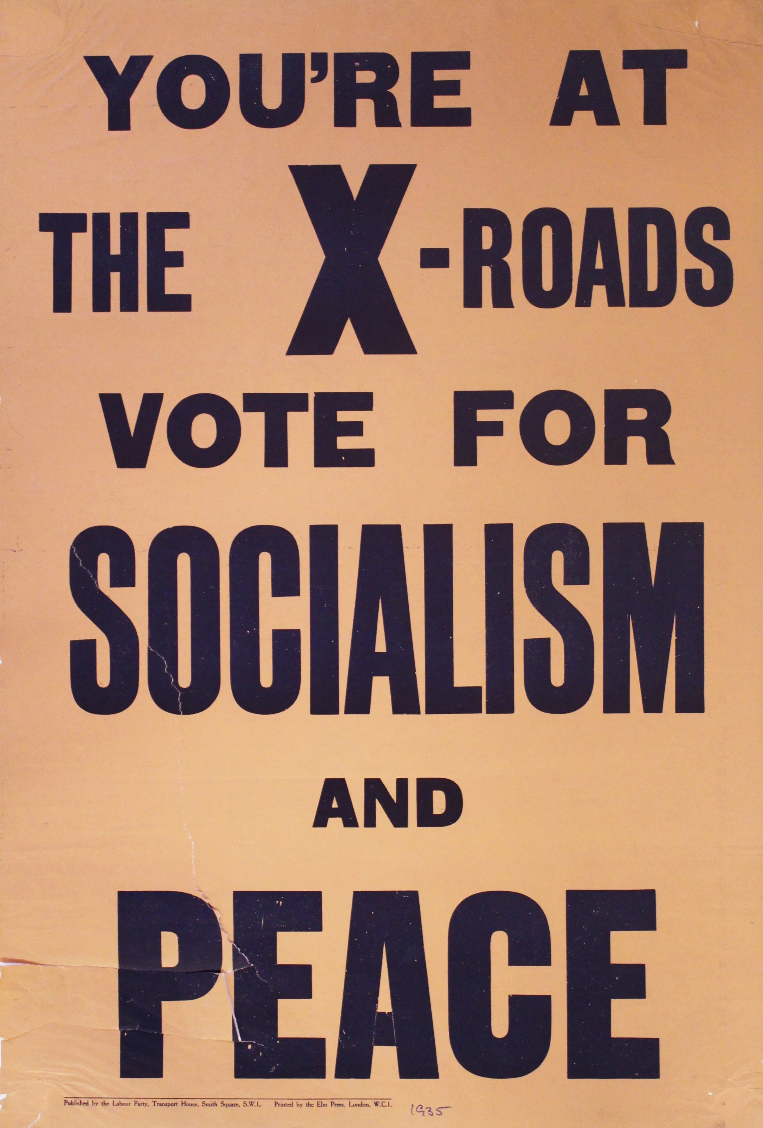
The type presented an opportunity to own our own identity. It made complete sense to use the one type family throughout the whole magazine. The design direction I worked on was always intended to be a natural progression from the work on the cover design identity in 2021. It all grew from the single-weight, all-caps, Big Issue Fat. With our route in content evolving too, it became clear we needed to smash up the system with the editorial design.
Disruptive, yet legible. Design with positive purpose.
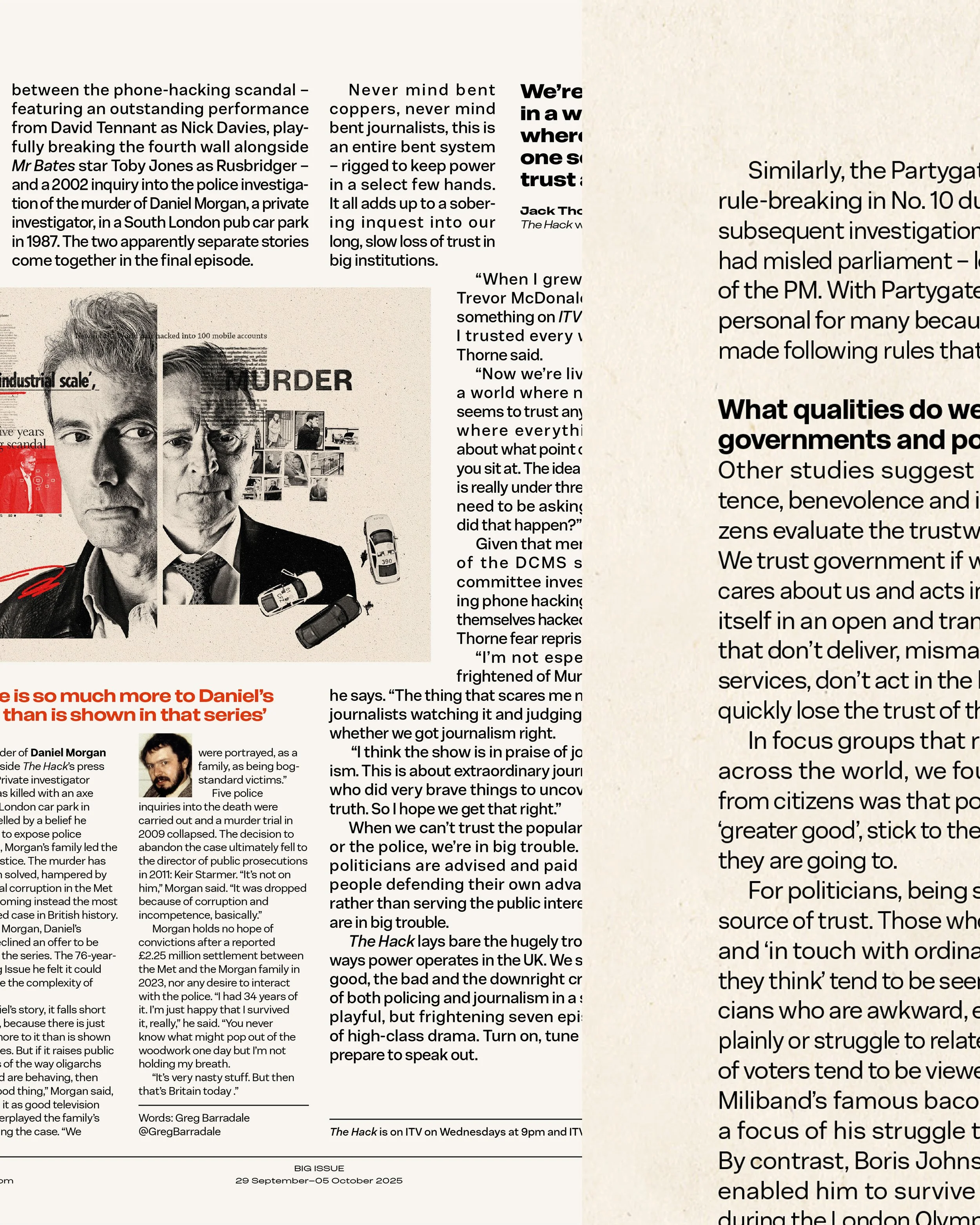
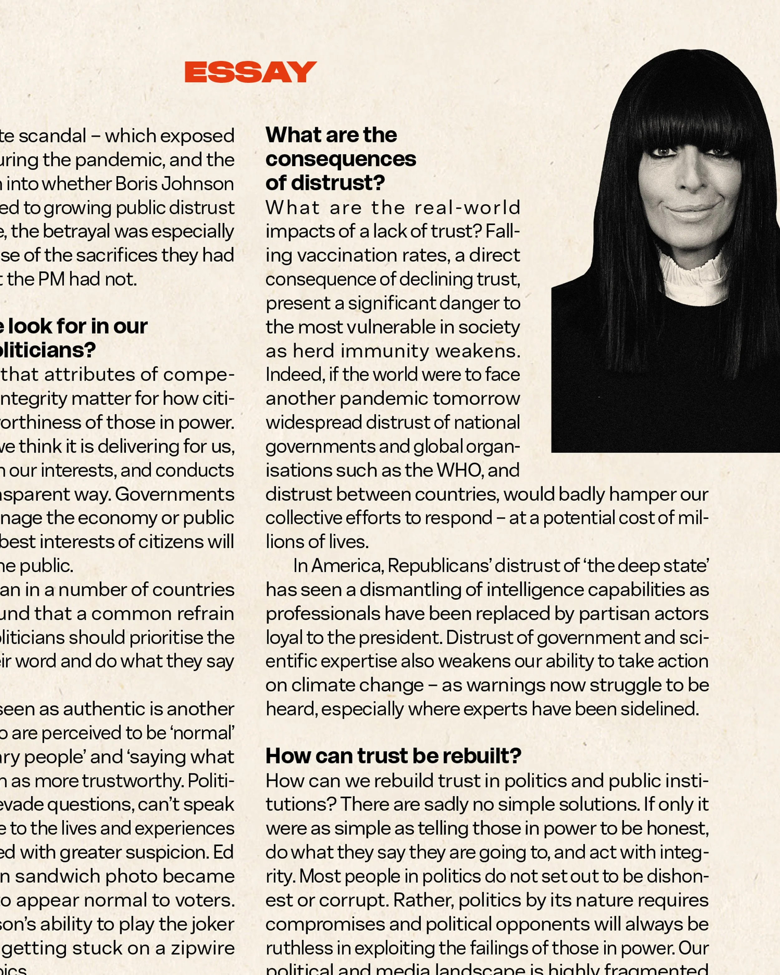
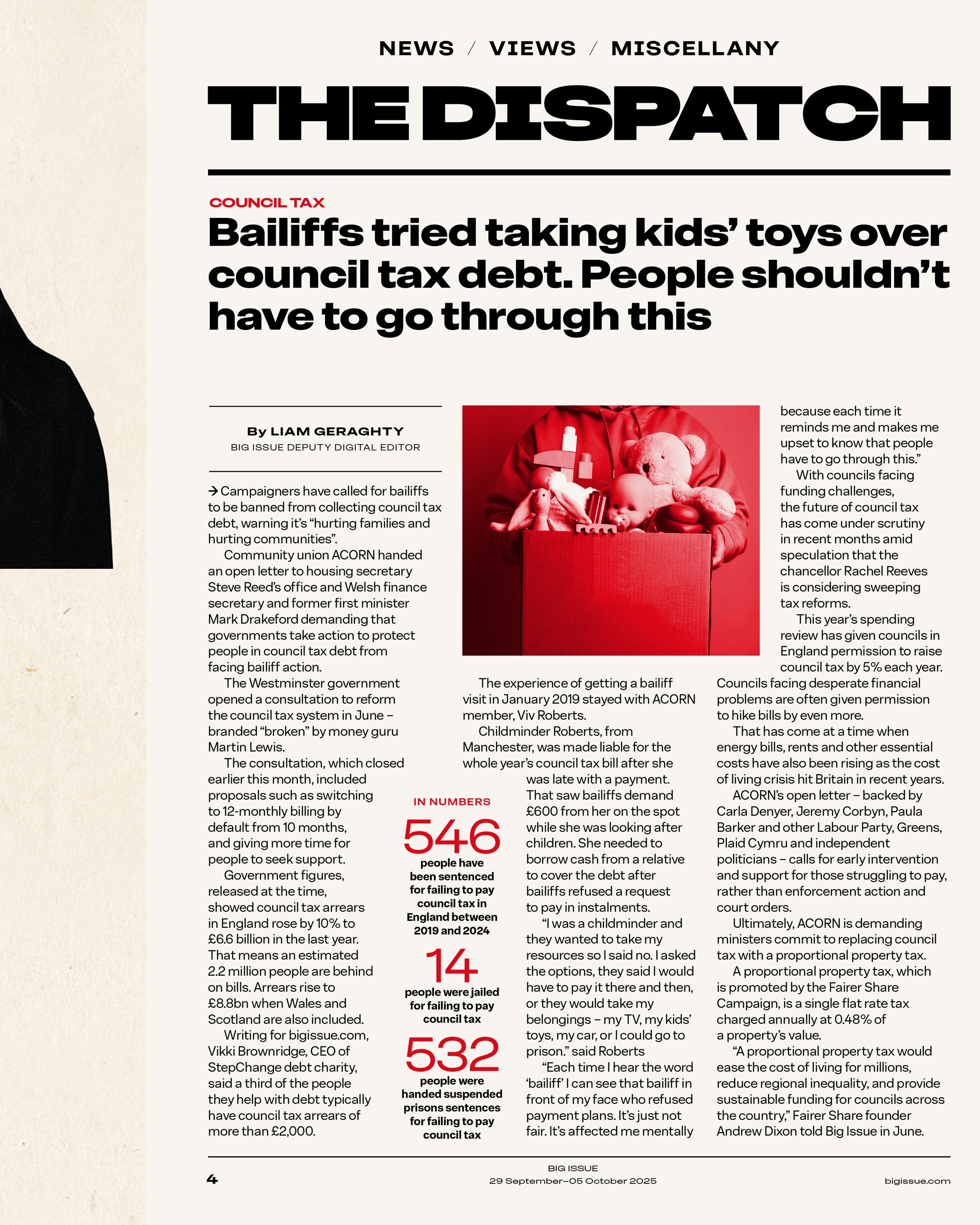
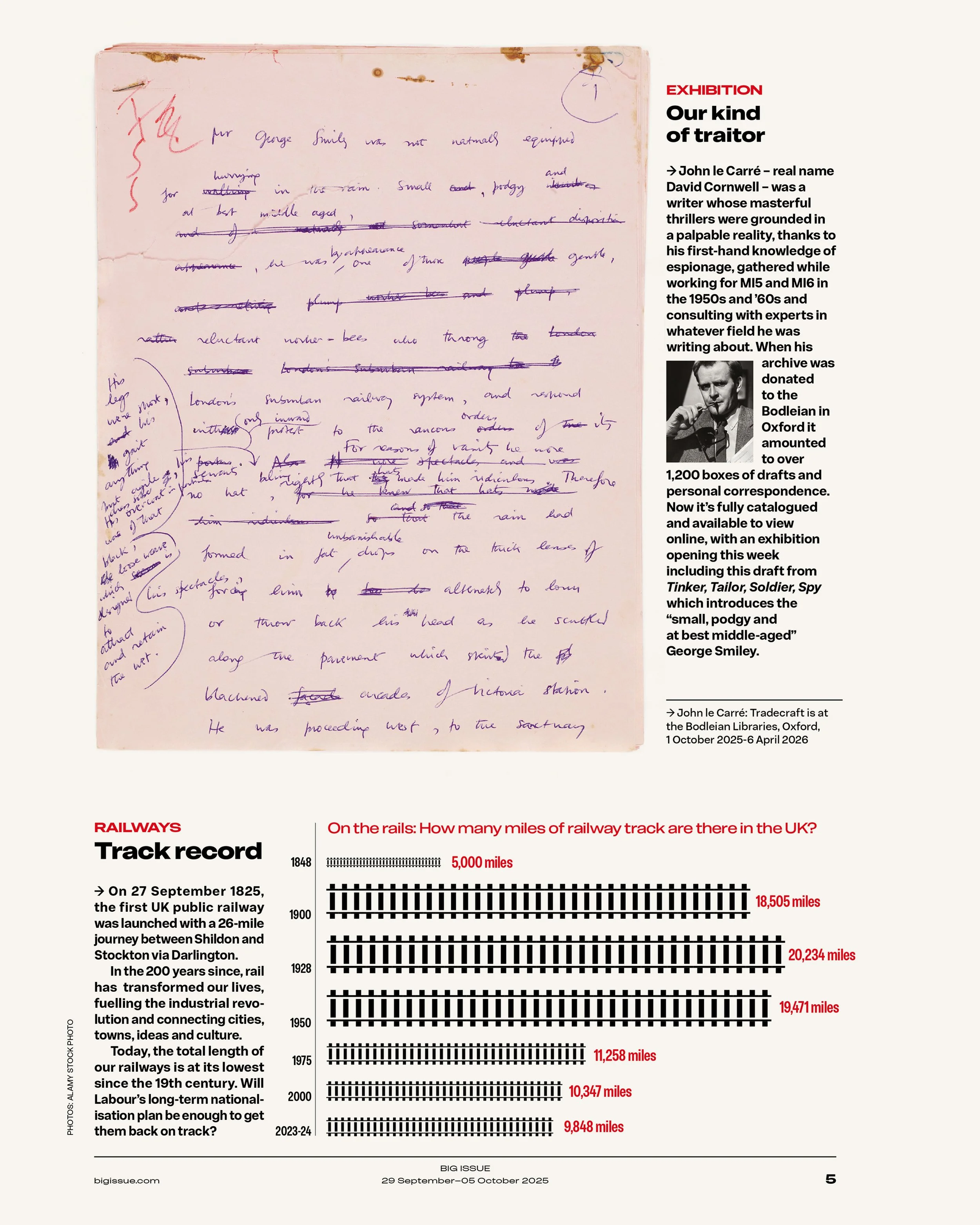
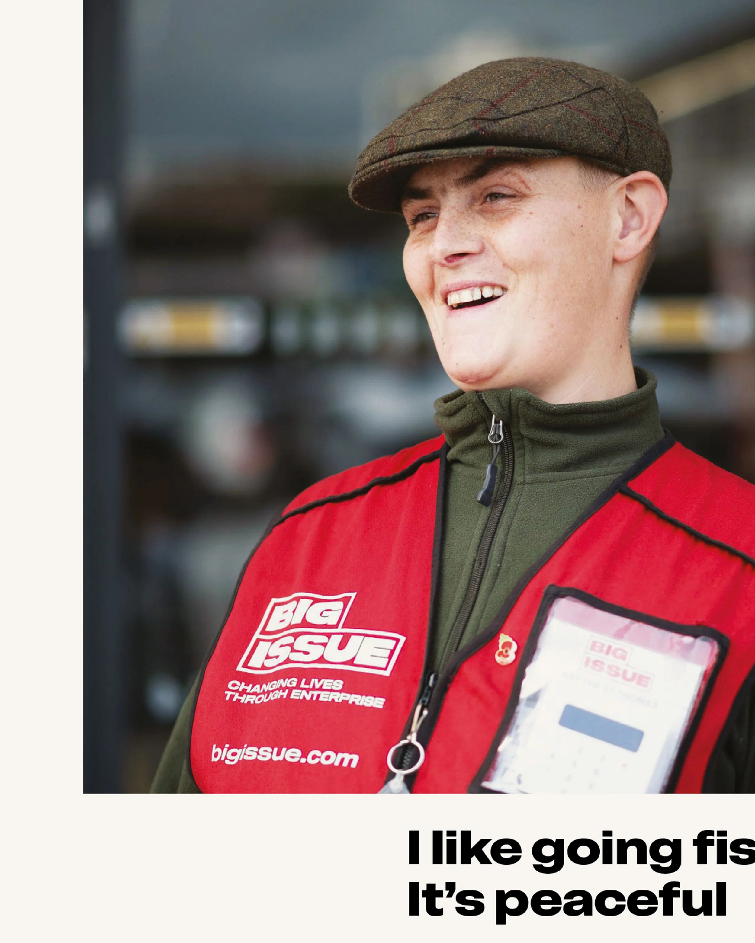
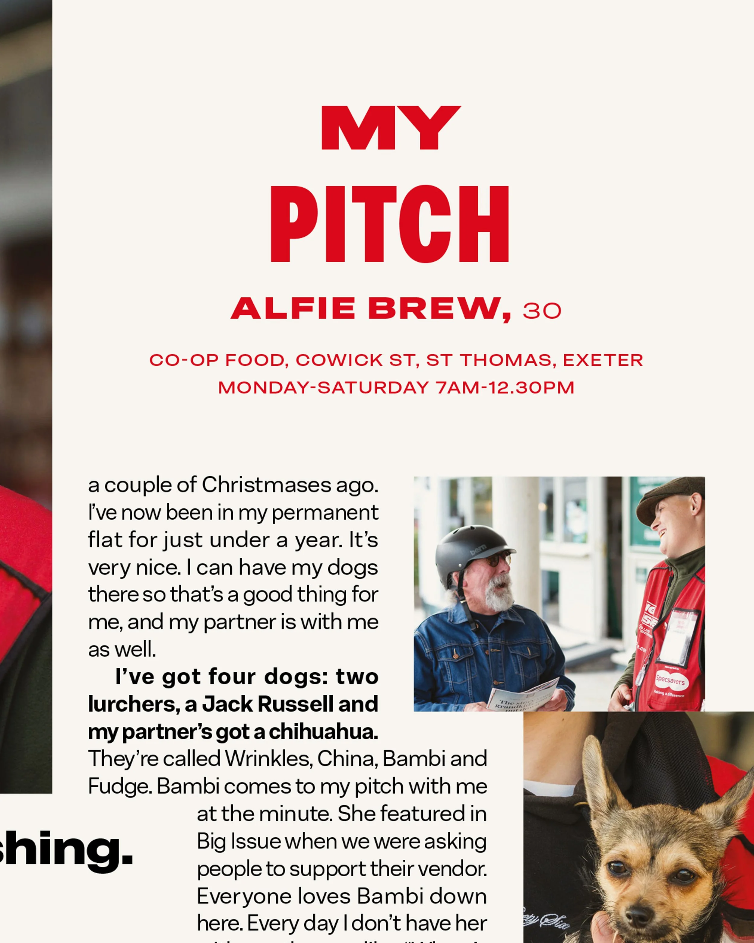
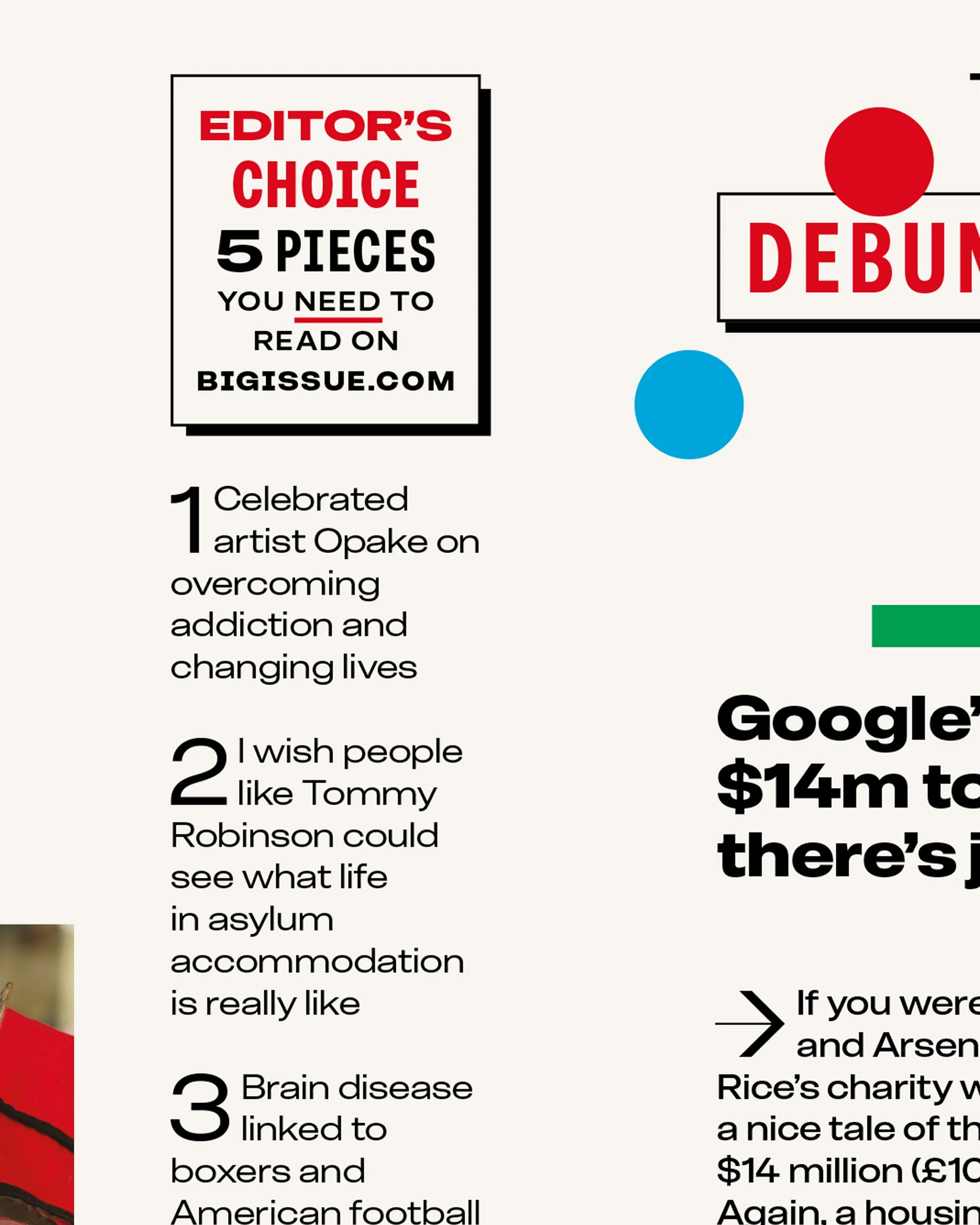
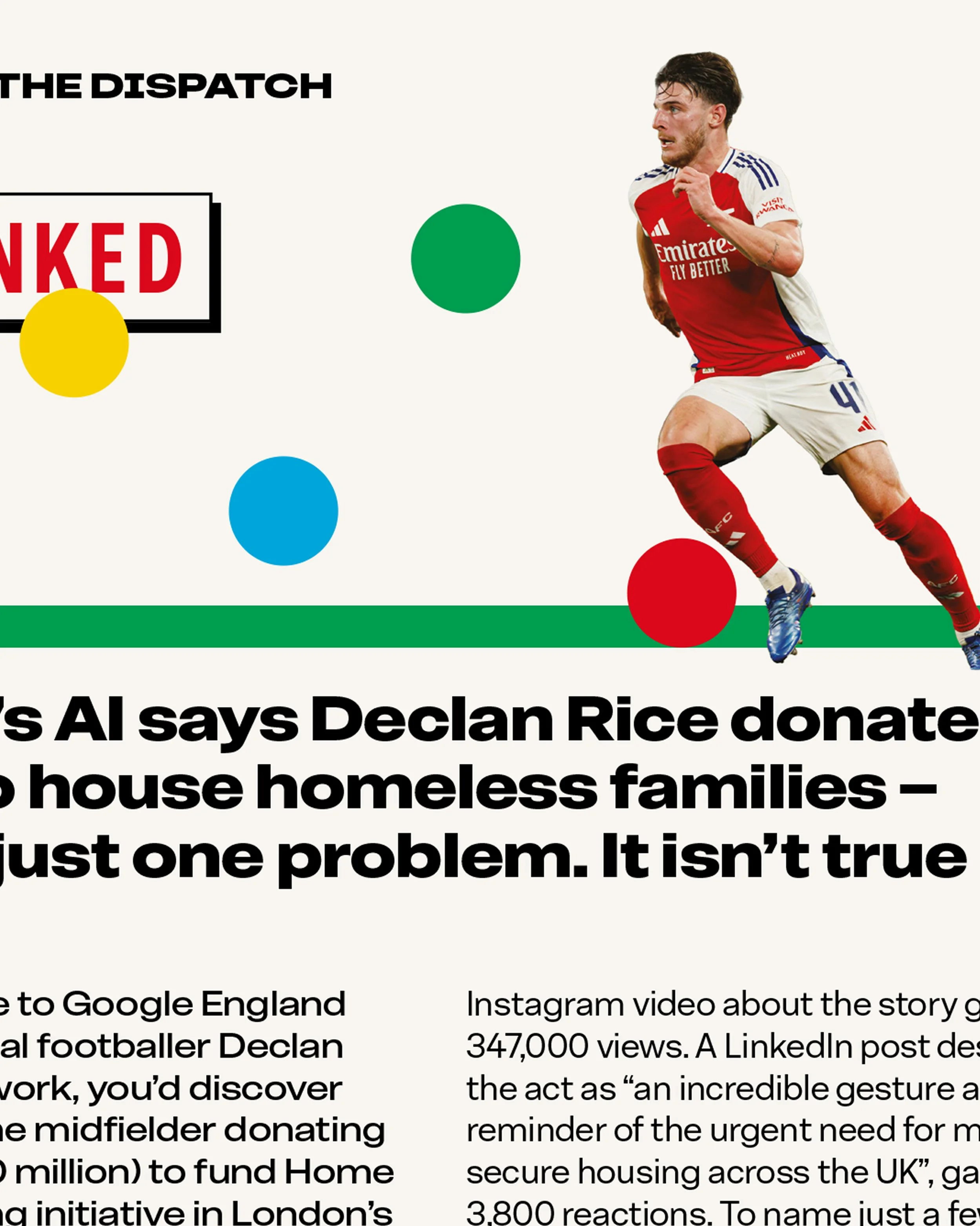
The Big Issue superfamily is available from Blast Foundry — 10% of all proceeds are donated to Big Issue, supporting the organisation’s work to end poverty.
-
Senior Designer Gillian Smith
Designer Harrison AikenEditor Paul McNamee
Deputy Editor Steven MacKenzie
Production Editor Alison Wright
Production Journalist Alan WoodhouseWith thanks to all collaborators.
Typefaces
Big Issue by Blast Foundry
Designers Barbara Bigosińska and Diana Ovezea
Creative Director Mark NeilBig Issue Fat
Designer Diana Ovezea, Blast Foundry
Creative Director Matt Willey, Pentagram