Method
Space and time:
designing Time Out in 2016
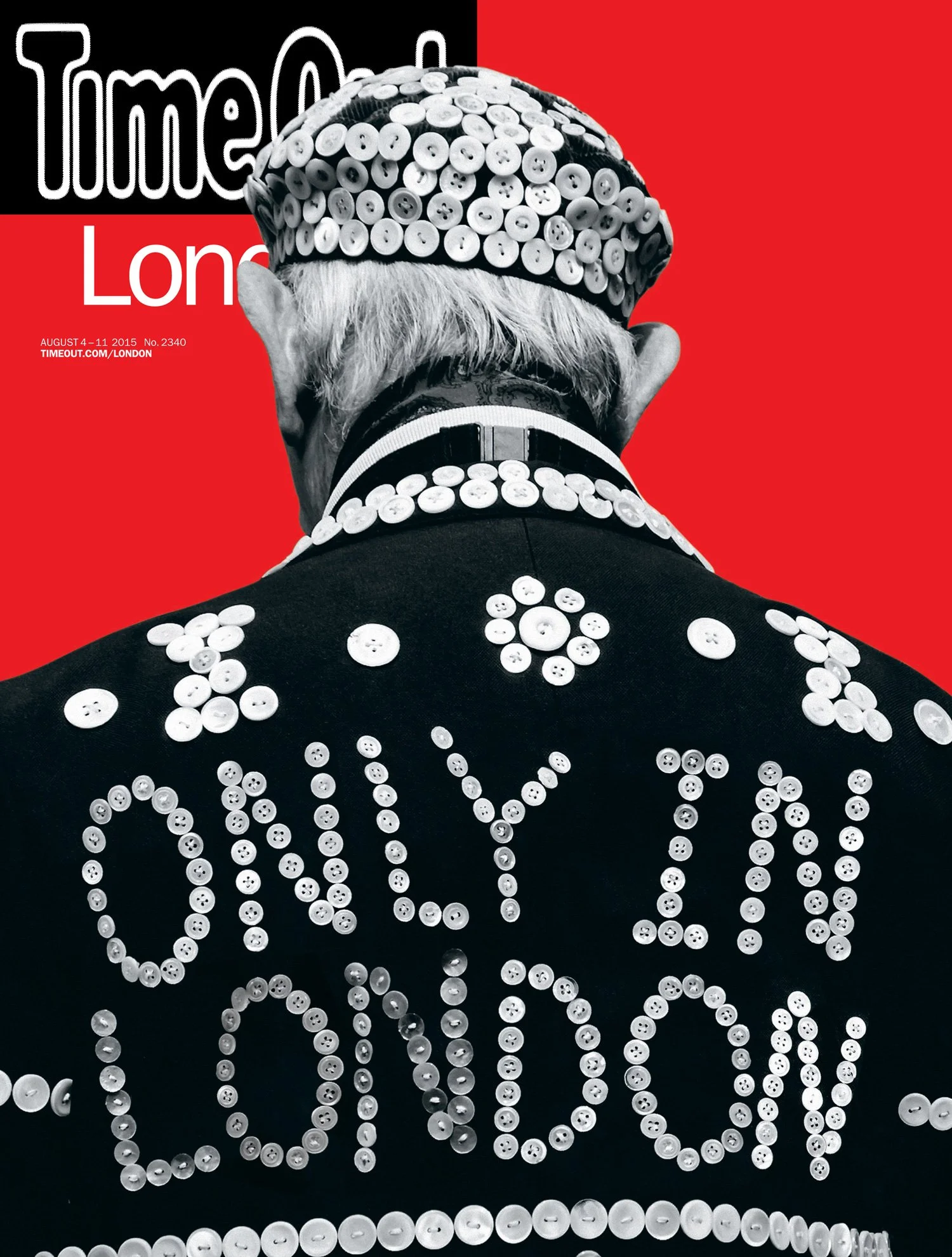
Image: Time Out London, August 4–11 2015,
an example of the free edition
Established by Tony Elliot in London in 1968, Time Out adapted to a new business model and audience in 2012, distributing its trusted content for free, first in London then New York.
Time Out serves a wide demographic. In London especially, 53% of its audience are 15–34, 47% are 35+.
In 2016, as editor Caroline McGinn was keen to redefine the brand, its readers wanted Time Out to be simpler and quicker. This was the main objective for the global redesign that started with the New York and London editions. It had to declutter and be the easily digestible and inspirational magazine the readers wanted it to be.
Easily browsable content was required via print as much as digital. With digital in mind, I started thinking of all content as individual blocks, much like a wall of fly posters on the street. Which led me to think... “Could the print content act like posters?…”
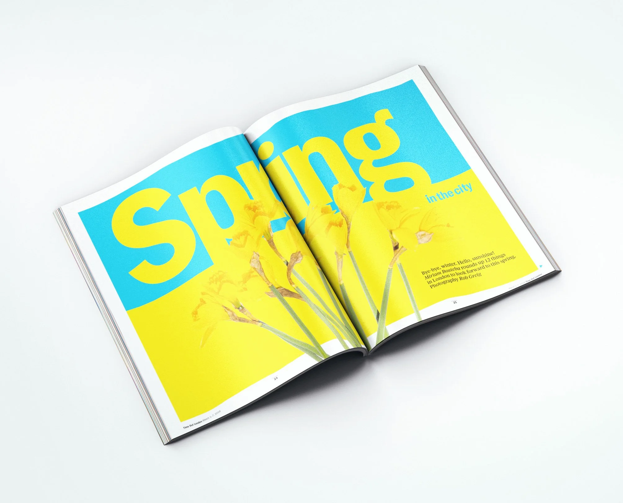
It would be all about the colour space. Not white space, colour space.
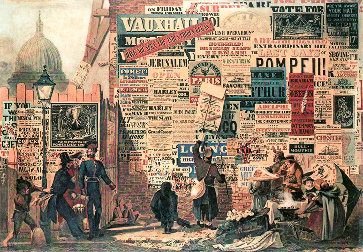
“Could the print content act like posters?”
A London Street Scene by John Orlando Parry c.1835
Space as colour, colour as space
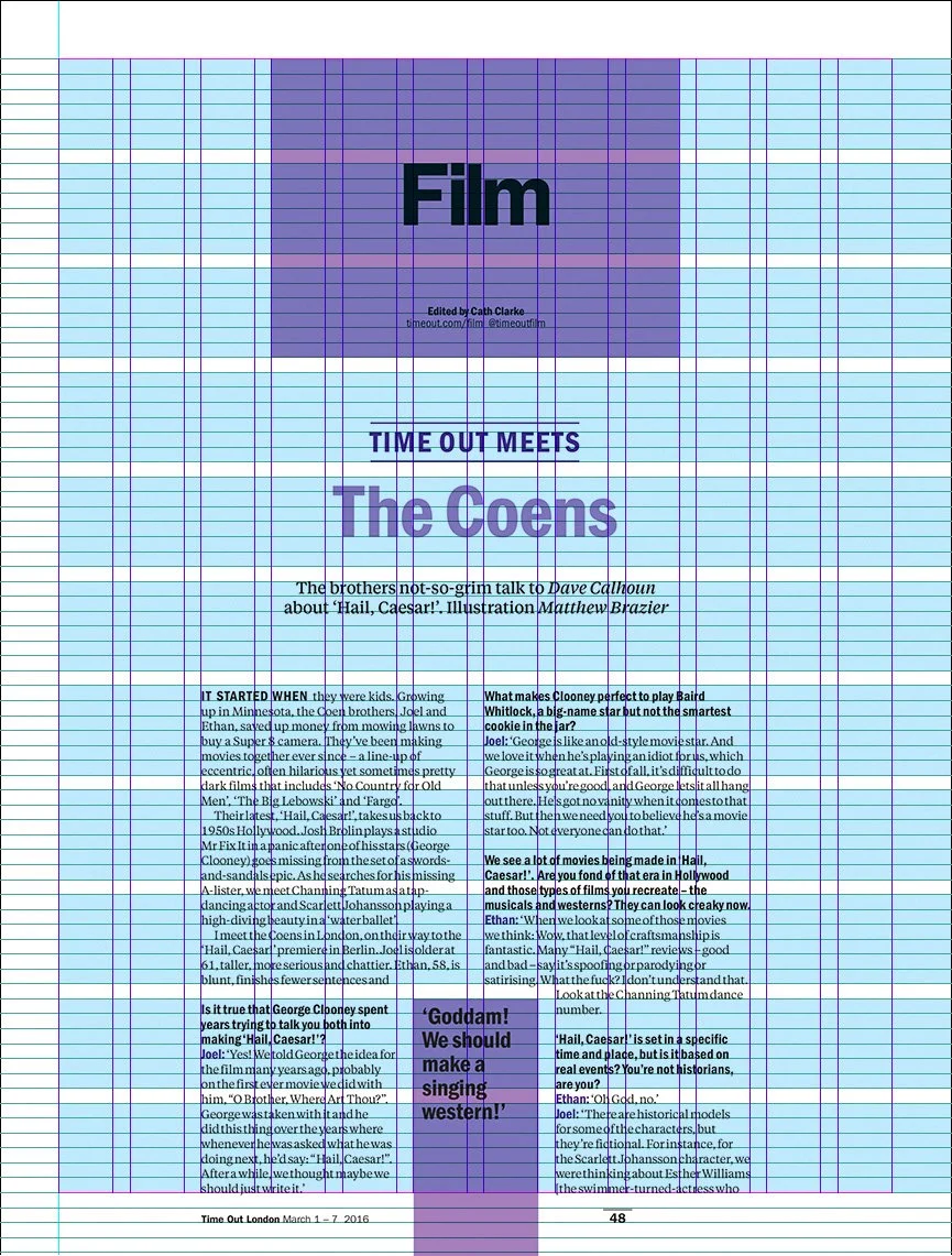
Better content hierarchy was essential to declutter the layout. I introduced a new modular grid that helped to define zones and ease navigation.
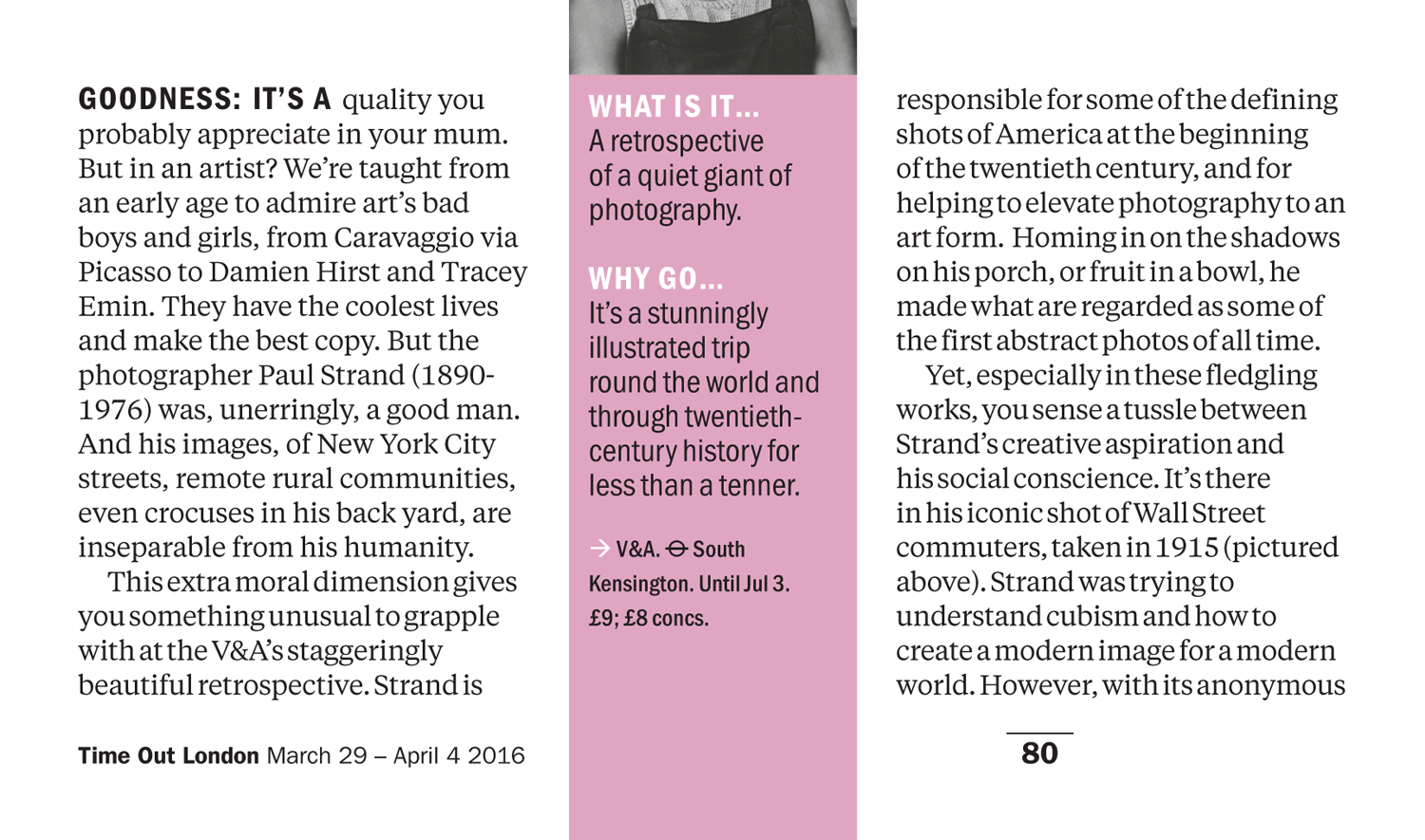
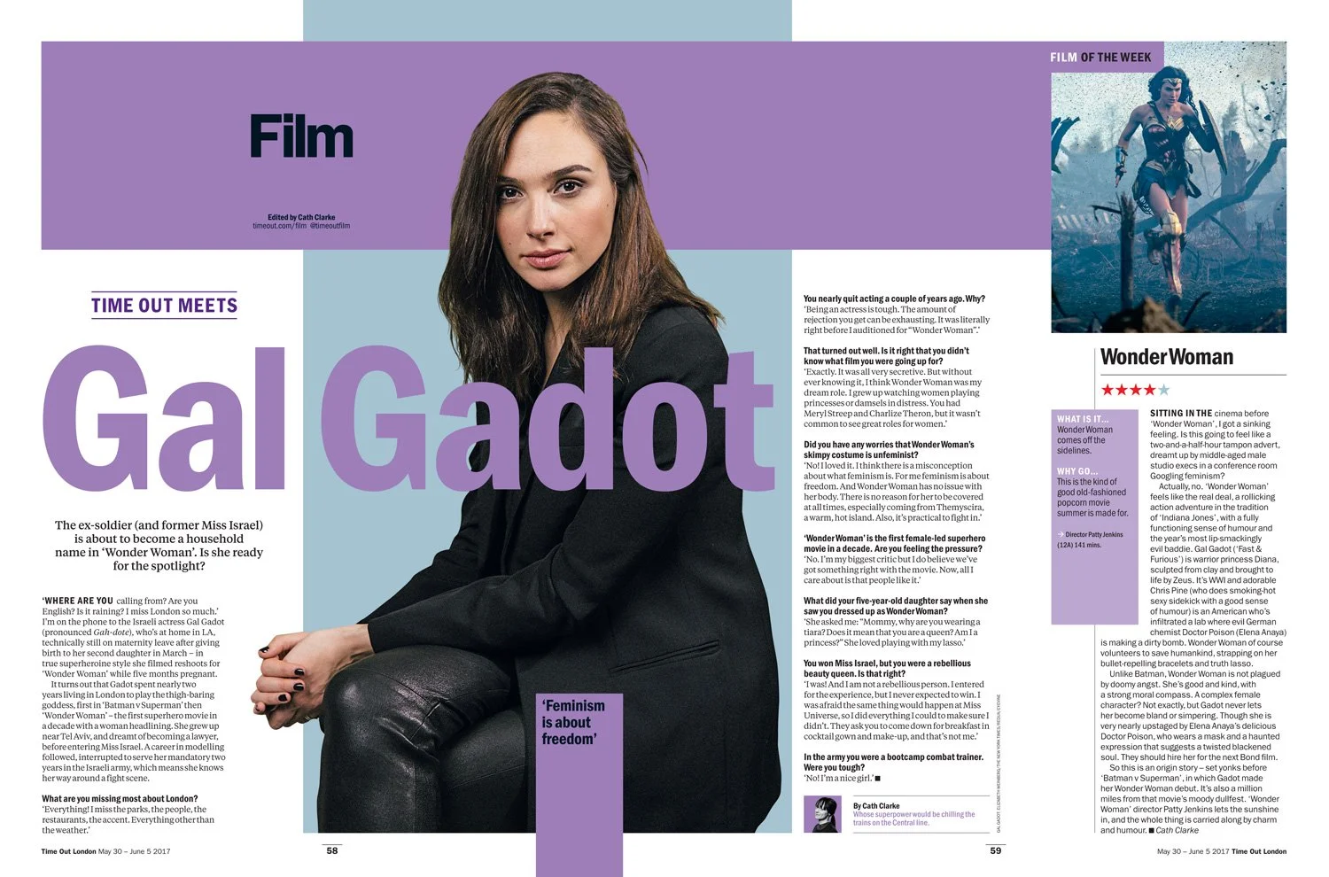
A serif face, Tiempos Text, was introduced to complement the Time Out family Franklin Gothic. This helped create a distinct partnership between immediate, browsable content, and longer and richer stories.
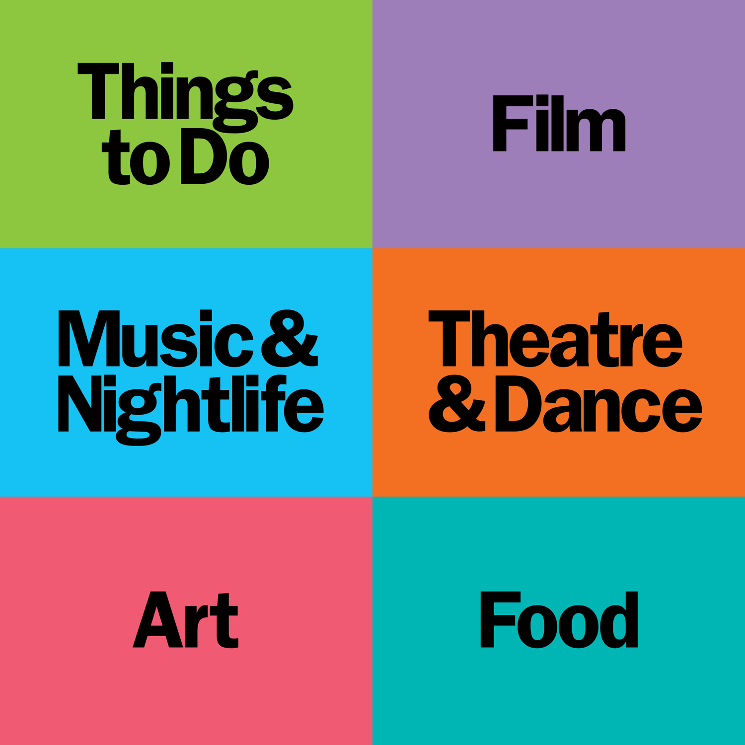
The new zonal thinking then allowed us to build our poster blocks, starting with the section titles.
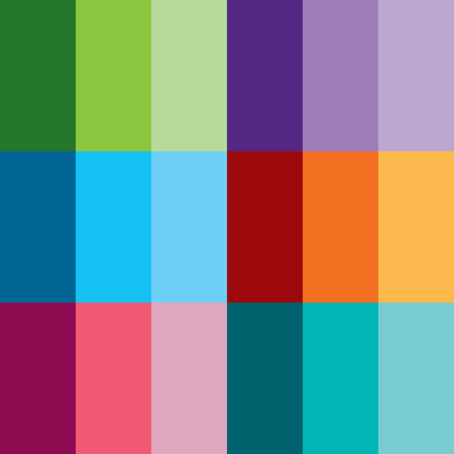
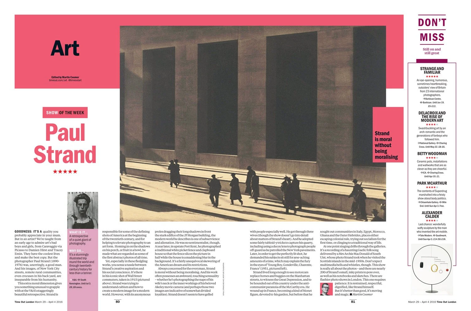
Each colour space/section has two relative tones for flexibility.
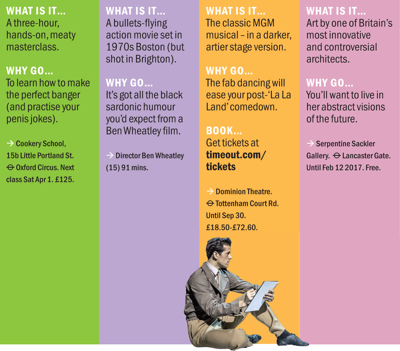
These were then applied to formatted content such as the new ‘WHAT IS IT…’ boxes. These graphic panels for the bitesize information would act as signposts for Time Out’s bread and butter – the reviews.
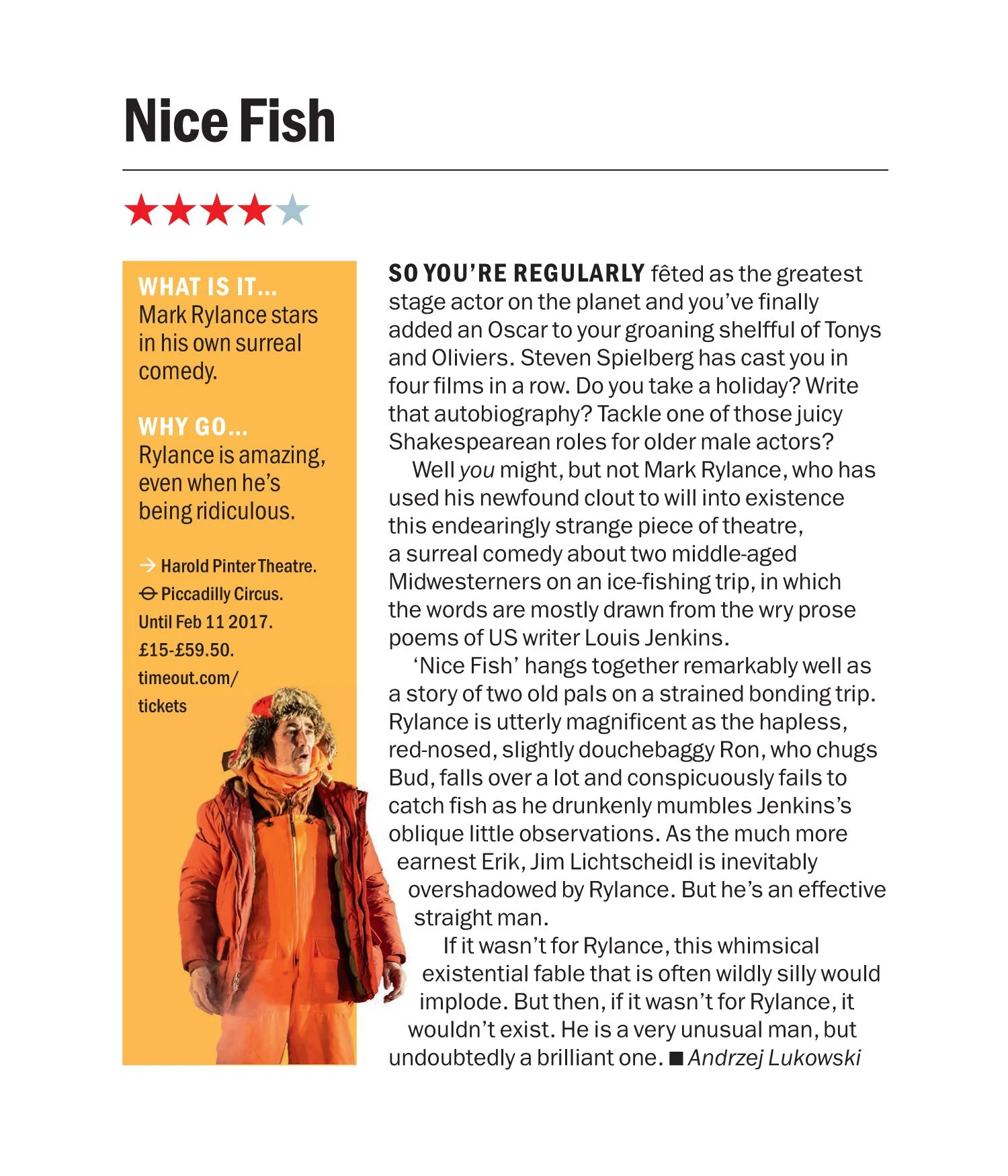
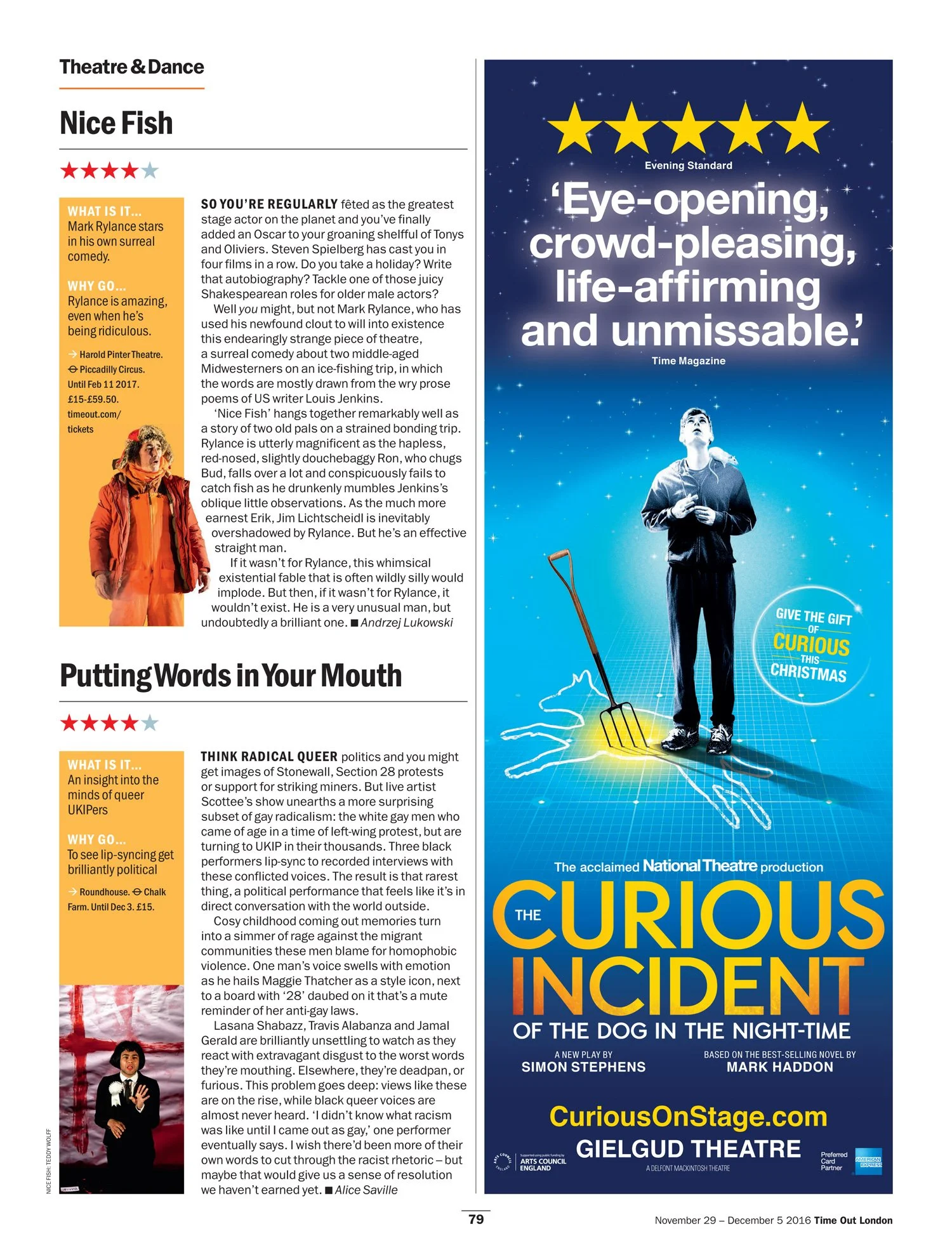
With the zones defined, recurring formats could be templated to easily slot into a book that is very ad-heavy. For example, 1/4 page reviews…
Type as character
The typeface Franklin Gothic is Time Out and we couldn’t ignore that. What we could do was explore the different weights and widths of the type family. The goal was to create a visual personality through type that mirrored the humour and confidence of Time Out’s tone of voice. The demi condensed weight of Franklin Gothic acted as our voice for this editorial personality used in all headlines and pullquotes.
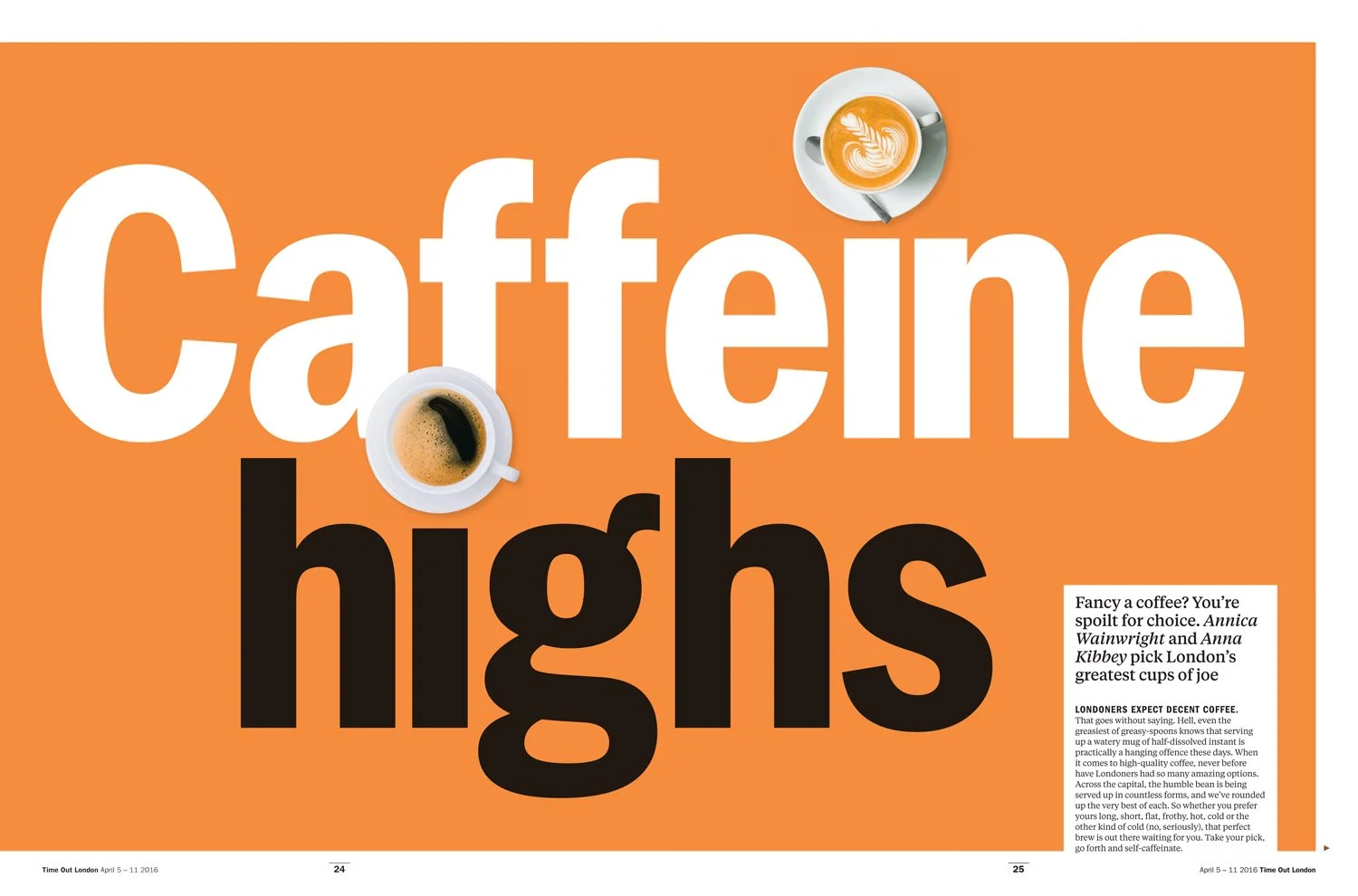
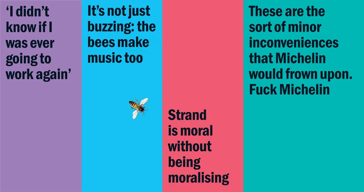
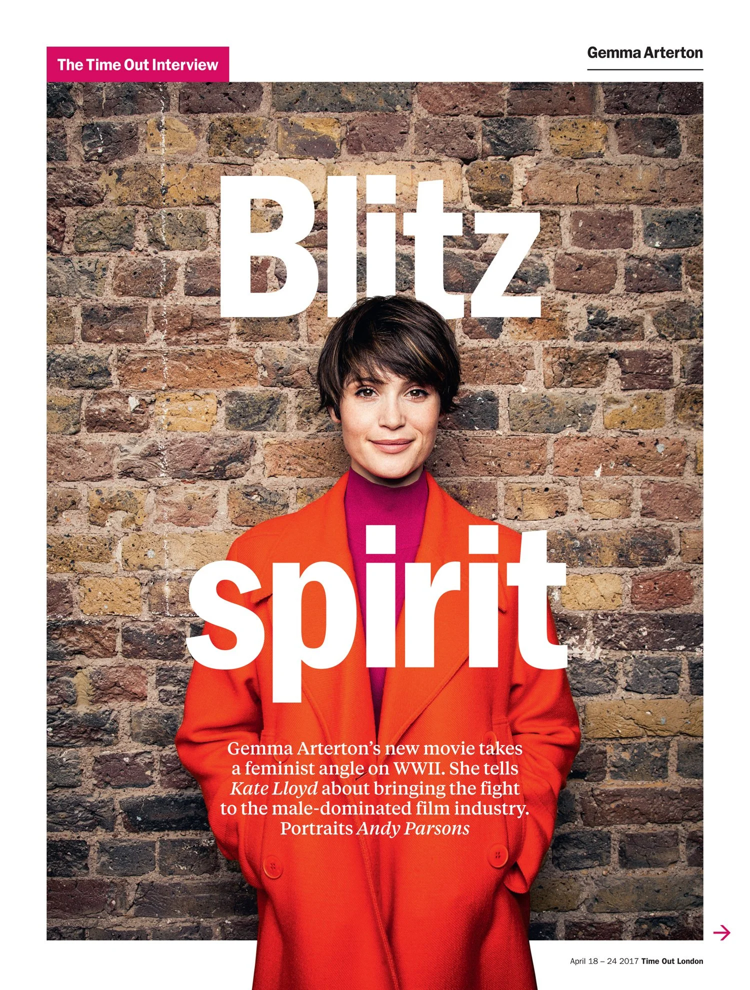
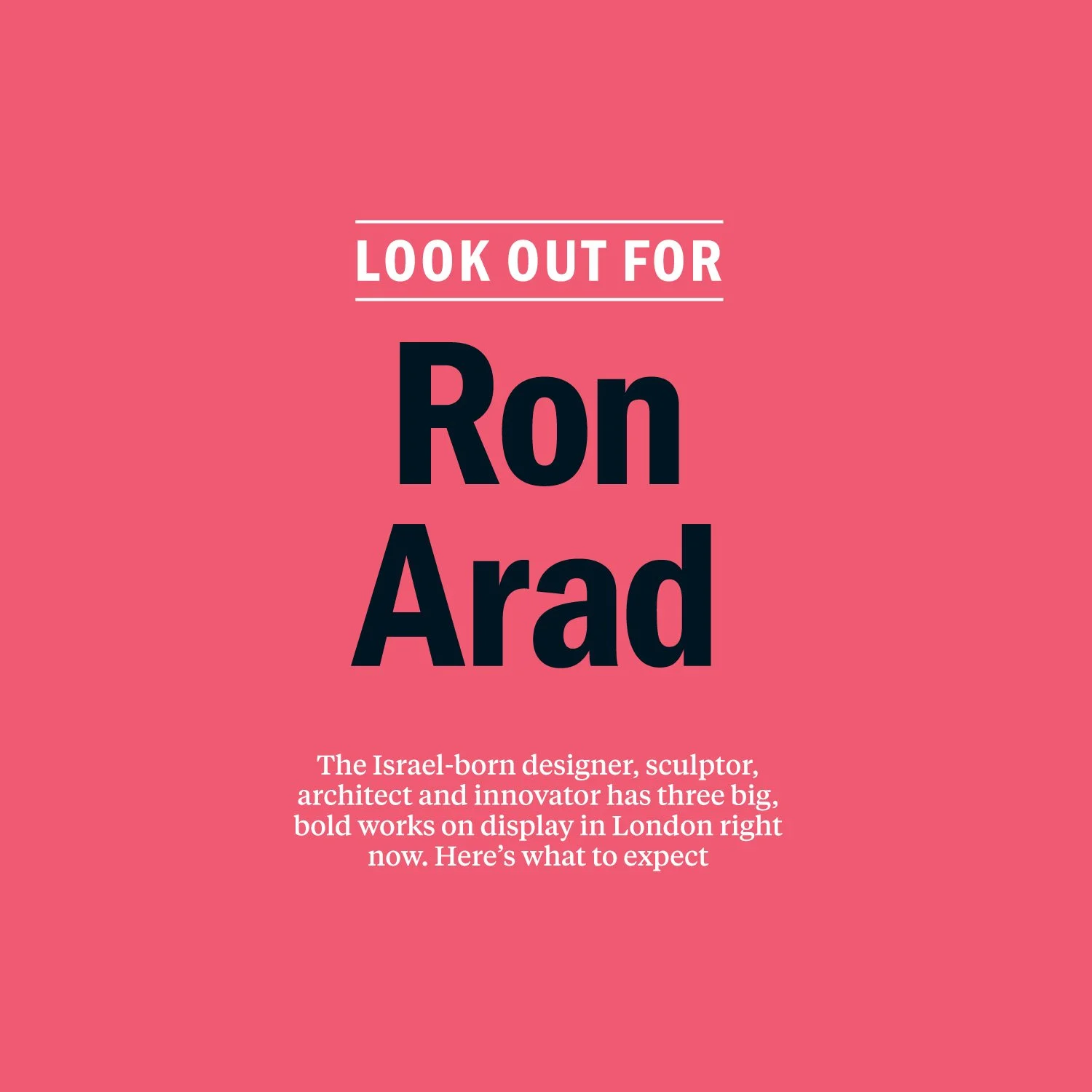
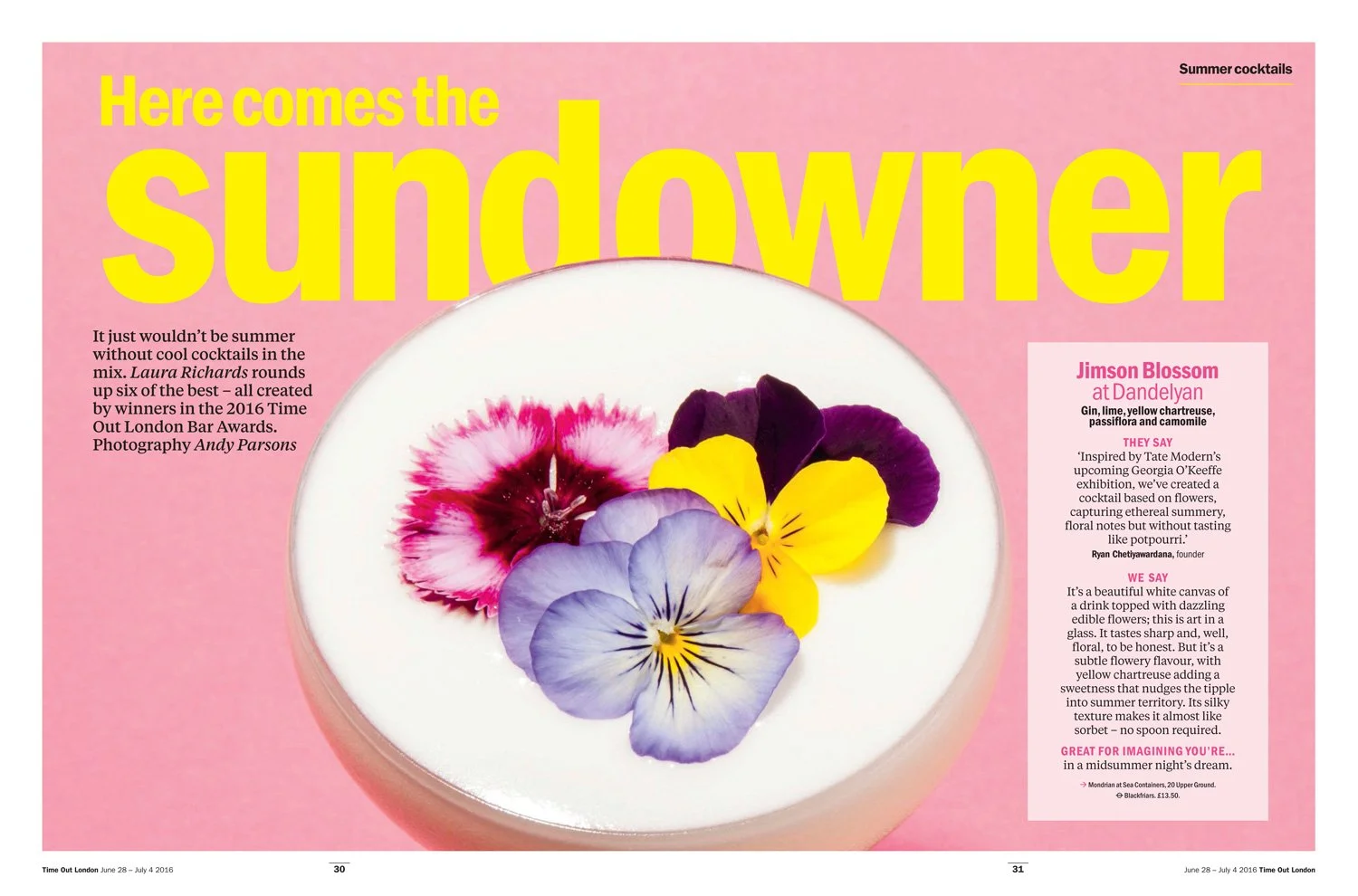
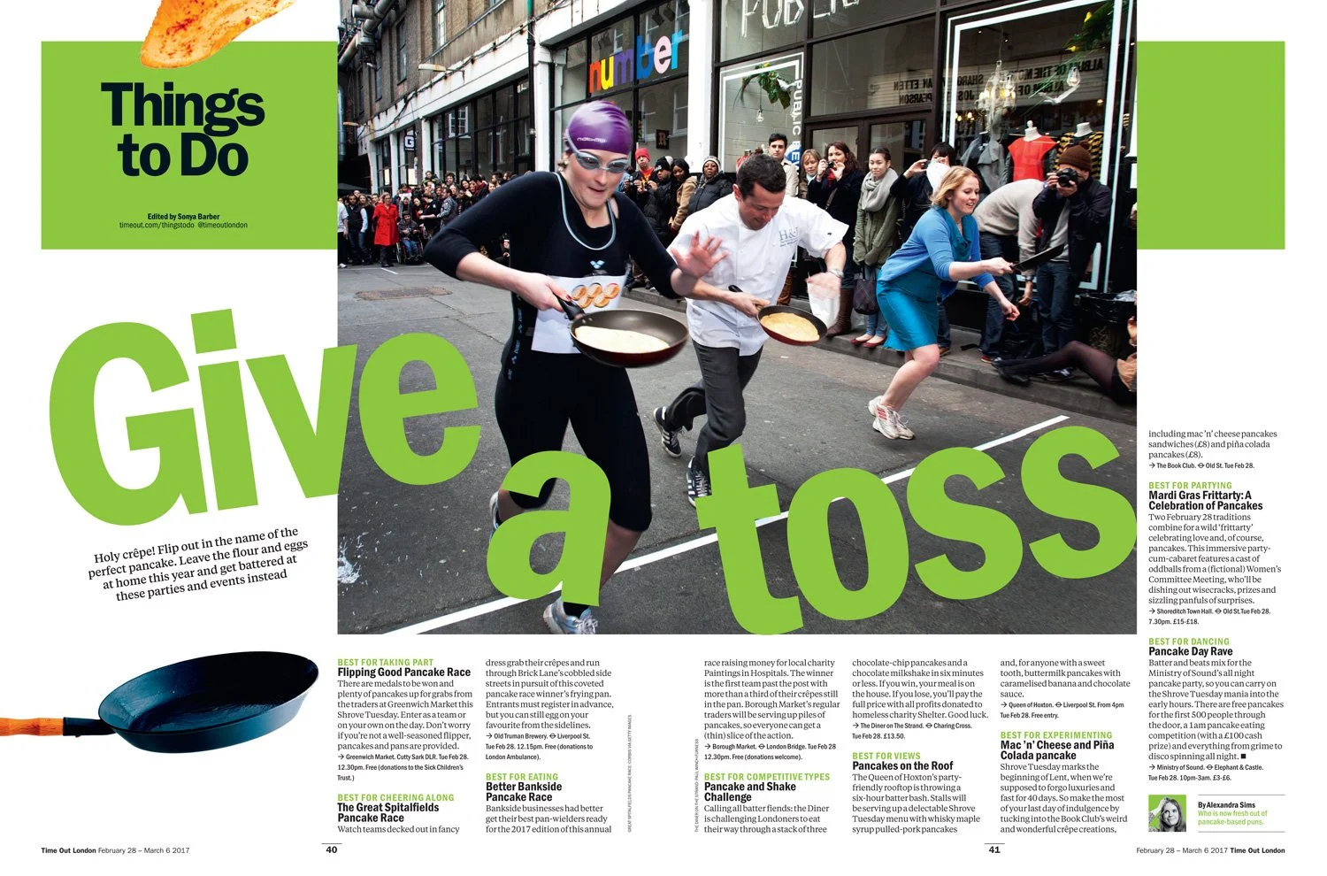
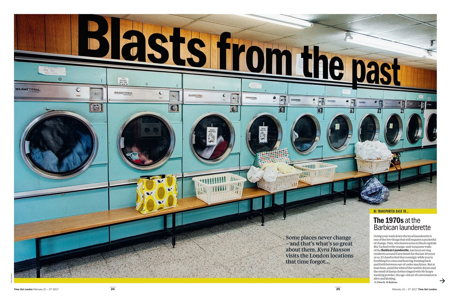
As the voice of Time Out, the typeface would show you around, at times, immersing itself within the city/content.
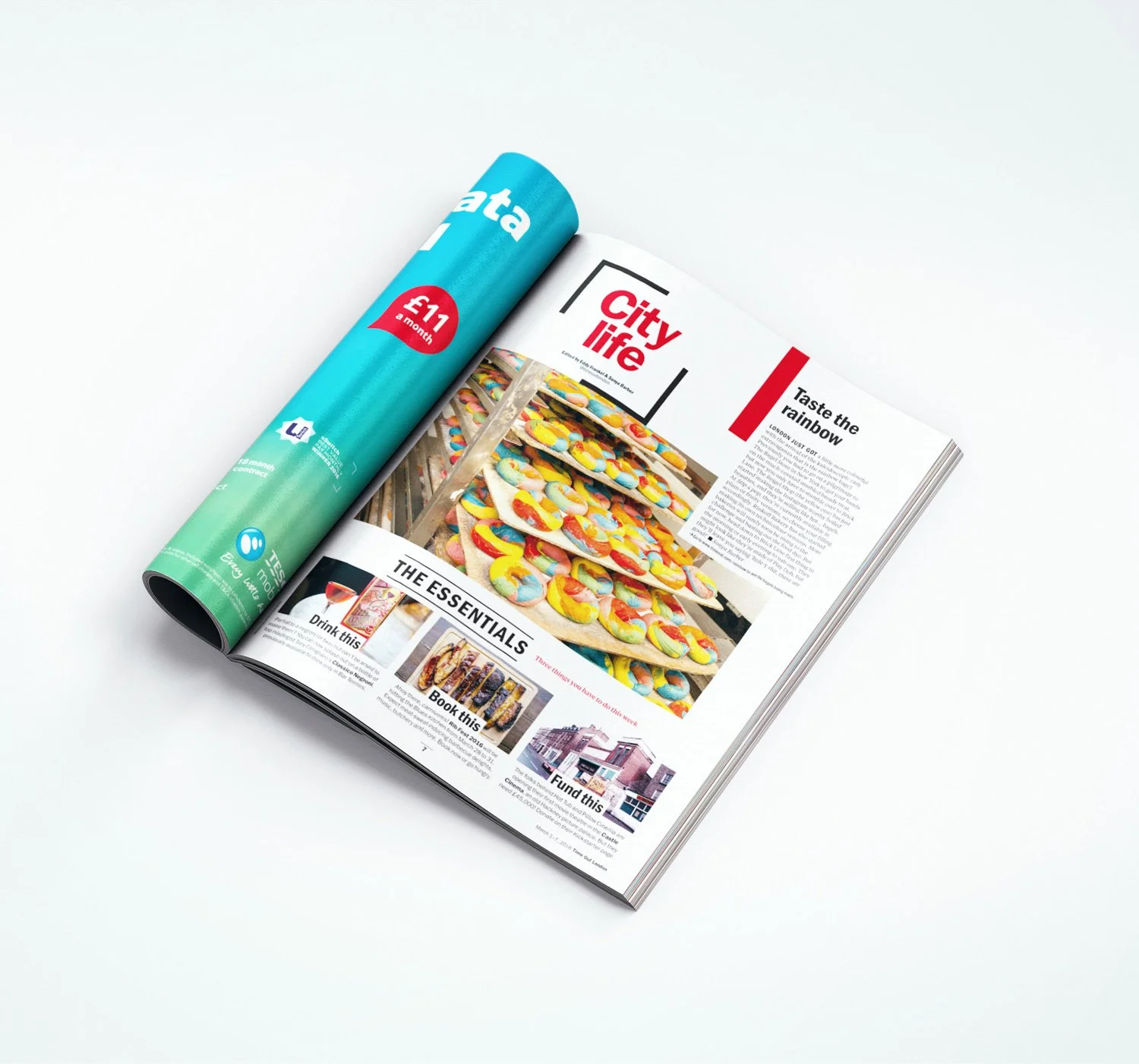
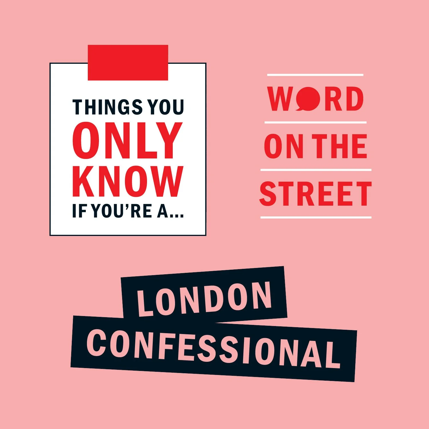
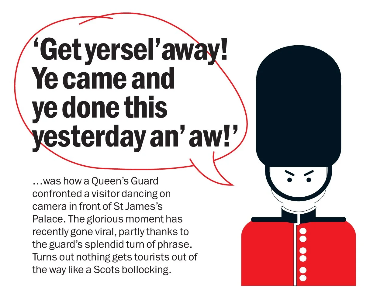
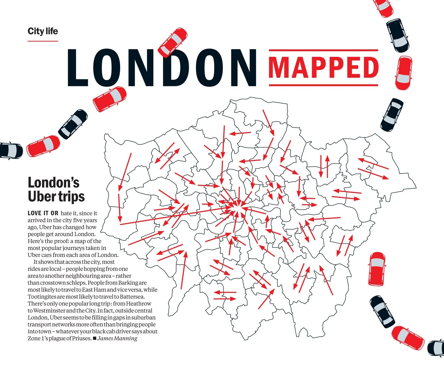
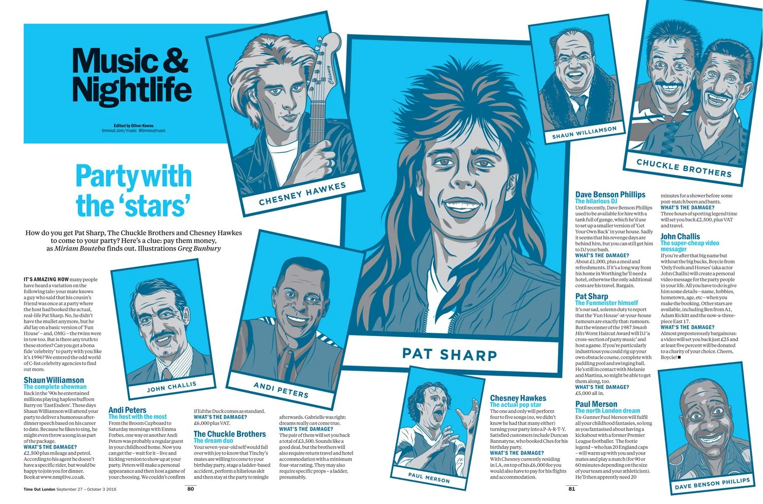
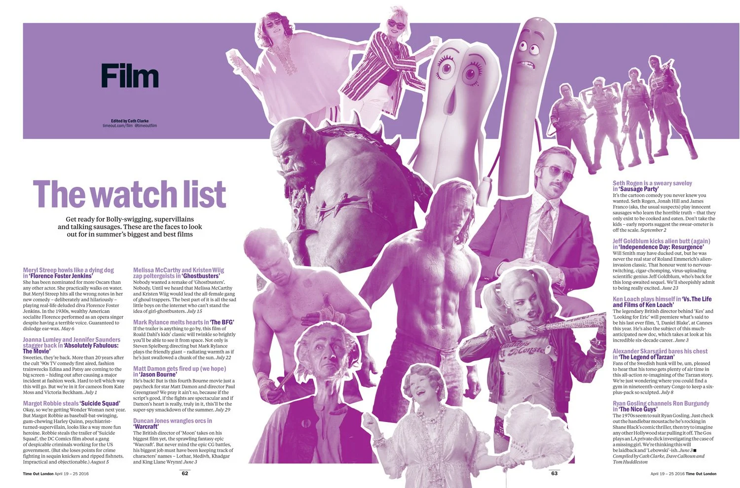
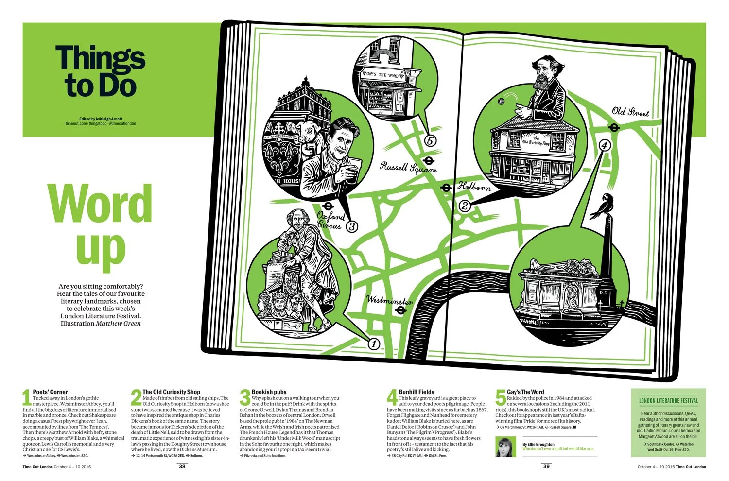
Colour as character
With a multiple colour palette at play, idents and graphics are visually consistent with the relevant section’s colour space to ease navigation.
Commissioned illustration would act like it belonged to a graphic novel for the section and again be visually consistent with the colour space.
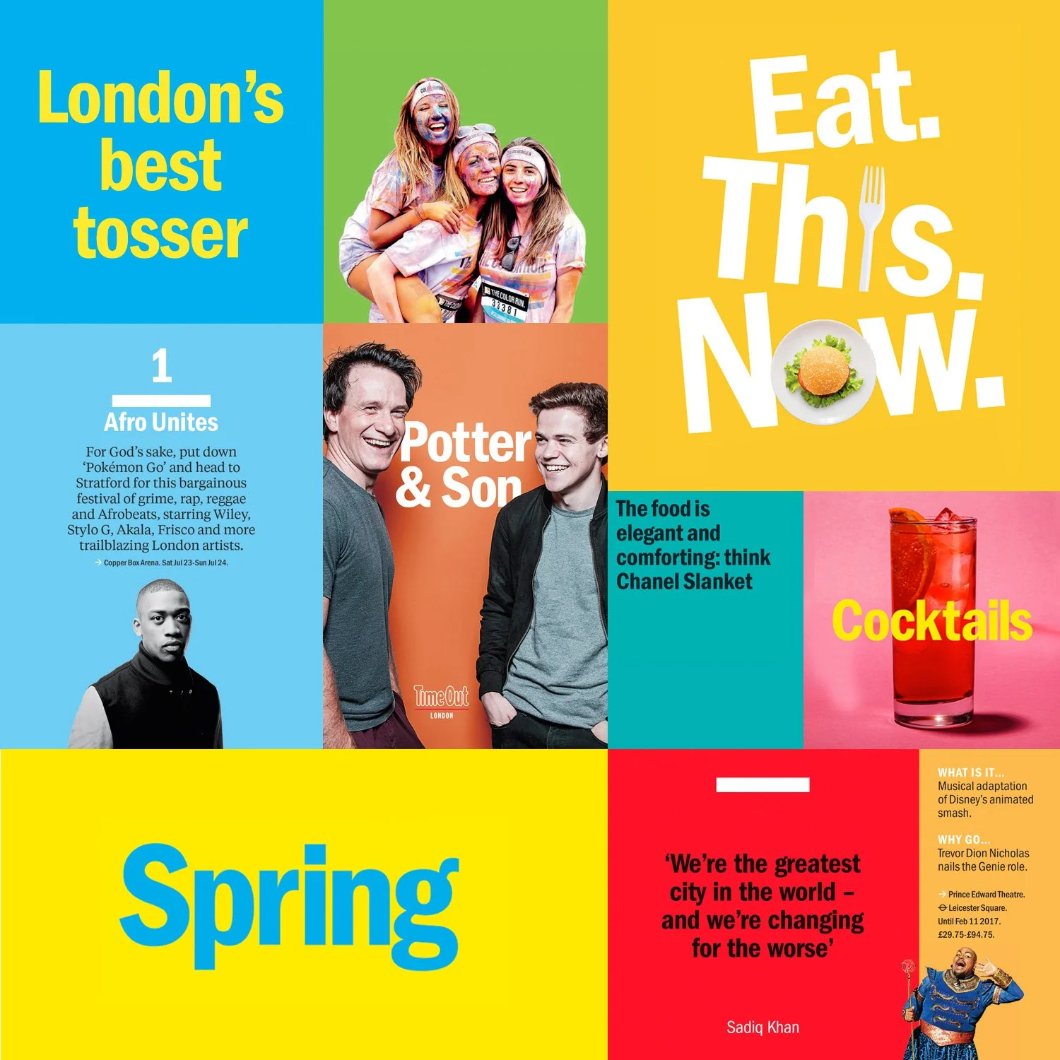
Content as posters
Panels of pictures and type created a poster identity for content in print, digital and across social media platforms.
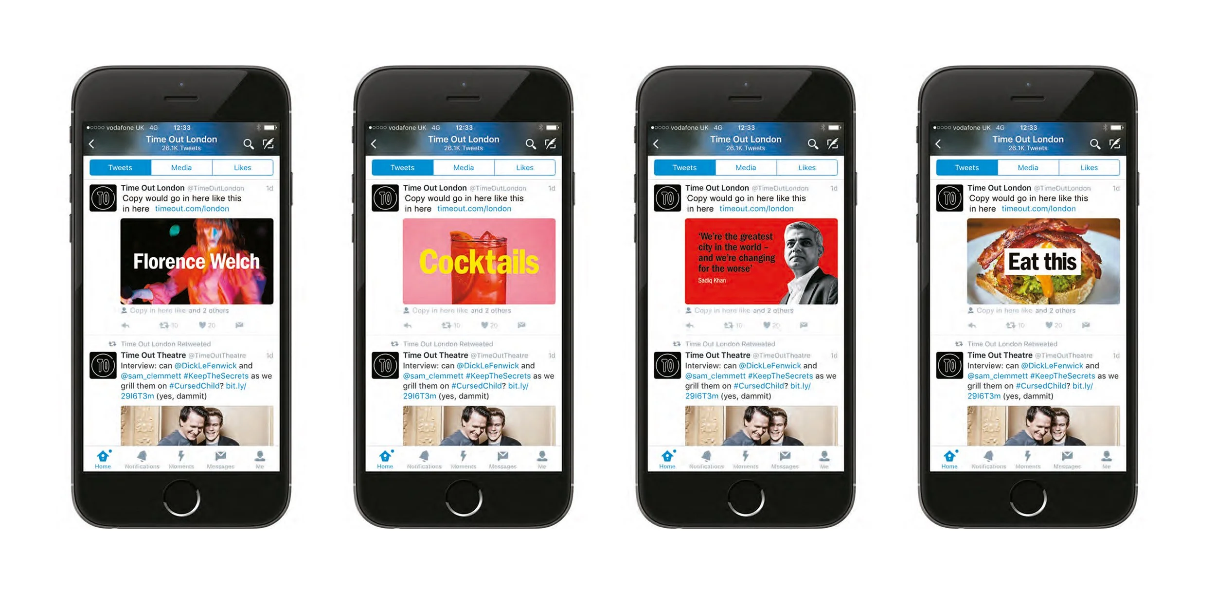
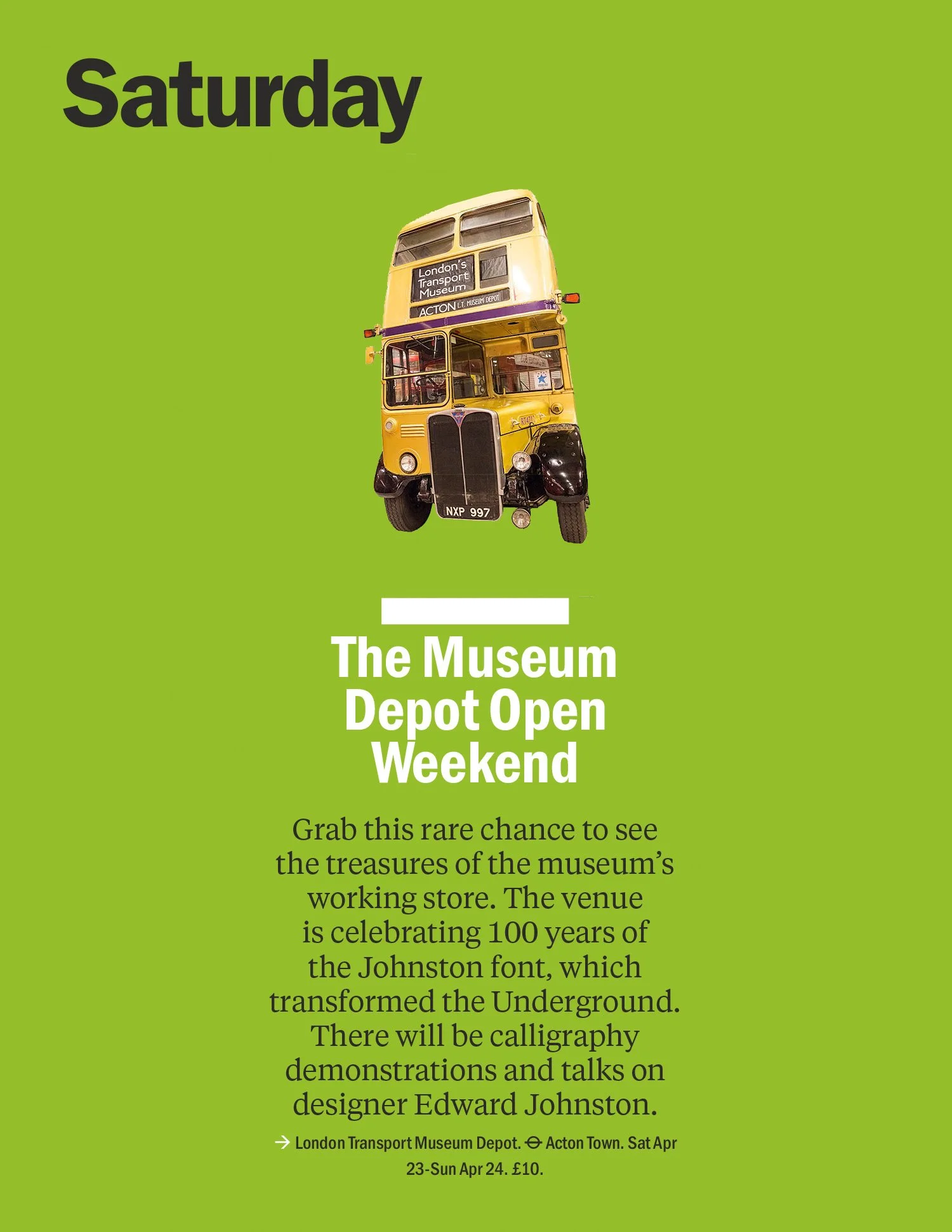
The poster identity would give importance to less glamourous looking subjects.
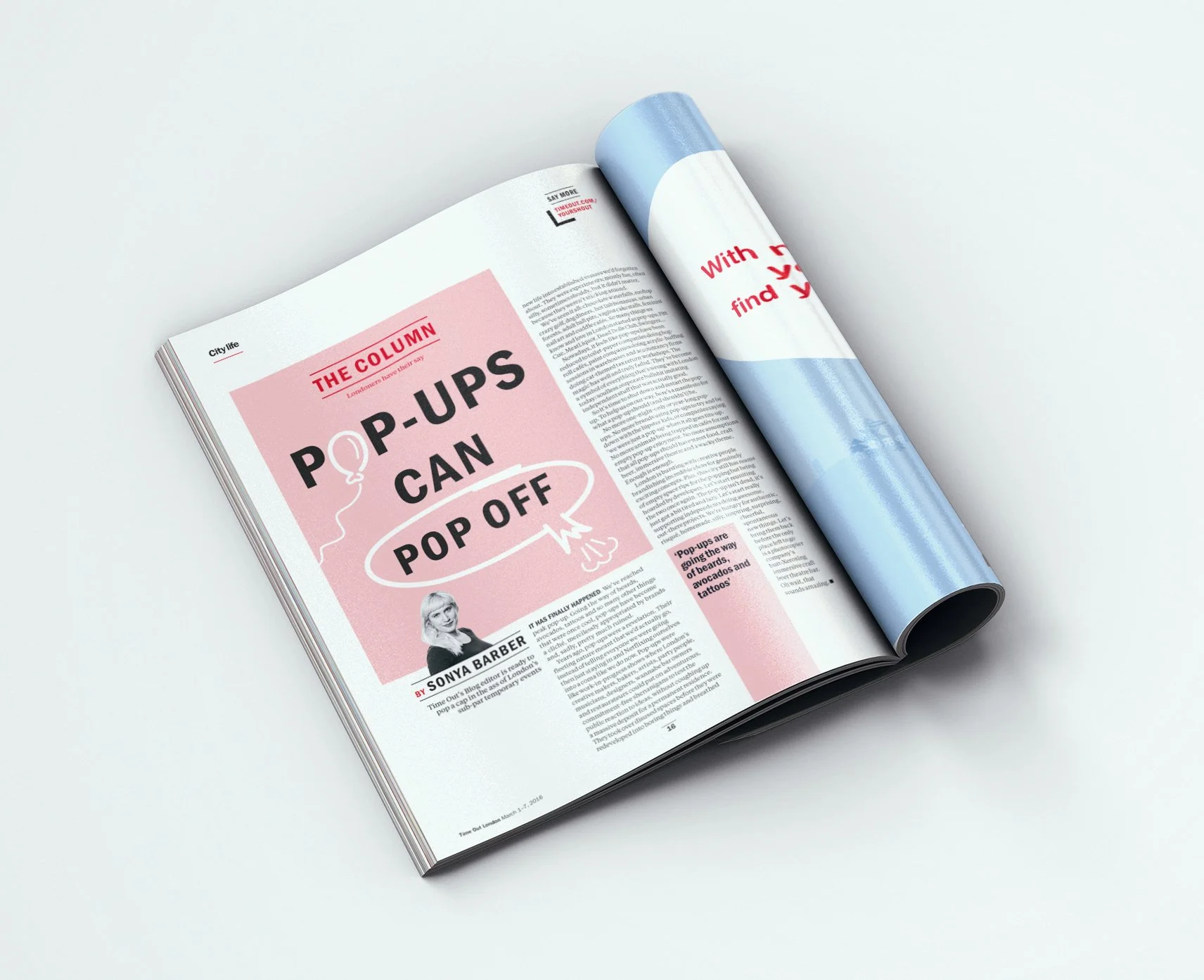
It would also headline pieces.
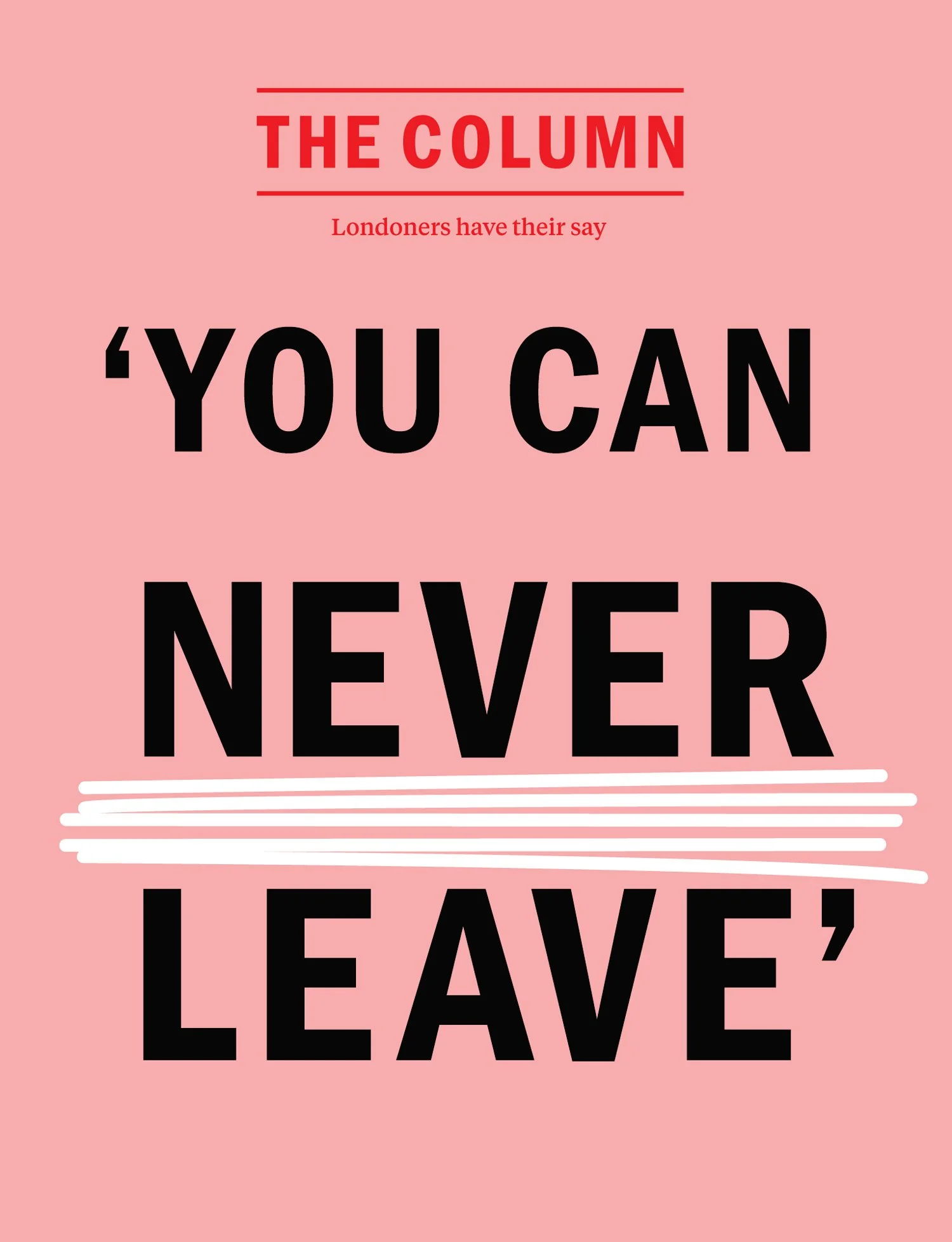
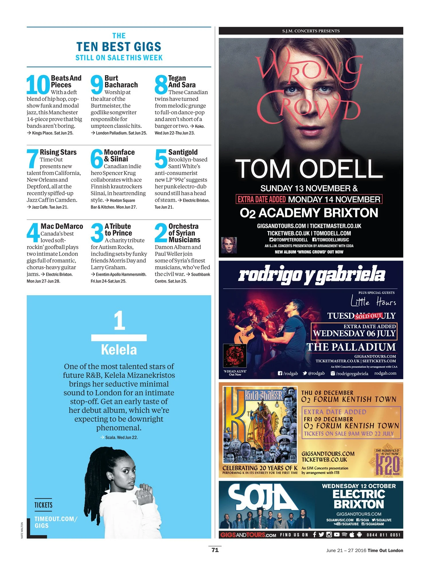
It would be impactful on our social channels and help define content in a print book which is very ad-heavy.
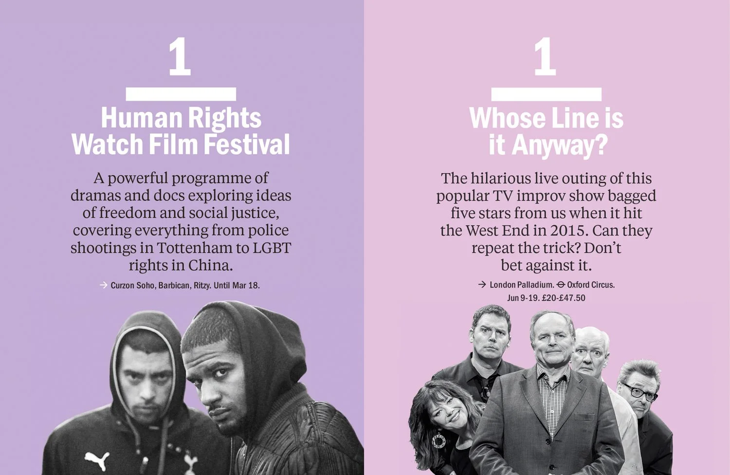
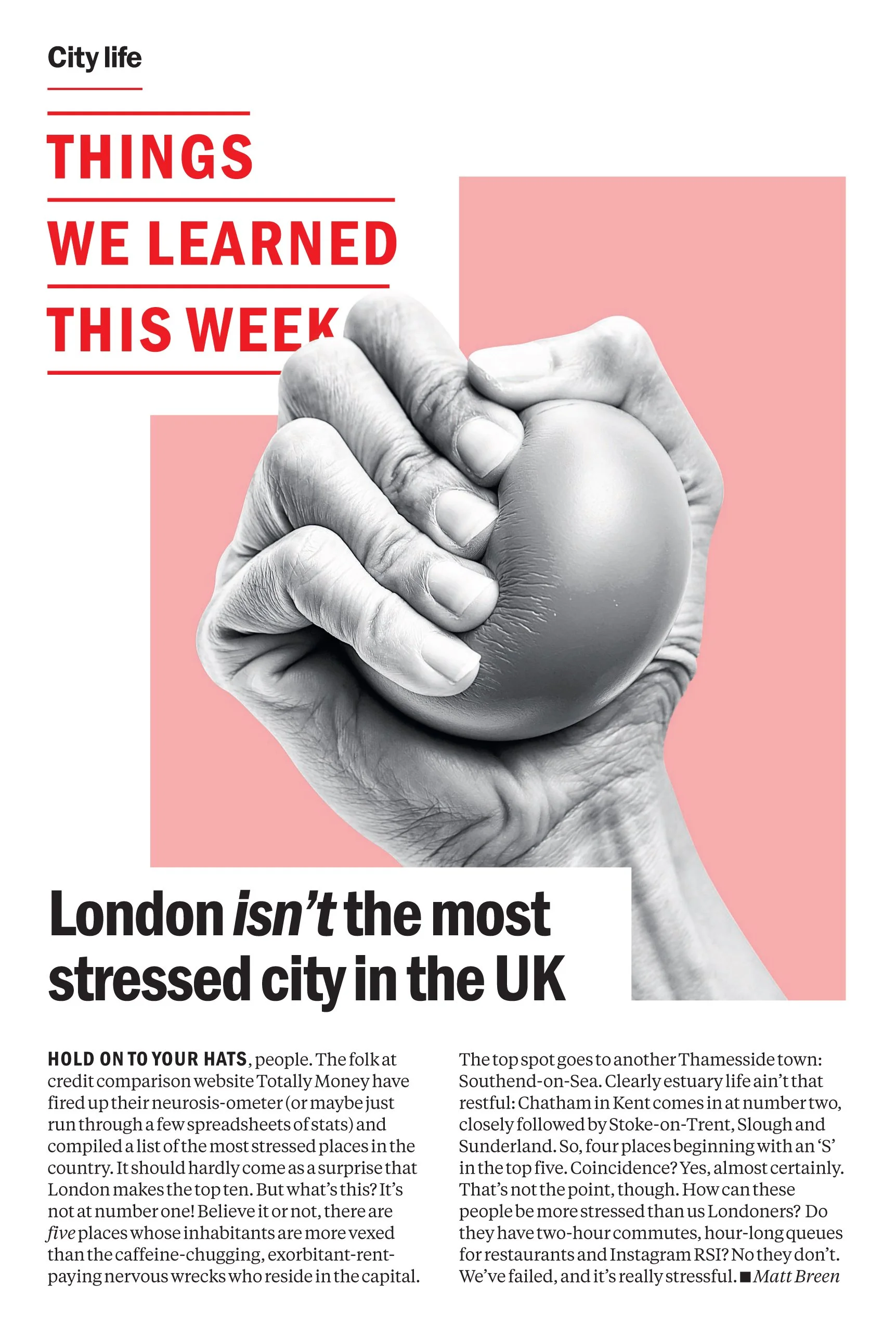
Black and white cut outs for families of formats helped build a unified identity for the different coloured sections.

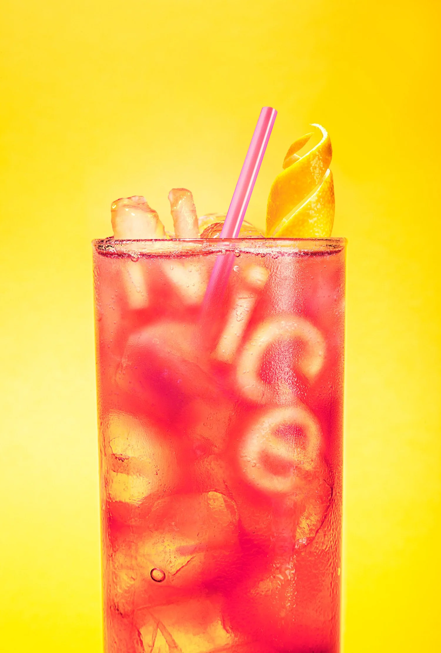
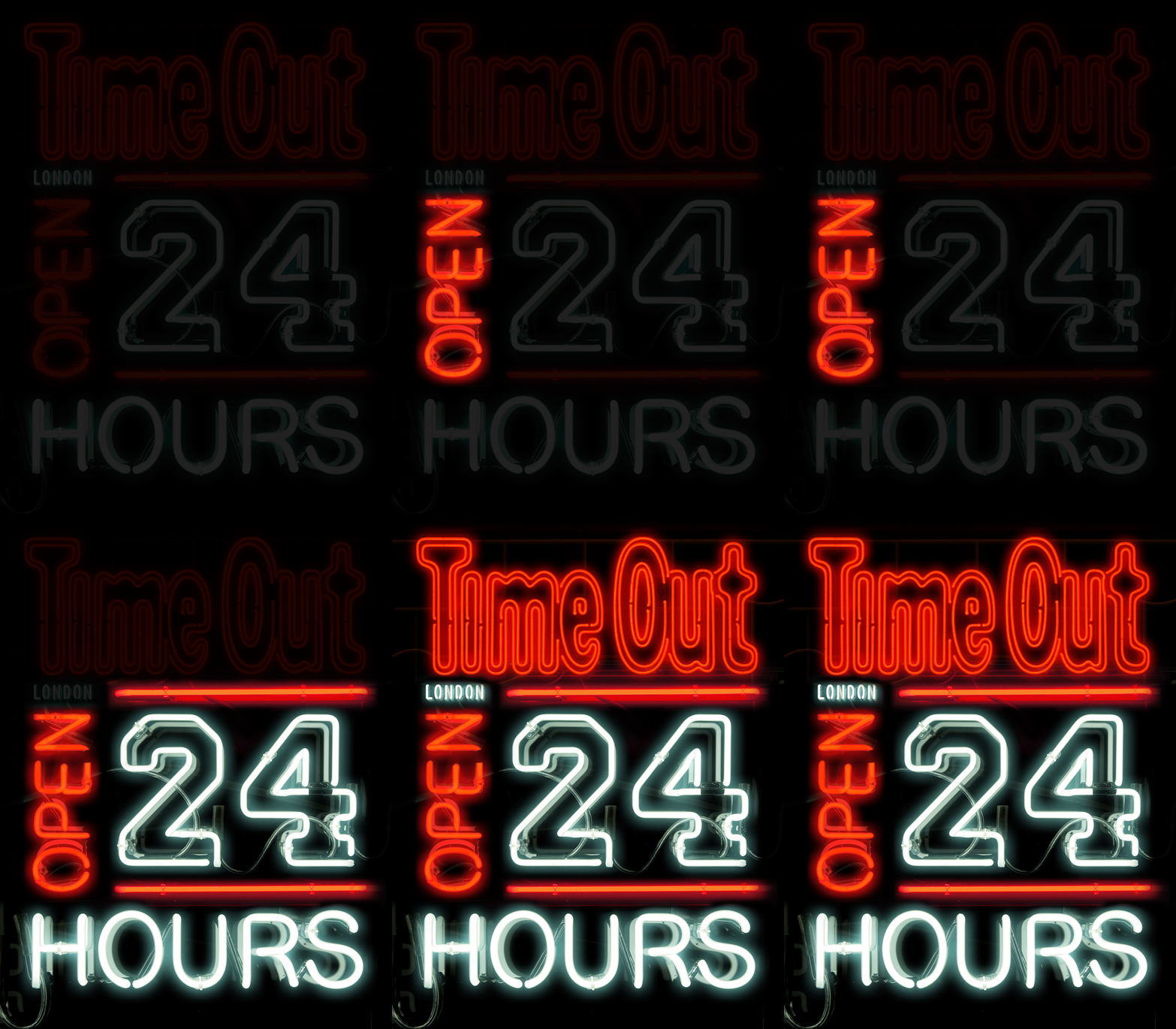
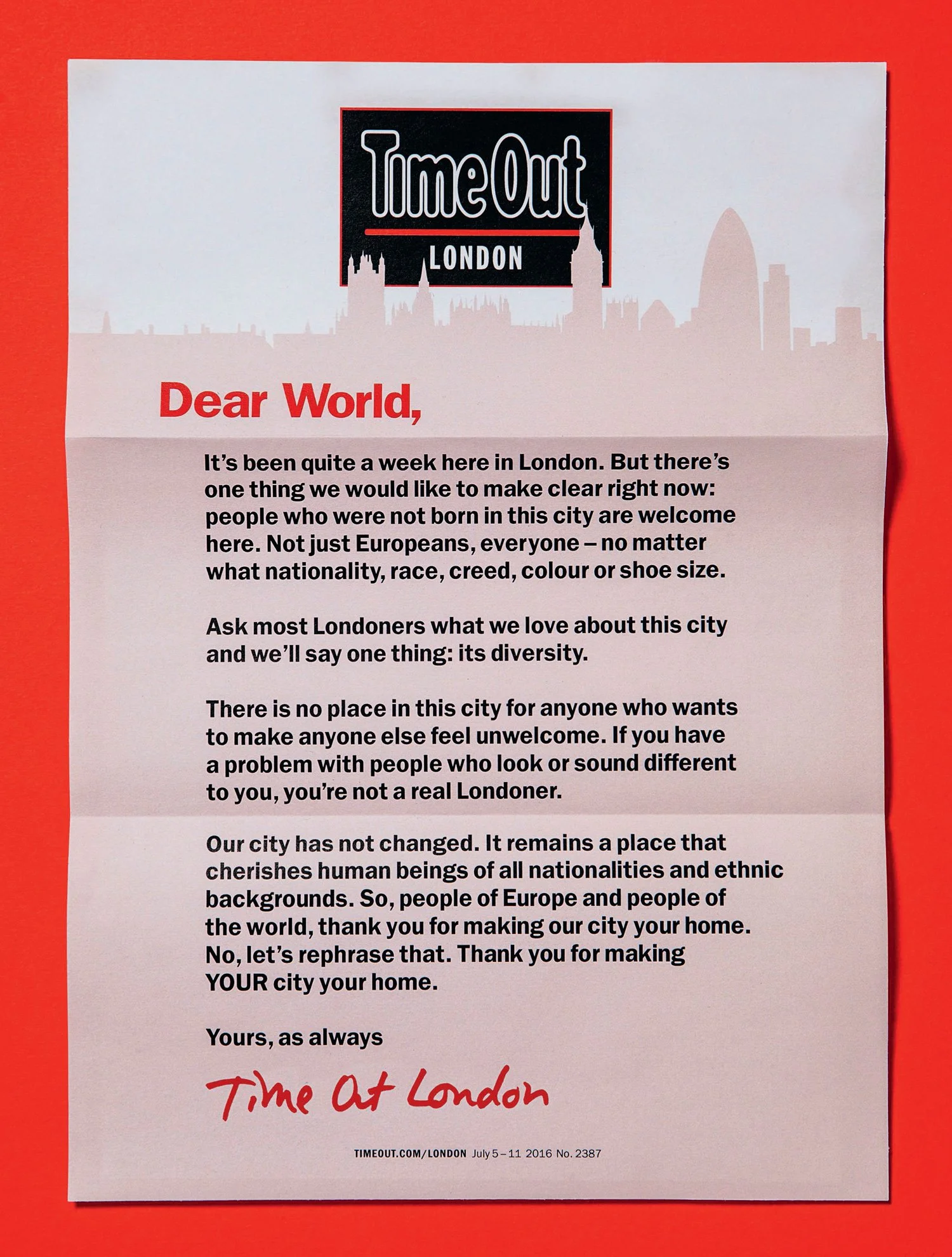
This graphic use of colour was key to the design from the poster identity to still life photography and artworked images.
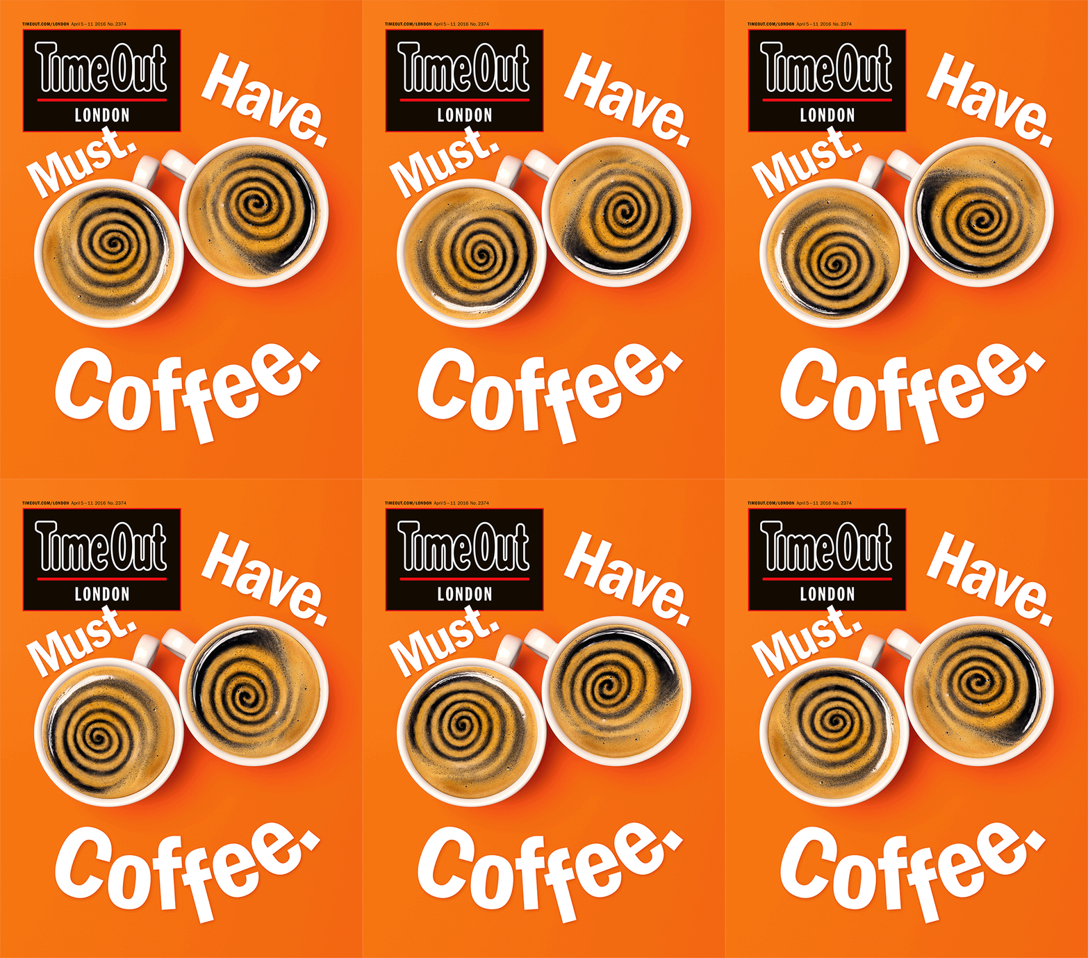
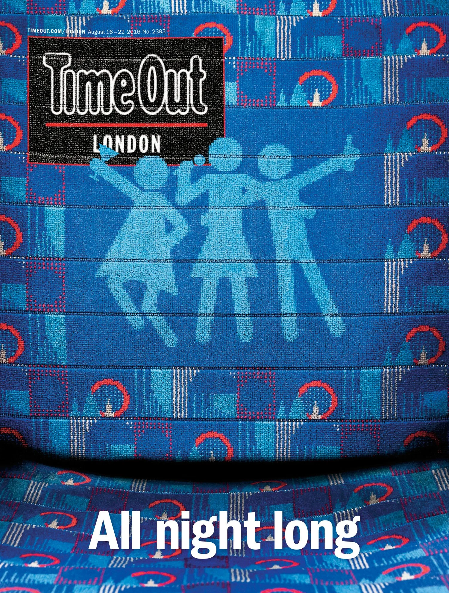
Covers as posters
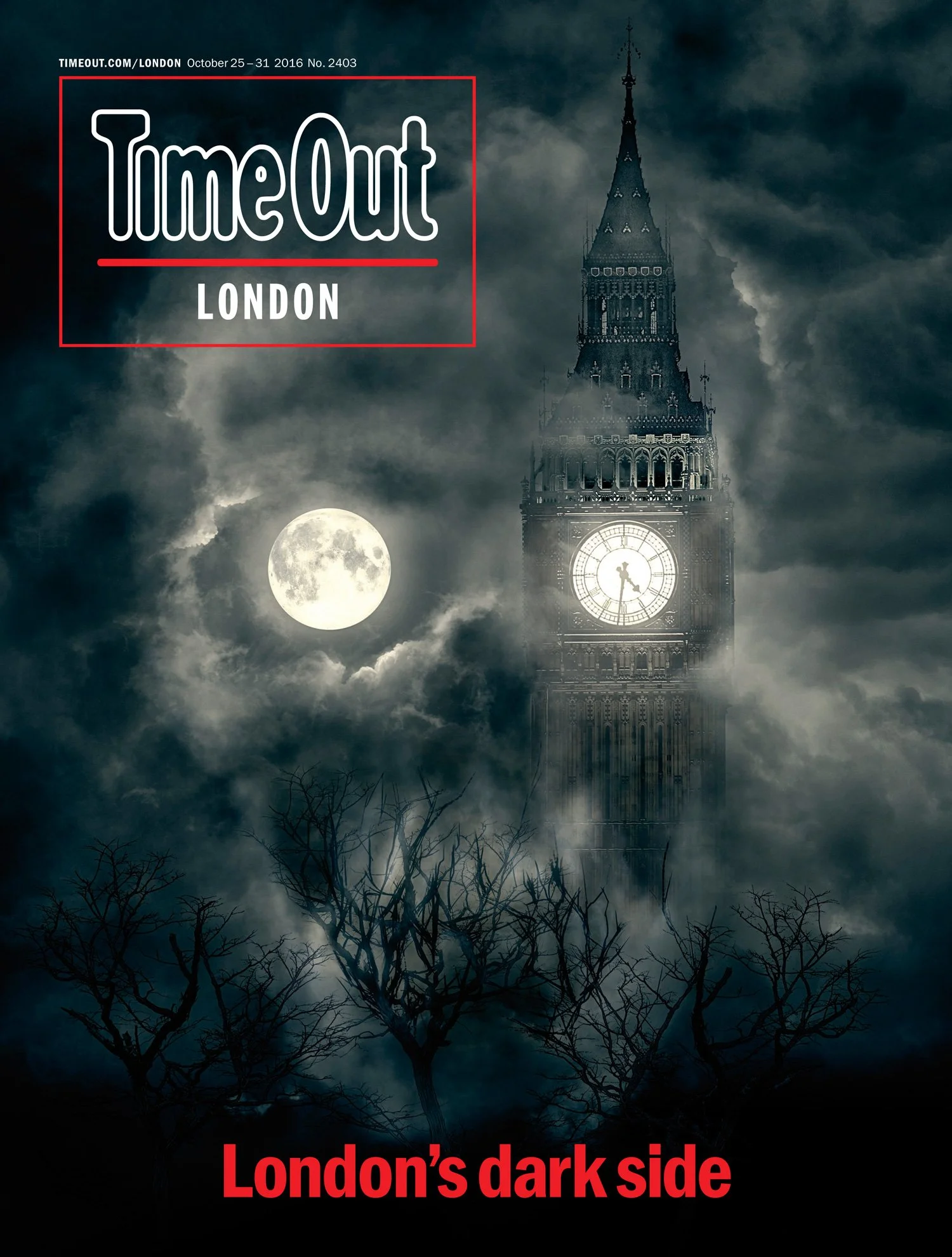
Time Out was London’s most-read free title distributed on the streets, in stations, hotels and various other locations around the city. The covers had to act like posters for the brand and easily connect to an audience that was constantly on the move, adapting to the city every day. They would come alive on devices and make statements that became massive social engagements. The ultimate goal with Time Out’s cover design however, was to bring inspirational magic to everyday city life for its readers — make reality magical — and this would be achieved through photo illustration.
Readers loved the 2016 redesign, rating the magazine higher for inspiration, intelligence, entertainment and design.
-
Studio Manager Anamaria Stanley
Senior Designer Tom Havell
Designer Tim Clark
Picture Editor Ben Rowe
Photographer Andy Parsons
Photographer Rob GreigEditor Caroline McGinn
Brand Creative Director Anthony Huggins
With thanks to all collaborators.
Typefaces
Franklin Gothic by Morris Fuller Benton, Victor Caruso
Tiempos Text by Kris Sowersby, Klim Type Foundry
Time Out design © Time Out